Help Me Make This Better
 ItsCeo
Posts: 471
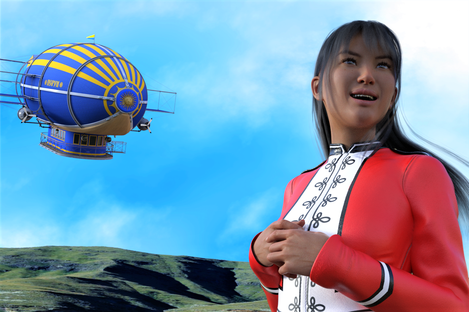
So... I bot https://www.daz3d.com/dirigible-perun I just love the look of it. So... I wanted to make a render with it. My first attempt here...

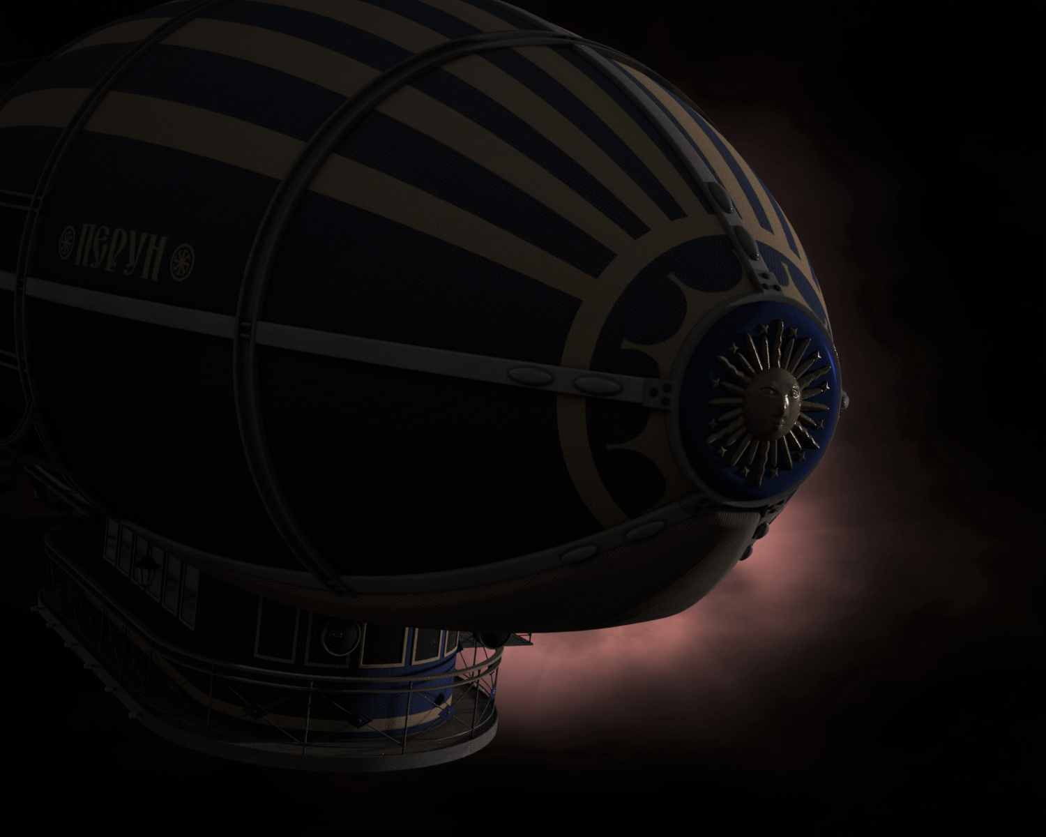
I am pretty sure the correct word to describe attempt 1 is 'hideous'. I would delete it, but am a believer in everything I do makes me better, it just takes practice. So... I kept playing around til I finally made attempt 2 below. I like it , but it just don't love it, you know? How would you change attempt 2 to make it better?


He's Finally Here! (2).png
1500 x 1000 - 2M


Journey Through the Dread (2).png
1500 x 1200 - 2M
Post edited by ItsCeo on


Comments
I got that model I haven't messed around with it yet. Do they have a setting to turn the lamps on? Have you tried shaders of any kind?
EDIT: So I pop it out and did this. Is this what you wanted?
What do you not like about your renders and what are you trying to do?
!! I didn't even know you could turn the lamps on! I found out you could make the props move after making attempt #1. :D
See, I like your Test1 better than mine alot more - to me the wings are what make it fun.
Number 1 is just ugh. My fantasy was to have her waving at the dirigible, but that didn't work. To me it looks like the airship is not real - maybe if I smacked it with some depth of field I might like it better. Actually, I really like AgitatedRiot pic test1 alot.My attempt #2 I wanted to make dramatic somehow, but I think it's just meh.
You do know how to use shaders? I could walk you through it. If you want. there is no simple flick of a switch type deal. The model textures are 3delight. I had to do some converting to get the lights up and running.
Ok, so re: the 1st one:
- Yes, DOF might help
- AFAIK airships are always horizontal? I don´t know if you actually tilted the model or if just looks like that because of the camera angle... but it looks tilted, like it´s nosediving.
- Lighting: I think there´s a mismatch between the lighting and the background image. The shadows on the hills are much harsher than on the character and ship. I assume it´s an HDRI and a flat image in the background? That can indeed work sometimes but you have to find a better match; or use an HDRI that can double as background.
- Shaders: It looks like you didn´t convert the materials of the airship to IRAY, which makes it all look a little plastic. First apply IRAY Uber shader to everything. Then turn the Metallicity sliders up on the metal surfaces. Apply the IRAY Thin Glass shader to the windows. The balloon and the cabin don´t look too bad but they shouldn´t look exactly the same; make one a little more shiny than the other to indicate a difference in materials. You control how shiny something is mainly with the Glossy Layered Weight and Glossy Roughness sliders. Yes, the IRAY Uber shader system is byzatine but this should get you started?
- Same with the character´s outfit, looks like 3DL materials and therefore a little plastic.
- The lady´s facial expression needs a little more finetuning. Smiles are hard!
- Her skin doesn´t look all that great, either. Is that the G8 base skin? It´s kind of hard to make that one look good to begin with, in my opinion, and this light isn´t the most flattering. I would first try and get the lighting sorted out, then see if you still want to experiment with her skin settings.
I know this was probably a lot... I hope at least some of it was helpful :)
Dirigible Perun also has a MAT so that the propellers look like they're spinning.
Just used it in a scene to add some life; while it's tiny and not seen in detail due to DoF, I converted all of the surfaces to Iray, something that's needed for older assets.
Specifically, it looks like it's kamikaze-ing the subject of the render.
Why wouldn't a blimp have flight control surfaces - rudders, elevators. Even this model has both. Yes, ascent and descent are controlled by a ballast system Using air instead, like a sub that uses water, of course but angle is controlled by rudders, elevators.
Test 4
The problem with the blue dirigible is the paint job is much too clean, so it looks fake up in the sky. The grungy canvas option would be a better choice if you layered the blue on the canvas in a editing program. The other problem is there is no sense of depth in the image, but rather than use depth of field you would be better off adding a few layers of fog or haze to suggest distance. If you look at the promos on the product page they added a flock of seagulls to mask the plainess of the blue paint.
If you add a hintt of distance fog, the image would gain some realism.
https://www.daz3d.com/iray-distance-fog
Yes, you should never use the blue texture it is too clean. You can change that also.
Even if you can tilt an airship... why would you?
In any case, I don't really know anything about this subject so I could very well be wrong. What I'm saying is that to me as a layman, seeing a picture of a tilted airship makes it look "off".
If you really want to know how it works, here's a link to explain How Blimps Work | HowStuffWorks I love learning something new. This is the only reason I mention this article.