Tree Stuff in Bryce
 IceScribe
Posts: 694
I was inspired by a post in one of the forums, can't remember where, on how to make arching tree boughs, say, over a lane. Some interesting solutions were offered. I decided to try out some other options from a couple other tutorials.
One solution was to make the tree a Fir, make the leaves completely transparent and gravity all the way. I changed the starting angle to a very wide one. This makes a somewhat diagonal limb. I then made a new Bryce tree, made the trunk transparent this time and them and posed the 2nd tree leaves by scaling and gravity.
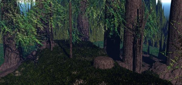
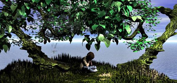
Another solution was to make my own trunk and then pose Bryce leaves with transparent trunks overhead as though drooping out of frame. I was pleased with this. [edited to add] First render is of the Calyxa method. 2nd render is of the Freetutorials method.
There were two trunk solutions that I tried and liked. The first one was dead simple.Youtube/freetutorials http://www.youtube.com/watch?v=dgFK798qUOA
Make a very low flattish terrain, erode it. Then make the brush at highest white to make various scattered dots, erode. In Bryce view, these look like columns. Raise them out of the view top and apply trunk materials. I used Hemlock leaves from Bryce tree to create illusion of lower branches. Could leave small "stumps" with lower grey dots in the terrain editor. Could make double rows of tall dots to make a lane.
The other tutorial, http://calyxa.best.vwh.net/pearl/miracle.html was simple but requires a steadier hand to draw out a trunk and arching limbs on a lattice in the terrain editor. Following Calyxa's setting in the object attributes, a very nice trunk was maded. I again applied Bryce leaves with transparent trunk. This was as arched a tree as I made it.
The grass was from part of a tutorial by David Brinnen. It's basically noise on a low flattened terrain. The terrain was duplicated. The trunk-less Bryce leaves were moved and sized to give a front and back illution. One radial light added to cast stronger shadows.
Ok, this was exported as a bmp. I watched most of Horo's excellent tutorial on exporting but only understood the gist of it, that the more data exported, the better the image. I usually use png at 48 but the render was 22 minutes so I didnt want to wait again, since this is not really a fine work, only a test of lattice trees and noise grass sculpting. Boy is Genesis using child scale imported as obj.



Comments
This next render took about an hour due to using many Bryce trees for leaf clusters and fog. The sky choice "Dragon Sky" increased the time dramatically. I used the Moongate pose I posted in the Bryce "Show Us..." thread.
The tree trunk and limbs were drawn in the lattice editor. It's not so easy to control the mouse which is a spare Apple mouse I'm using on a pc laptop, so painting the trunks is a little slapdash at best. I broke 2 mice already in past year.
I add the bumps as broken off branch stubs or maybe shelf fungi, but maybe I got carried away. The one on the left is as drawn and the righthand one is the mirror. Because they are lattices, not a lot of Y rotation is available before the ugly truth of the lattice shows.
I used Chohole's suggestion of smaller trees attached to the trunk to make more convincing clusters of leaves. I believe this made the render longer because I made the trunks transparent, so those with the fog added to the time. I used David Brinnen's "sand and grass" material on the plane, low terrains, the pathway and the rocks, and a low noise for the grass. Looked bare so I added two cube walls with a franontheedge material just to close it up. Again, a study and not so much "art", but I think it turned out well enough.
@Ice: Those first two are very nice. I especially like the image of the child(?) sitting under the two trees. I don't know it you did it on purpose, but the right hand limb doesn't seem to be attached to the trunk. The second image seems a bit too dark, including the shadows. The third one, wow, really nice job. One thing you might look at are the tree trunks. The texture appears to be of stone and not bark. To me, the left fore tree seems to have the same texture as the rocks in front of it. Otherwise, really nice.
@GussNemo
Thank you for your observattions. When I've worked a while on something, I tend to presume the object is better than it really is after staring at it for so long.
1. The "loose" tree limb is really jutting from the main limb, but it's not about the relative reality but how it reads, so yes, it's kinda hanging out there over the boy.
2. The forest with the trunks did render very dark. I did not put extra lights because I was hoping it was "filtered" light. Hope as usual is not a very good artistic tool for convincing viewers, but it springs eternal, LOL!
3.. You are right, that left tree trunk does appear rock like, although it's texture is the same as the right in "elm" and not "grass and sand". I did want it to appear mossy, but the lattice is skwed on the Y axix looking more slab-like than trunk like and that's doesn't help the illusion of a trunk.
All good stuff to learn from!
I like the work you've done. Trunks made of terrains can be quite effective. A very long time ago I experimented with this as well (http://www.bryce5.com/details.php?image_id=623)
Not very good as artwork, but the ivy on the trunk us also just a material. Nowadays, I would use IvyGenerator to add such an effect. I've never thought of making the trunk of a Bryce tree transparent. That's a very good idea.
Following this thread with interest.
I can offer some guidance for the Dragon Sky. If you want to radically improve the render time in regular rendering mode. Turn off soft shadows in the sky lab. (image right arrow)
Also this sky was made before we had access to the extended lighting capabilities of Bryce 7. So I would recommend turning the shadow intensity up to 100 and putting in additional light.
Or...
Alternatively still turn intensity up to 100 but leave the shadow softness where it is, switch to premium effects, use soft shadow and TA rendering along with TA scatter correction and set the Max Ray Depth down to 4. Preview with 4 RPP and turn it up for your finished rendering.