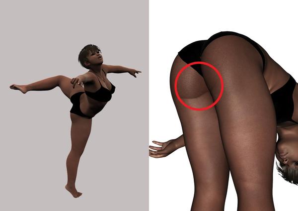
Chablis skin problem
 Akhbour
Posts: 0
While doing a couple of dance-related renders I noticed this strange marks and colour changes on the lower back thighs of the otherwise beautiful skin.
Any idea what it is and how to change/avoid it?


ChablisProb.jpg
1448 x 1024 - 78K


Comments
Looks pretty normal to me. Will depend on how you render things but marks and color variations back there are normal for women of color.
EDIT: to make it less noticable you can consider tweaking material settings such as specular and bump, or blend and soften the image in photoshop.
looks normal. love the chablis skin. so versatile.
I for one HATE texture sets that have that. Its like the shadow of the rear crease is textured in the skin. Same goes for underlying shadows on breasts. A texture set should not have these. should be one tone.. defeats the purpose of using directional lighting if the shadows are pre-determined by being baked in.
I hear what you are saying about shadows being baked in definitely. But some folks do have creases baked into their skin in the real world. And colored folks aren't one tone., the tones vary a lot through out the body and certain areas are noticably darker. Even light skin folk do to but it's not as visible usually.
I don't have a computer with daz in front of me to judge if Chabilis skin is shadow or just darker cause it's darker there.
But yeah breast shouldn't have baked in shadows.
Its fine for a normal standing up pose. But as soon as you rotate\bend the thigh it looks un-natural and plain ugly. As soon as you bend the thigh, the skin in that area is no longer together so it stretches and that baked shadow does the same.
Does that still look normal to you?
I know that the human skin has colour variations, but this looks not like one!
Thats a good example. Haven't noticed that myself, that looks like a bad seam to me.
It is not a bad seam. It is the texture set from a photo that has baked in the dark tone of the bottom of the rear. A skin texture should be an even tone. Darkness and shadows of a texture should be determined by the light source in your scene.
could it be a weird shadow?
I did not say it was a bad seam, I said what it looked like. Still looks like a bad stitch job regardless of the reason. No one disputed that shadows should not be determined by your lighting. But thanks for reiterating it.
I still will state that people are not an even tone. Forget the leg example since with the newer example its plain to see the texture has issues. I'm just restating that we are not one tone and saying a texture isn't good because it's not an even tone is off. Of course when pursuing ideal beauty they say having an even tone helps, but that's not how it really works. My fav texture set Marie Elite, but even she is not monotone ;) (and that's what makes her human)
Edited: typo
No, no shadow lamps in the scene.
Here is an example of what I am talking about. And this is the the issue you have on some texture sets. With scene lighting you do not texture sets with those dark tones in. A perfectly evened out set will actually give you more realistic results cause the lighting will generate that dark area for you IE mesh shadows.
Mmmh, it was part of the skinhip map, worked it over in PS. Not perfect but better (never said I was a texture artist), will have to work on it abit more.
And Lars, one reason for me to buy that set was, that it did not look like the perfect Hollywood skin! ^_-
Edit to add:
Thanks Zev for pointing me into the right direction!
wow that's a bum wrap....
sorry couldn't help myself. :)
nicely done
correct no one disputed that point. I guess it's just the word "tone" can be used many ways. You were talking lighting and I was talking skin. With your good example her skin tone is not even throughout and that's what makes it a good texture.
There are a lot of textures that are flat and toonlike even though they are billed as realistic and that drives me nuts. is ok for toons but not good for more realistic approach.
No problem:). That edit looks much better than the original texture.
correct no one disputed that point. I guess it's just the word "tone" can be used many ways. You were talking lighting and I was talking skin. With your good example her skin tone is not even throughout and that's what makes it a good texture.
There are a lot of textures that are flat and toonlike even though they are billed as realistic and that drives me nuts. is ok for toons but not good for more realistic approach.
Cool. There are a lot of texture sets that contain un-even tones but also do not contain the baked in shadows. If I see that crap on a texture set, first thing I do is take it into photoshop and get rid of it:)