Bryce Test Renders
 Apoc
Posts: 407
So I have been following along with david brinnen's brillant tutorials, and after long hours or studying and renders. I made a few scenes that have excellent lighting ( in my opinion only ) and I would love to get as many more opinions as possible
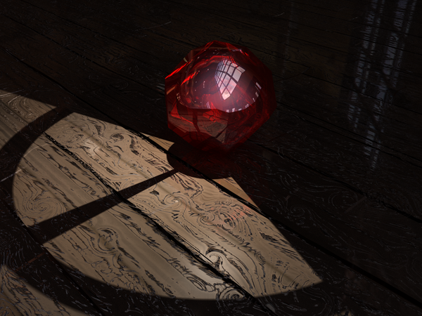

PerfectRuby_(TAlighting).png
1200 x 900 - 2M
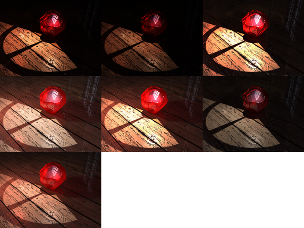

A_ruby_with_a_million_faces.png
1200 x 900 - 2M
Post edited by Apoc on


Comments
Great stuff!
Constructively: I think the middle one on the second row down is the best lit though.
It shows the transfer of colour from the gem to the environment excellently. The only thing I'd change is the amount of reflectivity and specular response from the wooden flooring as it's texture makes it look old, but it's brightness and shine doesn't follow that through.
You'll maybe get more opinions if you post your stuff down in the Bryce forum as well, we don't get out of there much. :)
lol thanks for the feedback XD, ironcally I didnt think of that. know where I can find a moderator to hopefully get this moved?
Don't worry about getting it moved, just re-post it down there, no one will mind. :)
I can move it if you like. Is one of the things I do when I am not walloping forum members with my trusty club.
See, there you go, all safely moved, and it didn't hurt a bit, did it.
Thank you alot chohole :)
I like the first one in the second row best because the table is not so bright but the backdrop still visible. Quite evenly lit but still very good contrast.