Volumetric effects and Carrara (8.5)
 thoromyr
Posts: 452
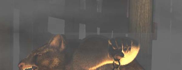
Although I really like using dynamic hair and volumetric fog, apparently I haven't tried to mix the two before, and the result isn't good. For some reason, having both results in a sharp dividing line (with Carrara's volumetric fog) or a rolled edge (Inagoni's volumetric fog).
With the Carrara built-in fog I was disappointed, but it isn't the first time (sharp dividing lines matching bounding box edges of the volumetric fog itself -- such as the opposite "corner" edge, even when using cylindrical), but when Inagoni's volumetric did (almost) the same thing I wondered. Taking the fur away removes the artifact so that would appear to be a clincher for the culprit...
In the included image you can see the sharp dividing line over the figure. It is particularly visible from the ear to the hand. You may also notice the vertical dividing line that meets the one I just described. That was caused by a simple plane I was using for masking -- that had "visible" unchecked. Deleting the masks and re-rending only eliminated the vertical artifact (at least, I didn't see it in subsequent renders).
Does anyone know anything more about this? I'm curious why it happens, and why with dynamic hair.


Comments
Carrara's dynamic hair and volumetrics have never gotten along.
What ManStan said. Additionally, it doesn't play well with the light cone either.
That being said, if you place your figure in front of the fog or cloud it will work fine. This is an instance where rendering a background layer with fog, a middle layer with your haired character and a foreground layer with fog and compositing could solve the issue.
Thanks for the replies. And I should've thought of the work around. Thanks, EvilProducer! I was going to try and accomplish it in post work, but a different way. This sounds more direct and simpler :)
I still would like to know "why", just coz I'm the curious sort...
Thanks for the replies. And I should've thought of the work around. Thanks, EvilProducer! I was going to try and accomplish it in post work, but a different way. This sounds more direct and simpler :)
I still would like to know "why", just coz I'm the curious sort...
I don't know the ins and outs, but I suspect because the hair, volumetrics and light cone are all render time effects. Maybe Carrara doesn't know how to layer or merge them? Just a thought. I know in the past it's been reported as a bug, but I don't know if it's been acted on in any way.
I should add that hair and volumetric clouds aren't the only things that don't play well together. If you some billboards with alphas within a volumetric cloud it doesn't look right. I used the smoke particle (which uses billboards set to always point at the camera) emitter (which uses billboards set to always point at the camera) attached to a plane, and had it zoom through a volumetric cloud. It wasn't pretty!
Right.
Conforming hair - Alpha Maps.
Many plant leaf models - Alpha maps.
Pretty much anything with an alpha map gets frosty-weird effects when placed within fog, vol clouds, fire, etc.,
Many a time, I've removed all plants from a scenery product and replaced them with Carrara leaf models, due to their lack of an alpha map.
And then Rosie has to always stay in front of the volumetrics, with her alpha-intense hair. My Glen Hair uses alpha, but subtle enough to not be a bother in this department.
On another note, entirely...
I really like that fur, Thoromyr. I'd love to see that shot a little more. Very cool
Thanks! I was just looking for this thread because I figured I'd show what I managed. In the end I did two renders, one with fur/no volumetrics and one without fur/with volumetrics. I used volumetrics pass to get the fog and composited it in post. Well, here it is!
Sorry I didn't respond earlier.
That looks pretty nice.
Thanks. I didn't notice until after uploading it that there appears to be some artifacting in the fog. Not horrible, but noticeable to me. Strange thing is I'm comparing to the original and I'm not seeing the problem. It almost seems like Daz's upload mechanism is re-encoding the jpg and thus reducing quality.
Thanks. I didn't notice until after uploading it that there appears to be some artifacting in the fog. Not horrible, but noticeable to me. Strange thing is I'm comparing to the original and I'm not seeing the problem. It almost seems like Daz's upload mechanism is re-encoding the jpg and thus reducing quality.
Wouldn't surprise me. Have you considered .png? I know when I do a screen capture to show something, my Mac defaults to .png and they upload just fine.
Wouldn't surprise me. Have you considered .png? I know when I do a screen capture to show something, my Mac defaults to .png and they upload just fine.
My final renders are always png, but for distribution I use jpg due to the much smaller size. Something to keep in mind though.
Thanks! I was just looking for this thread because I figured I'd show what I managed. In the end I did two renders, one with fur/no volumetrics and one without fur/with volumetrics. I used volumetrics pass to get the fog and composited it in post. Well, here it is!
Wow!
That would really make an excellent D&D module cover! Love the lighting effect on him. The scale of the floor stones, as well as their texture and contrast - it captures that dungeon crawl feel. Gygax would have loved to see this, I bet.
That would really make an excellent D&D module cover! Love the lighting effect on him. The scale of the floor stones, as well as their texture and contrast - it captures that dungeon crawl feel. Gygax would have loved to see this, I bet.
Thanks for the compliment!
That would really make an excellent D&D module cover! Love the lighting effect on him. The scale of the floor stones, as well as their texture and contrast - it captures that dungeon crawl feel. Gygax would have loved to see this, I bet.
Didn't Gygax croak?
Yeah... Sad times...
He sure left a legacy behind. Wizards of the Coast decided to reintroduce the old Dungeon' & Dragons book so they're once again available. Not sure how far they've gone - or will go... been years since I've been in those circles.