My 2D characters in 3D.
 MimicMolly
Posts: 2,209
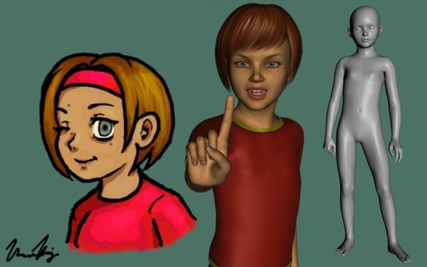
I got into DAZ because I wanted to more or less recreate my drawn characters' shape, pose them and just to practice drawing from different angles. However, I'm trying to go for a slightly more realistic look in 3D.
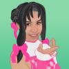
The first one (because I'm lazy and didn't make others, just her ATM) is my character Olga María Freudenberg. She's a medium-built almost 9 year-old girl with a light brown bob.
I mainly used a combination of YT Julie, Basic Child and Evolution morphs to get her shape. The skin texture I have that almost fits her is Azumi for Aiko 5. If you guys have suggestions in how to improve her, let me know.
She's also supposed to have a pet half-moon conure but Most Digital Creations' free prop parrot is a close-enough substitute. :P
--
Here's other characters I've done:
Carly, Krshoth'Ailon, Martín, Biana & Kristen, Mona & Niqui


Comments
Very nice work. One suggestion you mght want to consider to make her look even more like your original character is to use some of these morphs too. In particular, the one that makes the eyes rounder. If you haven't done so already, I'd also suggest using the Iris Size morph from the Evolution morphs too to make the irises as large as possible, and maybe lower the eyes and eyebrows a little (though that's not entirely necessary). You might want to make her nose a little smaller too, but that's a minor point. Over all though, very well done in capturing her likeness.
Thank you Tramp Graphics. :)
With DieTrying's 182 V4 Morphs for Genesis, I went ahead and not only made her eyes more round, I made her eyebrows and head more round. I made her irises and pupils bigger and I made her nose slightly smaller. (It's supposed to be sort of big, because her dad's nose is big and she sort of looks like him.) Finally, I raised her mouth a little bit.
She's wearing EvilEliot's Fate Saber Lily dress because I wanted an excuse to use it. http://freelancecomics.blogspot.com/2011/04/descargas-downloads.html
Now I need to go back and remake another character named Carly, since I made her before Aiko 5 and A5 fits her shape better.
I was busy, but I remade my character Carlota AKA Carly. The base was A5. She's supposed to be Hispanic and I'm thinking about making her head a bit rounder later on. She's supposed to be pear-shaped, petite on top and big on the bottom.
I couldn't decide which skin texture looked good for her, so I guess I'll just use whichever one looks best i a given scene. I also need more accurate hair, but the length of the braids is perfect. Once more, any suggestions or critiques are appreciated.
Looking good on Carlotta, particularly the second image. Once again, though, compared to the drawing, her nose looks a bit too big. The length looks fine, but it's a bit too wide and "bulbous". I'd make the neck a bit more slender too. Over all, she's coming together. As for Olga, much, much better.
I noticed the hairband you had in the 2D version of Olga, so I was wondering if there were hairband hairs here at the store. There's a few is you're looking to get the 3D look even closer.
http://www.daz3d.com/catalogsearch/result/?q=hairband&x=0&y=0
@ FirstBastion That Sammi Hair looks the closest, I added it to my wishlist. Thanks.
@ Tramp I went ahead and adjusted Carlota some more. I wasn't happy with what she looked like after I made her. Now, when I saw her again, I'm happy with how she looks and those edits I made just made her better. Thank you.
Now, I have to figure out who I'll make next...
This is Krshoth'Ailon, or "Kevin" (I should've called him "Cristian" sounds closer. Too late to change. :/ ) He's some sort of space-elf that's like a mix of octopus and frog, I guess this is a better reference , which shows his two tails more accurately.
He's a tall, somewhat muscular man with Caucasoid facial features and light palish-bluish skin. His eyes are an ocean-blue with distinct horizontal pupils. His hair is long, shaggy strawberry blond/orange-pink and it has two floppy things that look like dog ears but can look like bunny ears when they stand up. His tails were supposed to be long and thin with bulbous tips.
I think I need to make his neck a bit thinner. I wish there were tails for genesis that I could at least be able to use two at once. I tried with the ones I had with no success. Like before, any suggestions for items or the shaping are appreciated. :)
I reduced the M5 Superhero and M4 shape to make him seem less muscular. I also reduced the linea alba depth to make it less subtle. I'm probably going to make the musculature on his legs more pronounced, since he's sort of built like a dancer.
I'm not that good at drawing men, as opposed to women which is one of the reasons I got into using DS, though I've been improving in the past 2 years. In my mind, he's supposed to be more medium and toned even though there was a point where he was emaciated. :/
I have a few characters who're built like The Freak and I can't draw them without any sort of reference and even then those references don't come to close what I would like. For, now and for the purpose of this thread, I'm only adding small to medium built males. :(
I'm not that good at drawing men, as opposed to women which is one of the reasons I got into using DS, though I've been improving in the past 2 years. In my mind, he's supposed to be more medium and toned even though there was a point where he was emaciated. :/
I have a few characters who're built like The Freak and I can't draw them without any sort of reference and even then those references don't come to close what I would like. For, now and for the purpose of this thread, I'm only adding small to medium built males. :(If you want him more toned, add some Body Tone, or Fitness Details morphs (from Genesis Evolution Morphs) to him, and bump up the Linea Alba Depth again. I'd still slim him down more though, especially if he's "built like a dancer". Dancers tend to be strong, but also slender so as to be lithe and graceful of movement. Think Orlando Bloom, for instance. That's the kind of build I'm talking about.
I tried making him leaner, but I made his shoulders a bit wider.
That looks much better. much more like your drawing.
Okay, this is Martín. (o3o)
He's a Hispanic male, I'm not too sure how to describe his physique. He has an overall "fit" body, his arms, legs and chest are toned but his mid-section looks "soft' or not as toned. He's not thick, he's more medium. I'm not happy with his back looks like. If David 5 comes out, I might remake Martín, because he's a smaller male. His hair is sort of long, wavy and black, but wen I draw him I make it dark teal because he's a toon.
I kind of like the Elven Hair by goldtassel it almost fits him perfectly. But I don't know how to make transmaps to get rid of the braids. That default WildMane hair looks good on him too. Sometimes he has a short beard, chinstrap or is clean-shaven. He has a scar in the right side of his face and his nose is crooked to the left, both of which were caused by an accident during childhood.
It's unrelated, but he almost always wears dark colors. Appearance-wise, he's somehow a mix of hunky boy-next-door and stereotypical crime boss. I had two different characters and merged them into one making Martín, just because I can and to change things up. :P
Suggestions are welcomed, like always. :)
That first picture, especially, nailed him. I definitely like the longer hair and stubble. It gives him that roguish look.
My next two characters "share" the same body shape/type because they're sisters, though I might end up having to tweak them to further differentiate them. For reference's sake, these are the Florence sisters - the one with the ponytail is Kristen and the one wearing the flower wreathe is Biana. They're not twins, though they could easily pull it off if they had the same tastes in clothing. The comparison sketch is that of Kristen, because I'm redoing Biana's.
Appearance-wise, the sisters are voluptuous with exaggerated but almost "real" proportions. The genesis morphs I used was mostly 50% V5 and 50% S5, with voluptuous @ 60%, toned/fitness at about 20% and several of DieTrying's shaping morphs. As a result, Autofit does not like them. :P
I'd like to read your suggestions, please. :)
I also have another question about shaving shaping presets, can I just save a face-shape? I tried, but most of the saves just affect the entire body, not just the face. I'm asking because there's another character that's similar to the sisters but her face is totally different and I just want to start from the preset and work from there.
Nice start. One suggestion is to make "Kristen's" eyes and irises larger.
Sorry for the MS Paint colored pics. Anyway, last time it was a like a bait-and-switch (cat for a hare?) scenario, where I posted "two" characters for one shape. Now, I'm going to post two completely characters. :P
The first is Desdémona (Mona), who's practically my Amazonian/She-Freak character. She's mostly a V4/F4 mix, and her head is mostly a V4/G4 mix. Like the Florence sisters I mentioned earlier, her proportions are borderline real/ridiculous. Even though I make her hair purple when I draw her, it would be a dark brown if she was an actual person. The Genesis version sort of looks Angelina Jolie/Lara Croft fusion. -_- I'm not sure if I should make her arms bigger. I know the drawing isn't like that, but I like the look.
The second character is Veronica (Niqui), and she's practically the opposite of Desdémona. She is a small, very thin young woman who looks Asian. Veronica is mostly an A3/S5 mix with thin and emaciated morphs and other face morphs to give her that Asian look. She's also supposed to look sort of young. She is actually slightly younger than Desdémona.
I put both characters side by side. Desdémona is actually supposed to be about the same height as the default Genesis. (I had to use the young teens proportions to get her to be that size, she's 106% without it.) I know her ears seem to stick out too much, but it looks fine with the hair. (I wish that was longer.) I kinda feel bad for Veronica. lol
Once more, any suggestions or critiques are appreciated. :)
'Mona looks good as is, Veronica could use an increase in the size of the eyes, and some filling out of the cheeks to match the drawing a little more. As it is, the eyes look a little small, the face looks a little too long and narrow compared to the drawing. Over all, though, they're coming along great.
I fixed Niqui's head. I had to reduce one of the morphs I used (the A5 Azumi head one, I didn't even realize I had used it! I turn too many dials) and I made the eyes a bit bigger and fixed her pupils.
I need to make one of my characters a D5 based one. I originally wanted it to be Martín but he's too pretty (despite his crooked nose) and I finally made him small like he should be (I guess I might try a friend of his, or another random, more "average" guy). :P
Definitely better from the front. Let's see a 3/4 view.
I tried to make it more 3/4. Too lazy to render two images. Whatever, she looks good as she should. I don't particularly like the default Lana texture, but I wanted to see how much a different skin makes a difference in a character's appearance. Should've gone with the RM Nieves skin.
Definitely better.