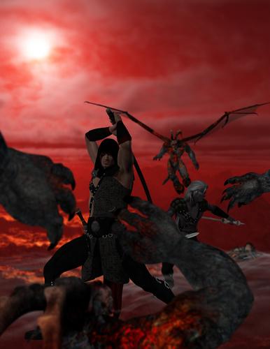
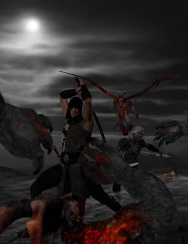
Cover Art WIP
 Brotherlobo
Posts: 495
Greetings all. I've been away from DAZ for the last few months, concentrating on my writing. I dusted off DAZ a couple of weeks ago and updated everything. Then, this past Monday I was to tired to write conherently so I started playing around with cover art ideas for my upcoming fantasy novel: Darkness Falls (Tales of the Wolf - Book 3)
Here's what I've come up with atm. Same image just changed the background. No postwork atm, all DAZ.
I'm open to suggestions and comments.
Thanks in advance


Darkness_Falls_Cover_3_-_red_sky.jpg
1170 x 1514 - 711K


Darkness_Falls_Cover_3.jpg
1170 x 1514 - 623K
Post edited by Brotherlobo on


Comments
In my opinion, the background would be a lot better if it was a mix of the black and the red. Red near the sun and black towards the bottom. Other than that, it's looking good.
I prefer the first background myself.
Okay, I went back in and rebuilt the image. New placements, camera angle, lighting and completely reworked the female character.
I'm happier with this one but it's still not perfect. Suggestons and comments welcome.
I like the concept. Suggestion: lower your focal length, and move the camera closer and lower, so that you're looking slightly up. This will make the main characters big in the image, larger than life. You can also try out different angles from above and below.
Examples:
http://2.bp.blogspot.com/_R-WhB9g9eYk/TNn8CbzS-MI/AAAAAAAAAP8/xVAWu3WMF8o/s1600/frank_frazetta_thedisagreement.jpg
http://www.wallsave.com/wallpapers/1366x768/battle/167841/battle-death-knights-fantasy-art-ravens-167841.jpg
thanks....I'll give that a try :-)
I've removed this cover suggestion post due to Lost Lands: the Game being put on hold for the time being.
Okay...I've been writing a lot and hope to have Darkness Falls ready to go soon.
I've completely reworked my cover art ideas.
Here are my latest 2 -- same basic concept, just slight position modifications.
Any suggestions?
Also, would this cover pique your interest enough to stop and read the description?
The second one looks best to me. I'm not sure what is needed here, but to me, the subject needs to pop a bit more. It seems like the background is a little too bright and the subject too dark. That's just my opinion, mind you... :)
Thanks for the input....your opinion matters. I learned long ago, that everyone sees things a bit differently and has different likes/dislikes. I receive criticism on my writing all the time....sometimes its positive, sometimes negative...but I can promise you this: I may not like it and I may not take it...but I will damn sure LEARN from it.
If you don't mind, take a look at this: http://www.daz3d.com/forums/discussion/17043/
I rendered this in layers so I could light the background and the subject differently. You have to be careful doing this, because the lighting has to fit one another. The objective was, like I said, to make the subject "POP" or stand out from the background while still looking like she belonged there.
With your latest pictures posted in #7, your main character fills the frame better in the second image and the sword hand isn't blocked by the title and the glint on the sword blade makes it stand out more, but the contrast of the background against the sky, where you can clearly see the wolf's outline works better in the first image. I'd keep the camera exactly where it is on the main character in the second image and shift the background arch set, over to the right to get better balance in the overall image and highlight the wolf's silhouette. And I agree the main character need more light to define him against the backdrop. Adding UberEnv2 could help balance out the light.
Thanks for all the suggestions and comments. Just another reason to love the DAZ Community :-)
Here is one that I started yesterday afternoon. I changed the lighting, background and a bit of positioning. Whatever I did took, it 14.5+ hours to render (although I do have an old system). I think it is better but still not completely right. I know I need to tweak the dimensions slightly since unless I transform the image in photoshop, it won't fit on the front cover template.
Still open to suggestions. I think I might try the render in layers trick and cobble it together in Photoshop. I still have several chapters to write, then the manuscript goes off to my proofreaders, so I'm not in a rush. I've set myself a target release date of mid/late June.
Once again, thanks for the suggestions and comments. It helps more than you know.
Here's a couple more cover art ideas.
As always...suggestions and comments are welcome.
Nice images, I think I like the last one best.
However, the wolf doesn't look convincing when it's up close, it looks a bit like it's been stuffed. It looks fine in the background though.
Thanks. At the moment that one is my favorite also.
I agree with you assessment on the wolf model....time for some more tweaking.
Once again...thanks for the input.
Okay...here are the latest tweaks.
As SteveM17 suggested, I moved the wolf to the background, more as a silhouette, which works for the storyline (foreshadowing for the next novel). Actually, I need to add an eagle in the air for the same reason but I don't have one in my runtime atm. Also, I changed the shadow on the moon from red - ie Bloodmoon - to the black of a more traditional eclipse. Thoughts on that would also be appreciated.
BTW - I still need to work on the script shadows and the like, the lettering doesn't jump out like I want but that is whole different project. Right now, I want to keep them the same for comparison reasons.
Okay...after much trial and error, here are my latest versions of the cover.
Advice, suggestions and comments welcome.
On the first picture, with the figure in the background - is it important plot-point? A character in the book? If not, then maybe the second, with the wolf. Maybe make it a bit more grey, unless the point is it is white.
Another point, how about softening the shadows? I tend to use a combination of sunlight (direct light with sharp shadows), and Uber Environment 2 light, with soft self-shadowing in corners, creases etc. The color of the light seems good in the pictures. The camera-work is also very good.
I like the Second the best myself, but I think the single torch on the trail is not needed. Those with the wolf work, that single one breaks the flow with a spot of unneeded color.
Thanks for the suggestions.
Norse - The werewolf is a plot point, as is the wolf. But I agree, the werewolf doesn't work too well in this render. And I will try a grey wolf, I thought I blended too much but then, that might be the point - the white stands out too much. I will try your suggestion about softening the shadows...especially in the background.
Jaderail - thanks for the suggestion, I hadn't realized that about the torch but now that you said it, I agree.
Here is the same cover with a slight tweak (all I could manage with my work schedule this week).
I changed the wolf to grey and rotated him. I tried 'softening' the shadows a bit...but never messed with that setting before, not sure if I've got it figured out quite right. I may have even tweaked his position and made Grimstalker a bit larger.
As always, input and suggestions are welcomed.
NOTE -- Now I'm off for some much needed sleep :-)
Only question, does it fit the story more for the wolf to be howling at the moon or to be watching the Grim one?
Sorry for the delay in response...its been a busy week with the family. Actually, it fits the story better if the wolf is watch 'the Grim one' -- but several friends wanted to see the wolf howling at the moon for comparison.
I realized last night that maybe posting images of the first 2 book covers would help since this is the next book in the series. Both covers were commissioned work by two different artist.
With the two previously published covers in mind, here is my latest idea built around the final confrontation in the story.
Suggestions welcomed.
Here are my latest concepts/layout for the cover for my upcoming fantasy novel. The first one (the one with the two brothers) foreshadows the most about the novel since a major portion of the novel focuses on the relationship between Gray and Galvorn. However I was thinking it looked slightly out of balance, so I added Tamina (a minor character but pivotal for the plot).
Suggestions and comments are welcomed.
I like a mix of both better. I would put the third figure behind the two brothers as they are posed in the first one. I would also match the under lighting on all three faces to get a better balance to the flow, or lower it only on the figure behind the brothers.
Also in the Background image all the main characters are Action posed, that makes the attackers look very static with the poses they have now. They also should have some action type poses to give the impression of action IS going to happen very soon.
just my 2 cents.
Nice idea Jaderail on adding her in the background. I will try that and post a version soon.
Okay, I see what you mean about on the background image.
A) I should have the some of the villains already engaged with the heroes? B) Just shift the villains' poses to more action-like?
Thanks for your 2 cents...I have always found your advice to be worth taking to heart.
EDIT: Watch your Brother placement. Don't cut off the chins with text raise just enough to show full face for both.
I noticed that problem with the text also. Here is a modified version with a bit more 'action' for the villains and Tamina (the female assassin) in the background. I also added an extra spotlight on Galvorn - I'm assuming since he is a dark elf (technically a half-dark elf) the other light just got swallowed up by his ebony skin.
I am still open to suggestions and comments. I can only improve by trial and error. Also, it would help to know if you saw this book cover, would it intrigue you enough to stop and read the blub. Thanks in advance for any and all help.