Improving with learning
We've all been there, when we started to struggle with DAZ Studio or Poser, urging with creativity and struggling to get something that looks good.
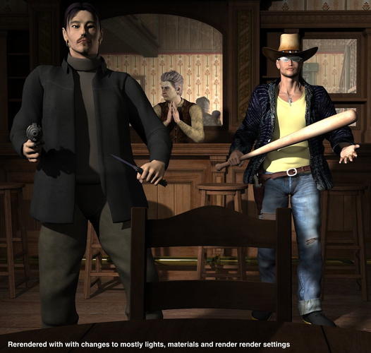
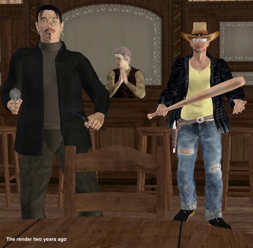
I decided to pick up a render I did over two years ago, when I've had DS for about 4-5 months and was still struggling with getting scenes to look good, but I was rendering away because I was working with an adventure and needed to pictures. My outdoor pictures looked good, but all my indoor ones looked like this. I had the same problems with both Poser and DS except that all my Poser renders looked like this, flat and ugly.
I loaded the old file (created in DS 3 32 bit and started to fix all the mistakes I've done on over two years ago, here is a list of things I changed and fixed.
(a) Lights: The lights where all wrong, they lit the wrong things and they lacked shadows.
(b) Materials: Some items didn't have DS materials applied, other items were old Poser items and needed lower specularity.
(c) The Mirror: Was not reflecting at all, did a total change of the material using HumanSurfaceShader-Chrome and then tweaked it).
(d) Render settings, too high shading rate (changed from 1 to 0.1) and to low maximum trace depth (changed from 1 to 8), to get the reflections to really work with the window in the back of the room.
The render time was probably longer now but the result really shows a difference.
Hope you learn from the mistakes I did.


Comments
Very good idea :)
Maybee I also should pick my first scene and re-do it - it compares really good how you improved your skills with DS!
OOh can we all play.
THis is one where I did change my image , but only a few monthst after I had first done it. ANd that was way back in 2004, so I don't think I still have the working file for this one, to try yet again.
Called "After the Darkness"
Great images.
Goes to prove practice to hone you skill and improvements in the software tool, you can result in a better final image.
I haven't done many lately but I have done this a few years back with a few images.
First two sets evolved from advise given by my fellow Dreamlight members
Set one had some serious postwork education for me.
Set two was about lighting and composition
This next set is all me no help (well apart from learning how to make fake caustics)
The first image was my first entry in to Ken Gilliland birds rendering comp 4 years ago http://www.empken.com/SongbirdReMix/Contest/2010.htm then sometime later I redid it to be one of my all time favs.
wow you guys improved a lot... but I think it would help if you mentioned the time frame, like what year was the first pic done compared to the newer version.
on average about 6 to 9 months between the two.
About 5 months between mine, but I did get a new monitor in the interim period, which made me realise how bad the first one was
An thread that will inspire everyone new to CG to learn, learn and learn. Great idea.
Posted this one not so long ago, but I'll repost it since this is an appropriate thread for it. I actually won a competition with the first (original) image (thanks Ippotamus) and while I was very proud of the image at the time, four months on I decided I could go one better and remade it. I have Merlin Studios to thank for the awesome props used in the remake.
I actually modeled the fence in the original in 3D Studio Max, but I got lazy towards the end and didn't UV map it. The wood grain is procedurally generated so doesn't quite look right. At the time I wasn't doing much postwork on the images either. Obviously I needed to splice together two renders for the final output, but as far as filters went I rarely used them. Not so with the remake, so I get to be proud all over again.
I still consider myself a beginner when it comes to postwork, but the more I learn the better my work will become.
Subtle...but such a difference.
Everyone of them
Thanks for posting as sometimes it feels an uphill battle
Yeah a great idea Totte, we did this on the last forums but not often enough.
I love seeing the differences in all your images and yes megabixel is right, subtle but changes the images completely to another level.
But also have you noticed with Totte's and chohol's examples the differences come from the lighting and tweeks of the surfaces in Tottes case where as with mine and HeraldOfFire there are a number of compositional tweeks, for me resizing the frame, light and shadow and camera postioning and with HeraldOfFire it is the contrast in colours and the fence, not up and down but now across ways which I think works so much better and flows.
...OK only about a week or so apart, but played around a bit more with UE and making mesh lights. What a difference.
The firs is the original version of this scene. The second is what I stayed up until 01:15 to finish. The setting is lit by only the four lanterns that were turned into mesh lights, all at 92 samples. A linear point light with a falloff of 600 was used to illuminate Kelly as when I used a disk area light, it left a "harder" edge on the floor. Experimented with moving the Headlight Blocker but then her shadow would disappear.
I think she looks more dangerous in the second one.
Waited until today to upload as my connectivity from home isn't the greatest especially with multiple image attachments.
I like the update. More Dangerous for sure.
...wait until I get the blades in her hands. ;-)
When I saw the effect of the first lantern I set up, I was very excited. After I got all four working I thought the set looked better than in the original promos. The original light set that came with "Escape" pretty much faked the same effect employing something like 20 individual spot and distant lights. I used a total of four mesh, two specular, and one linear point light. so much more efficient and accurate.
Now I need to reconstruct my Bots at the Bar scene from 4 years ago. That was a lighting nightmare.
Szark's tutorial made this so much easier to understand.
Very cool renders, everyone!
Here's an example of mine...
Original from April 2012 (DS4.0 render, postwork in GIMP)
Updated version from January 2013 (DS4.5 render, no postwork)
Postworked version of the same render from today (postwork in GIMP, Fotosketcher, and Fotor)
This project was an attempt at the Pre-Raphaelite/John William Waterhouse style, with a bit of N.C. Wyeth mixed in.
I'm enjoying this thread...keep them coming! It might inspire me to dust off the other remake I'd been working on a few months back... :)
A really great thread...thank you.
Please keep it going
Hope to be brave enough to show you one of my examples soon.
Still mastering lighting and that seems to be the key if compostition,characters are in place
...OK the next stage. changed the pose and added her weapons. Adjusted the shading rate to .2 and changed the surface reflection type of the clothing to from Environment map to raytraced.
Render took about 52 minutes (I expected it would take longer because of the shading rate).
The hair and woodwork look much better though the specular lights still don't accent the sheen of the clothing as they do in openGL mode. Does the specularity of the clothing surface and the light need to be the same colour? Most specular lights I have seen are usually a light blue which is what I set mine at.
What is the Strength of the Spec on the clothing? And do they use a Spec Map?
...had to reopen the scene.
...oh bugger, specular, was turned off.
OK, For the Shirt, Skirt and Pants
Specular 1: Strength = 100% Glossiness = 100 Sharpness = 0% with light grey colour setting (all 202)Sharpness is 0%
Specular 2: Strength 43.3% Roughness 10% Shaprness 0% with a light blue colour setting (214, 249, 249)
Multiply specular though opacity is "on"
These are the defaults from the Silkessence shaders used.
Specular lights are at 60% intensity.
Composition aside (it rocks) I love the THEME of HeraldOfFire. (Just want to say to the character, "You GO, Girl!")
Love the softness of the ghost and no lantern coming from the head, love the marbles idea- oh my gosh I laughed so hard! but the second render is SO much better... and the birds looked stunning to me either way- like I could scoop up the water with my hands! I do think the overall tone of Kyoto's is so much better- agreed. Love these, keep them coming!
...OK, I think I see why Marieah had the specular active channels turned off. Rendering now and it looks like she's in a polished vinyl supersuit instead of woven silk. I still thought there should be some type of sheen though.
Hope you don't mind me adding.
Lighting is still getting the better of me and only using ray tracing,but slowly getting there.
The shadows are way too dark close up,and hoping I sort out Uber soon.
Don't know why it's still a struggle for me...hmmm
...for ray traced shadows, they look fine, They are not totally black and detail shows in them You may wish to soften the edges a bit by adjusting the shadow softness (usually 5% does the trick)
How may and what kind of lights are you using?
I notice you are trying to get the lights on the vehicle to appear that they are glowing by using either point or spotlights This can be done much more simply by adjusting the Ambient colour and strength in the surfaces tab for the lights themselves. I don't have this vehicle so I'm not sure what material zones will appear in the tab.
Select the vehicle and then open the surfaces tab. In the editor tab it should show the vehicle's name. Click on that and then expand the selection. If the lights are all individual material zones then you can simply adjust the ambient level and colour for each one. Usually the default ambient colour will be black. This can be adjusted to match the Diffuse colour, provided that is not white 255, 255, 255. If it is white because of a texture map then you need to select a colour that is as close as possible. I would start at 50% on the strength slider and then do a spot render of just that light to check it. Adjust the strength level as needed and thee do so for the other lights.
If you wish to have the vehicle lights casting light, that is a bit trickier. This can be done three ways: carefully positioning and adjusting spot/point lights (which looks like what you are trying to do), through postwork, or creating mesh lights like I did for the pic I posted above. For using point and spot lights there's a little trick you can use. After you get the first light set up the way you want it (say for the right large red tail light) when you create the matching one(s) select Copy Selected Item . This will create the new light in the same place as the first one and you simply can move it to the left tail light using only the X transition slider. It will already be at the proper X & Y placement so no further adjustment will be necessary. This can be repeated for each set of lights.
Postwork might be easier as programmes like Photoshop and Gimp (the latter which I use) have their own lighting effects. This can also be used in lieu of adjusting the ambient values, especially if the lights are not a separate material zone. Render the scene then open it in the postwork application of your choice. Once there, experiment until you find an effect you feel works best for the scene as you will have a number of different choices.
Finally there is the mesh light option, however this involves using Uber Area lights (built into 4.5). To use this you would still need to make adjustments to the ambient colour and strength for the lights themselves. This is better suited for lighting a setting using lamps, torches etc that are already props in the scene.
Here is a link to that tutorial again.
http://www.daz3d.com/forums/discussion/14536/
...I'll give that a try tonight, heading off to do the weekly shopping soon.
Here's the latest however. Adjusted the ambient colour on the two pedestals slightly to get their details to show a bit more without having to throw a light on them.
Never underestimate the usefulness of the ambient channel.
Kyoto Kid that is a great improvement, the lighting works well, nice one.
It's fun to revisit an old scene, so I did it again. The last one I did was more a spur of the moment thing after getting my hands on Merlins Infinite Gardens. I had an old render I'd done with one so I thought I'd redo it. This time I'm going waaay back. This is probably one of the earliest renders I have and it was originally done in Poser.
Now, love it or hate it but Poser doesn't make it all that easy to work with lights, especially fiddly point lights and such. As such, the lighting in the original was awful. On top of not being able to work the lights, I had virtually no skill in doing so anyway. Diffuse IBL sounded like a swear word to me at the time because it would 'blow out' every thing in the scene. So yeah, the fledgling years of my rendering.
The only real reason I was particularly pleased with this one at the time was because of the book. No, it's not my prop, I can't take credit for that, but it is my artwork on the cover and it actually contains a readable story on the inner pages written by a friend. Or a portion of it, at least. Though, I did rename her main characters to Sadie and Sam, the former of which I used to make the cover image.
In the updated image, Victoria 5 takes the place of Vicky 4, and the lighting has been redone from scratch in Daz Studio. I've said it before and I'll say it again, indoor lighting is REALLY tough to get right. My first attempts with area lights were awful, with most of the area blanketed in darkness even with very high intensity. The lampshade was as easy as throwing on UberSurface2 and making it translucent. The lamp has no bulb of its own, so I placed a sphere inside to emit light.
The hardest part of this really, besides lighting, was figuring out which part of the Dream Home I needed to bolt on in order to ensure there was something for the mirror to reflect. Anyhow, enjoy.