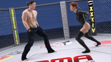
Small Iray Fight Scene - Constructive Feedback Welcomed
in Art Studio
No postwork yet, lit by 3 mesh lights on simple planes (one above the subjects pointing towards their backs, one on the right, and one on the left). Approx 3hr 40 minutes with GPU+CPU to render to 15000 samples and 99% convergence. I find that mesh lights seem to result in better looking skin generally, main drawback being longer render times and more grain in the render, though the latter can be mitigated with some postwork.
Curious if there's a way to avoid that slight warping on the section between Michael 8's torso and shoulders. Encountered that a few times going back to Genesis 2.


01.png
1920 x 1080 - 3M


Comments
Looks pretty good on the whole (on the "I don't know art but I know what I like" scale ).Not sure on the warping - have you tried setting SubD up (if it isn't already?)
One criticsim I might have is with his over all pose - it looks very relaxed, and adde with the dark gloves looks like he has his hands in his pockets - I might be tempted to raise (at least) his right forearm, maybe to a high guard position, leaving the left down for low guard?
Subd is set to 2 for both characters. Good point regarding the hands. I'll probably add some highlights in post to make it stand out a bit more.
One thing to help hint at dynamic action, especially in a static shot like this, is active posing with the use of arms and hands. Fights have limbs in motion moving away from the body. be it grappling, punching, kicking, In both your poses the hands get lost against the body as Simon said, too relaxed. Silhuettes of fights usually have hands up, counterbalancing the weight of the torso, or blocking, which hints at more action.
A really simple way to make this scene more dynamic - rotate it. Then we can either be looking down at the woman with the man towering over her in the foreground, or be looking up at him towering over us with the girl facing towards him. It'll solve the arms getting lost in the body too.
I like fight scenes. I would suggest more space above the heads. People like to look at faces of figures and these are too high up and close to the edge to capture visual interest.