fixing cloud contrast, cloud is too light in one area and too dark in another
 sriesch
Posts: 4,241
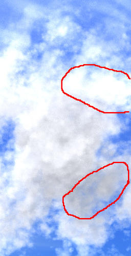
What is the most appropriate way to fix contrast problems in clouds where one part of the cloud is washed out and another part of the cloud is very dark? Nothing I try seems to fix the problem, and most things that get rid of the washed-out part also make another part of the cloud look like smoke.
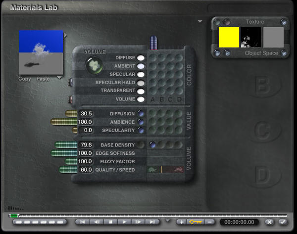
I have attached a screenshot of the settings for this particular cloud screenshot just to illustrate, although it is not the only setting combination I have tried. I've mostly been messing around with the ambient and diffuse and base density settings, but perhaps that is completely the wrong approach to take.
(I don't actually have anything but sky in this scene at the moment though, as I was intending to use it as a backdrop, but I have been avoiding changing the light settings for now, because they were pulled from a scene that was working fine and I'm assuming I don't want to mess with those especially if I want to save my cloud settings for future use in a different scene. )


Comments
I am currently having a difficult time understanding what the problem is. The clouds in the slab have different depths at different areas. In some areas light travels through a lot less stuff than it does in other areas. The denser areas naturally occlude more passing light rays than the thinner areas, so the darker areas are surely thicker clouds. Also when considering the behavior of sunlight, sometimes light from the sun strikes clouds in unusual places.
Some things to consider...
Look at the Skylab settings. As a general rule the Sky ambience needs to be fully white. When this color is fully white it allows materials to glow at full force. When you add colors other than white to that channel what you are doing is lowering the total amount of "ambient" light available for your materials. That being said, if your sky ambience is black then your materials wont glow no matter how high you set the material ambience slider.
Looking at your screen shots I can see that the Ambience slider is at 100 yet there are still areas of the cloud that are somewhat darker. Ambience can be used to bake away that darkness but it comes at a price.
I think you should do the following.
1. Make sure sky ambience is fully white.
2. In the material lab turn off all Diffuse. Increase Ambience to 100.
3. What you should have now is a uniform cloud that doesnt have any highlights or shaded regions. It should be a gray somewhat flat looking cloud.
4. Add in diffuse in small doses until you get a little bit of highlight.
Now, if for some reason thge steps above dont work then try to play with the shading mode. Off hand I cannot remember what the sequence is, but most clouds are set to Basic Shading. Most likely that will fix it for ya.
Best of luck, please report back with your progress.
If you want to email me the scene I'll take a look and find out what the the best approach is.
@Rashad, thanks, that was the information I needed. It looks like there were several problems.
One was indeed the sky ambience setting in the Sky Lab, which was set to grey instead of white. Setting that to white got rid of the dark grey part of the cloud. I didn't even know that was there and having an effect.
The second part was that the washed-out top part of the cloud was actually part of the second cloud in the scene in addition to the top of the first cloud. It was actually in front of the first cloud instead of behind it; that should have been obvious, but I wasn't paying attention because I was too focused on the other cloud's settings. When I then turned diffuse completely off for the first cloud the overlap with the other one became obvious and I realized my confusion. Of course none of the adjustments I made to the first cloud were fixing it, although since you could see through it, changes seemed to be happening, just not as expected.
With the ambience at white, I am now able to adjust both clouds the way I want.
@David, thanks very much for the offer but it looks like Rashad has sent me in the correct direction.
I have started taking screenshots, will post them when I get the final adjustments rendered.
Thank you for the question. I just had the same problem. I had no idea of this connection and struggled with much too dark clouds.
Ok, here is what happened after going into the Sky Lab > "Sun & Moon" tab and setting the Ambient box from grey to white, and also going into the Materials Lab for the cloud and setting Diffusion to 0, and also a screen shot showing the two clouds (cubes) and their relative positions to each other in the scene:
And here are my results after doing the same thing to the 2nd cloud:
I then repositioned the clouds so the thin wispy ones were behind the fluffier one, and messed around with the diffuse, ambient, and quality settings, and arrived at this. It's not done yet, I'm going to make the sky nearer the horizon a bit less blue, and might make other changes once I decide on the final positions of objects in the scene. I haven't bothered with the horizon line itself and below because this is going to be a backdrop for a scene where the foreground is going to be hiding all of that anyway.
@Sean: Nice.
@Sean Riesch - came out fine. Though not all agree with me, I have Ambient in the Sky Lab set to full white by default so that I have full control over it in the Mat Lab. And Skydome is fully black by default.
Thanks everybody!
Here's the sky background edited with a slight gradient to get more haze closer to the horizon, and trimmed to approximately where it will be cut off when used.
@Sean: Looks real nice.