Shantara is Ginormous and Intricate
 Three Wishes
Posts: 471
Wow.
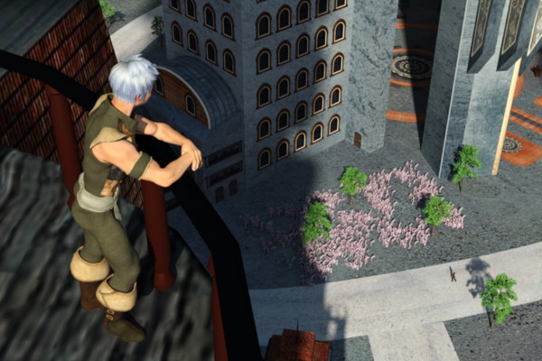
Couple of quick renders just because I wanted to get the sense of scale. Conclusion: MASSIVE.
For the shot from street level, there's a guy looking down from the balcony waaaay up in the ULC of the frame. The other shot is from the balcony observer's POV. Both figures are slightly above Genesis default scale, about 103-104%.
Both shots want some depth of field across that much open space, but if I tried cranking it up noticeably I completely blurred the far characters, so I just shut it off.
If you're thinking about getting the set, the trees in the balcony shot don't come with it. I dusted the ground with some XFrog plants just to break it up a little.
When you consider that this is only one byway in a massive cityscape, this is one heckuva a potent scene for multiple story lines.
But (aren't there always buts?) you can see in the balcony shot, especially along the balcony floor, that some of the textures aren't really designed for close-up. I suspect I'll wind up picking the set apart a tower at a time on an as-needed basis, redoing some of the surfaces with my own set of planar-projected textures, and then baking them to new UV maps. And I just don't know what to think about that ground surface yet.
I could wish for doors that opened, because some of the exterior details imply really interesting apartments and other rooms. It may be fun to break the doors out and try modeling some matching interiors.
The fact that surfaces are so flat is my fault, I toned down most of the bumps globally on my first pass through the set.


Comments
They're from the trees expansion set that goes with the WorldBase XT, which can also be used with the city. Haven't used them much yet, have to do some playing around when I have the time.
Just about to buy this, it looks very nice indeed.
And 70% off now. An amazing deal. I snapped it up straightaway. I don't use textures in my art at all, so that limitation doesn't faze me at all!
The pics look great!
Greetings,
Emphasis mine...
O_o?!
Okay, so...I hesitated for a long time before buying the city, because I _knew_ (from prior experience with this PA) that the textures would not lend themselves to close-ups. I pulled the trigger because I have shaders that I can fix some of that with, and the price is good enough that I can justify buying the model as if it didn't have textures and any that do work I'll consider a happy coincidence.
What I'm desperate to know is... You don't use textures?!?
Wh...wh...what kind of 3D art do you do that has no textures?! (Yes, I'm flabbergasted enough to stutter...) Do you mean you just use shaders (which generate the texture for you), or do you really mean...no textures?
And OMG, that must render fast. :)
-- Morgan
[Edit: Looking at the video on your site, I guess the stark black/white images rely purely on the lighting...? That's trippy. And yeah, that must be fast...]
I took it into Vue - looking pretty good!
I'm still considering this one. It's almost exactly what I was looking for to fit a project I have in mind set n an alien city... Though I wouldn't be able to use the background buildings.
Can the main buildings be used separately and rearranged?
It's four prop groups, so you can use those you want to use I guess.
Yes, actually every individual building can be used seperately and rearranged. The building come in four groups, but you can remove and relocate every individual ones (for some even parts of a building). The texture is bit of disappointing though.
Greetings,
Here's two versions of a shot I wanted from when I saw the set. There's a little nook on the second floor of one of the buildings that I thought would be great to drop a character, and have them be looking out from, or holding hands with another character.
I knew it would be a problem, texture-wise, though.
Here's a quick (and I do mean quick) attempt at resolving it. The smaller is the render done with the original textures, the larger is done with 'Pimp My Prop' and 'Wood shaders', and a lot of Polygon Group Editor work to create surfaces out of the visible polys. I left the poles and the door alone, but everything else in the nook was retextured.
The problem is that instead of using multiple hi-res textures for each element and carefully creating surfaces for each, there are many textures crammed into large uber-textures and huge polys dominate the scene. I still feel it's worth the time to work with it at 70% off, but it could have been so much more.
-- Morgan
p.s. Contrast with this random nook in Stonemason's Urban Sprawl 2 (the lighting is blown out on the character, unfortunately). I don't expect anybody else to be a Stonemason, but the ability to have scenes anywhere in your city look good is what makes Urban Sprawl 2 worth $49.95, and Shantara City not worth full price, which it appears to have gone to now.
I see Shantara as a great "distant city", but not as great for medium or close renders.
The problem is that with highres textures all over it would kill most machines, but at the same time the res is a little too low, which is a shame on such a great city.
But, it will leave a wide open opportunity for texture specialists to create a new high res texture set for it.
That's my take on it too. I'm glad I got it at the lower price, but I would have felt a little burned paying full pop.
Still, the scale and the complexity of the model are admirable, and I really do like the look the artist was going for; the quirky mix of primitive, retro, and alien.
I'm not familiar with the tools you're using, but the results look promising. I have the set loaded into Modo, and I'm wandering around inside the wireframes trying to decide what I want to do with it all. The only real stumper I see (well, apart from my probable poor taste in whatever I try) is that a lot of the buildings don't have their windows cut out as separate polygons from the casements and surrounding wall areas. My first thought was to redo almost everything as procedurals, but that's kind of a deal-breaker, since windows contribute so much to the sense of the city.
Also, the fact that the DAZ renderer treats all surfaces as double-sided is hurting my head. Mostly, I want that behavior and I understand why it's there. But right now, I really, REALLY want it turned off so that walls and windows are invisible to a camera parked inside one of these structures. IF anybody knows how to get a material to turn single-sided on a polygon inside DAZ, I'd appreciate the tip. I've looked all through the Surfaces tab and haven't spotted it yet.
I've isolated the "Village A" tower into a separate scene to try a few things on, spare time permitting this next week.
And please don't get me started on Stonemason. The dude is just ridiculously awesome.
EDIT: I know I could cut the windows out in my own copy. But I had the faint and rapidly-dwindling hope of coming up with something that other owners of Shantara could use.
Hm. A custom camera might be able to do it. It occurs to me that it could be useful working the other way, as well, for inside shots from the outside....
Greetings,
In the end, I had to give up. I found I was doing too much work to retexture and there were polys that did double-duty so I couldn't retexture those without screwing something else up, and modeled-in details were just completely lacking. In the end it's just work the artist should have done, and I started getting angry while trying to fix it, which is never a good sign. I just filed a ticket and used DIM to uninstall it.
If all you need is distant renders, it's pretty.
-- Morgan
My renders are usually close up. I would love a city like this but nor detailed enough for me close in.