To Gamma or Not To Gamma, this is the question
 Rareth
Posts: 1,462
Rareth
Posts: 1,462
Ok here we have two Images of the Same Scene, everything is exactly the same except in the render settings one has Gamma correction ON with a Gamma of 2.2 and one has the default setting (Gamma Correction OFF and Gamma of 1)
Top Pic is Gamma ON, Bottom Pic is Gamma OFF
Which do YOU think looks like it has better lighting?

prettyinpink2a-nogamma.jpg
1024 x 768 - 271K
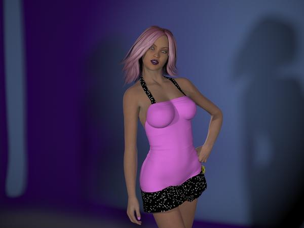
prettyinpink2a.jpg
1024 x 768 - 291K
Post edited by Rareth on
Daz 3D is part of 
Connect
DAZ Productions, Inc.
7533 S Center View Ct #4664
West Jordan, UT 84084
Licensing Agreement | Terms of Service | Privacy Policy | EULA
© 2025 Daz Productions Inc. All Rights Reserved.
Comments
Depends on what you are aiming for - but the first has more tonal smoothness, the second is much more contrasty with sharper transitions.
well I've been reading a lot about light and gamma, and I've been following the Cararra discussion on the Gamma Correction setting.
So I figured an experiment was in order to see how it would effect a DAZ Studio Render with 3Delight (I have luxus and it defaults to gamma 2.2)
this scene was just lit with 3 DAZ studio spotlights, no UberEnvironment, no area light planes. I was really intrigued when I saw how different they came out.
my biggest surprise was how different the background is between the two renders.
google gamma 2.2 render and see all the results
as I said on C forum I found 3dsMax has gamma correction of 2.2 as it's default setting.
I see Facegen has too and iClone so there must be something in it!
oh I agree, which is why I started playing with it in Studio.
As far as I understood the Daz Studio setting, just setting "Gamma Correction" to "On" already makes DAZ Studio 'guess' what Gamma to use per texture, so bump maps get a 'guessed' Gamma of 1.0 while e.g. diffuse texture maps get 2.2, which is usually how these maps are designed to work. The "Gamma" slider appears to adjust the overall brightness/exposure or so? Not sure if someone from DAZ can chime in and explain how it is correct.
hmm news to me, now I need to do a test with the gamma slider at 1.0 and gamma correction on
Yes, the Gamma Correction switch is adjusting the maps for their presumed gamma (or you can find them in the Surfaces pane, click to bring up the browse/Layered Image editor/texture list menu and pick Edit Image to set the gamma to use - 0 means guess) while the Gamma slider is for setting the output image's gamma value. Usually if the latter is non-zero you want the former on.
That is good to know, adding to my word doc I've been compiling all day based on render experiments.
I am liking the results with Gamma correction ON and the slider at 2.2. especially after adding a smidgen of specular2 to bring out some of the detail.
Would a ShaderMixer snippet to adjust gamma at the material/surface level be useful?
I like the top one.
Seeing both makes me want to put one of top of the other with a 50% opacity. But I think I pick the top one.
I'm leaning towards the top one myself (Gamma Correction on)
and with some minor tweaks to shadow softness and specular settings..
That's pretty cool, I'll have to experiment with the gamma too and see what happens. :)
Your last render is better. Without Gamma correction, the renders are darker, espescially shadows
My opinion is that using Gamma Correction really depends on what you're willing to achieve, but if you're aiming at more realistic renders, it should be ON
Probably - as far as I can tell the gamma setting applies through out the application, though if set to 0 I think DS guesses by contest. But in Shader Mixer there isn't the same context, so with some networks it may be necessary to set a value for the image and then correct it manually where another value would be needed.
This was dug up (praise the Lord for the Wayback Machine!) from a lost newsgroup article from '94 called Color Space FAQ, by one David Bourgin.
It doesn't sound too difficult to model (says the guy who tried turning displacement maps into normal maps...)
could be my screen but to me the top one looks flat and boring while the bottom one is more vibrant. The third is getting there but still lacks the character of the second. But like I said it could just be my poorly callibrated screen.
btw art isn't about faithfully reproducing reality; it's about enhancing certain aspects to evoke emotion...
Just a thought.
Hmm...I partially agree...first one is more realistic, but the second is more aesthetically pleasing, I'd say. But #3 I definitely like more than either of the others.