Books for those empty virtual bookshelves - and stacks too
 3dcheapskate
Posts: 2,719
*** Thu 19 Sep 2024: "Vintage01 texture map for the 64-book mapping" now uploaded. See this post on page 3 ***
*** Thu 19 Sep 2024: "Multi-figure bookstacks for Poser" now uploaded. See this post on page 2 of this thread ***
Sat 10 Aug 2019: DS4 native version of the 64 book row/stack thingy... See this post on page 2 of this thread
Mon 14 Jan 2019: "More Of The Cheapskates Books" now uploaded. See this post on page 2 of this thread.
Mon 7 Jan 2019: TEST prop (PP2) of a single 86 face closed book with a few morphs uploaded to this post
Sun 30 Dec 2018: 41 more dubious pulp fiction titles and 41 dubious classics now available as textures for the original 41-book prop
Mon 29 Oct 2018: 3DCheapskate's Six-Bookrows Prop is now uploaded at ShareCG. Also see this post on page 2 of this thread.
Mon 10 Sep 2018: New texture for the first bookrow prop (25 Aug) now with 41 different books - in this post
Sun 9 Sep 2018: illkirch has uploaded a couple of 'Rows of books' props to ShareCG here http://www.sharecg.com/v/92122/browse/11/Poser/Rows-of-books
Wed 5 Sep 2018: mCasual's script is done ! See this post
Mon 27 Aug 2018: With luck mCasual will be posting a script for creating random blocks of books and a morphing book prop as mentioned in this post below.
Mon 27 Aug 2018: Two morph targets to make the bookrow a more realistic stack of books uploaded to this post below.You need to download the two TXT files attached to that post, rename them as OBJ files, and then in Poser/DS apply them to your prop as a morph target.
Sat 25 Aug 2018 : The first book row prop is available - see the third post on this thread for details. (N.B. If you do a texture set for this prop you're very welcome to post details, pictures and links to this thread. I'll then add the links up here too)
Still to do:
- A 'Lean' morph - it would be nice to have some gaps in the bookrow with adjacent books leaning over
- Rotation morphs - if the bookrow is used as abook stack it looks odd with the bottom side allperfectly aligned) Done
- Single prop with 6 rows of books, for filling a complete set of shelves in one go Done 29 Oct 2018
- Individual book props (in progress)
- Geometry-swapping multi-bookrow figure to easily change one row of books for, say, a stack of atlases.
Note: There's a lot more details regarding the development of this project in this thread over on the Smith Micro Poser forum (until that forum disappearsof course), as it started as a Poser project.
(Original post starts here)
I'm currently playing with a rather simple freebie for populating bookshelves. Six vertices, two faces ! (That's the very,very simplest variant- there are others with more polys, but my goal here is low poly)
It's not quite ready yet, but I've done a first 2048x2048 texture JPG for testing. Yes, the books are duplicated - I said it's a test!
Since I tend to lose stuff that's on my PC I'm posting the JPG here for starters.
I'll post again as and when I make progress.
(Yes, you can use this JPG however you like)
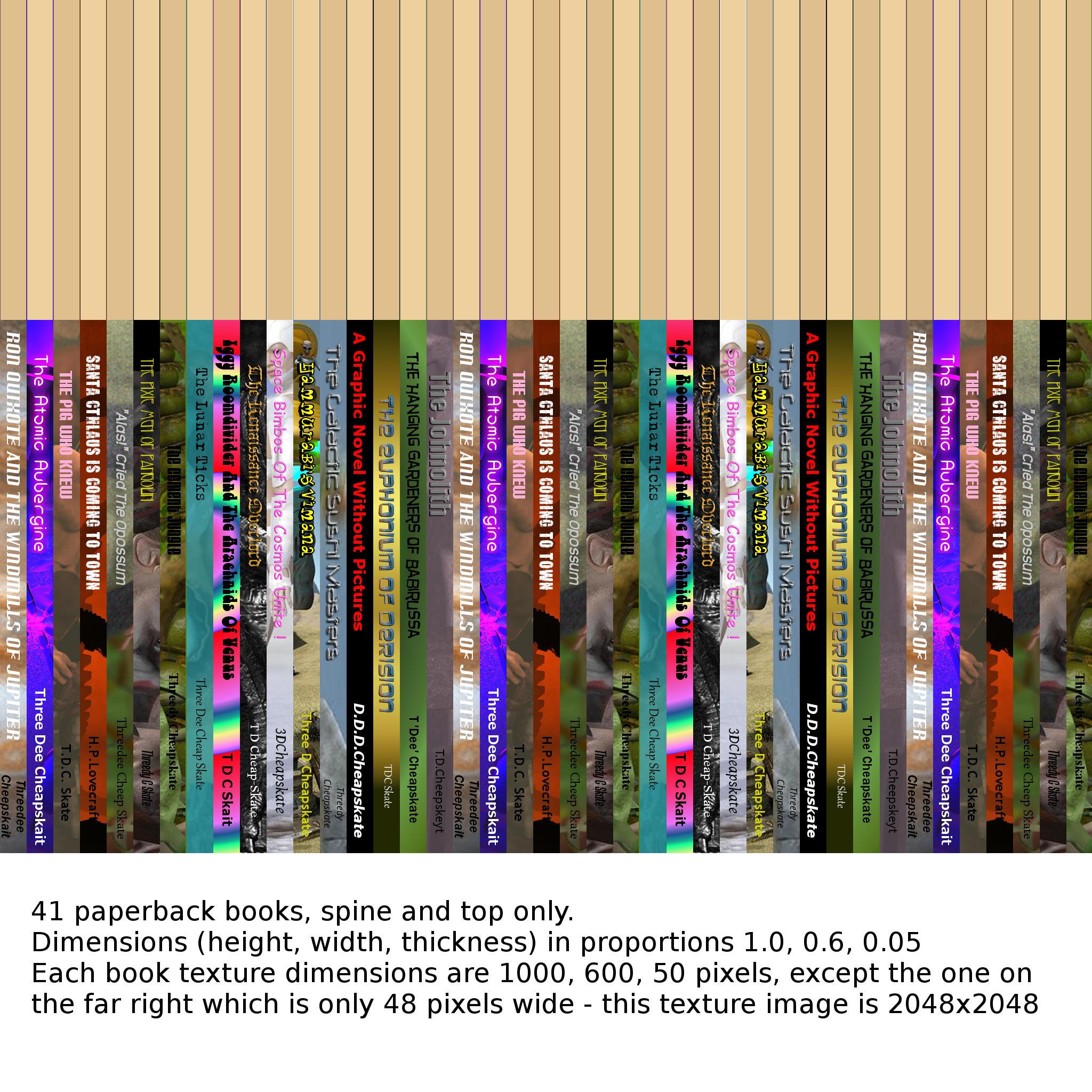
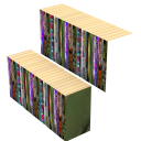
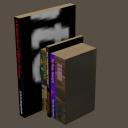
Edit: Added a couple of renders of this texture applied to a 6 vertex/2 face and an 8 vertex/6 face prop
Edit2: With a few vertices and faces for each book (6v/2f for just spine and top, 8v/4f for spine+top+covers, up to 8v/6f for all six sides) there's a lot more flexibility.41 books of different sizes using about 287 vertices/123faces. Still using just the attached JPG for texture. You can probably tell that the covers aresimply UV-mapped to a small section of the spine.The intention was to grab a similar colour swatch - but of course there's sometimes text too.
Edit3: A couple of simple morphs for each book ('bigger','thicker', and 'lean') would add to the fun. 'Bigger' only affects that book. 'Thicker' and 'Lean' require all books to the right to be moved too. 'Lean' won't combine nicely with the other two.Also with 41 books in the prop, theorganisation of the morphs on the UI needs a bit of thought. Maybe a 'Gap' morph would be better than a 'Lean'? A single book prop,leaning, could then be put in the gap.
I'm expecting to do normal/bump (and maybe displacement, for micropolygon-displacement renderers 3Delight and Firefly) maps when I get around to doing hardbacks. Maybe need them for well-readpaperbacks too?




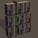


Comments
I should have mentioned what my aim is (or perhaps in 'asset-speak' - I should have 'stated my mission goal'... ).
).
"I just want a quick and easy way to populate all my empty virtual bookshelves with a visually interesting library"
Doing individual morphs for each book (as mentioned in edits to theOP) would be heading off in totally the wrong direction. I'm not interested in fine-tuning the size of any book.I just want a random-looking collection of different sized books. So a couple of morphs for predefined randomish booksizes should fit the bill there. I also like the idea of being able to add a small gap between books. Adjusting the thickness of books and adding gaps between them allows the bookrow's length (or width depending on your preferred terminology) to be adjusted in an interesting manner.
Here's where I'm up to so far:
I think that looks quite visually interesting and flexible- not bad for a 328 vertex / 246 face row of books with a single 2048x2048 JPG texture.
(note: the morph dials in the screenshot are Poser ones because I'm initially doing this as a Poser prop)
I had been worried about the titles on the spines being stretched too much when I made a book thicker. But I was forgetting that these books are mainly to provide background clutter and visual interest. Being able to read the titles isn't important.
I'm now looking at putting six rows of books in the prop, with morphs to cope with different shelf separations, and with poses to fit the prop to the shelves in various things I own ("err sorry, what was that? Oh... 'assets'. Okay,if you must.)
And I'm beginning to get bored with this already*. Maybe I should release what I've got so far ?
Edit: maybe another morph, 'A4 Size', could be useful ? Everybody knows A4 size** - its, errr... [quick Google]... 21cm × 29.7cm (note to self: 1 PNU = 103.2" or 262.128021cm). The base mesh at the moment is roughly standardish paperback size - 17½cm × 10½cm × 1cm (it's a thin paperback), but I'm wondering whether some arbitrary base size and a 'Standardish Paperback Size' morph would be better. You see the sort of quagmire of insignificant irrelevances (irrelevancies?) I get entrenched in ? And entrenching in a quagmire is really no joke !
*I think maybe I'm a manic-apathetic...
**except people who don't
I managed to package and upload the thing before the apathy set in...
A Few Books By The Cheapskate... on ShareCG
It's a Poser prop*, and here's a DS4.9 render of it what I just done:
Here's the blurble I put on the ShareCG page:
"A first test of a simple prop for populating all those empty virtual bookshelves.
It's in Poser 6 Poser Prop format.There's a PMD version, plus a normal version so DAZ Studio users can use it too.
There's a single 2048x2048 JPG texture containing 41 classic titles in paperback - you really should read them !
The prop loads with the bottom left corner of the leftmost book at the origin.
All 41 books are standardish-sized thin paperbacks (17.5cm x 10cm x 1cm)
There's a morph to separate the books, and another to make them A4 magazine-ish size (29.7cm x 21cm x 1cm).
And because having all books the same size is so boring there are two morphs for making them more random-ish.
All morphs play happily together, and negative values work to some extent although some books turn inside out, and that's not a pretty sight!
More details in the "Books To Populate All Those Empty Virtual Bookshelves"thread on the DAZ Freebie forum
Hopefully I packaged everything up that's needed. It'seems a long time since I last did one of these.."
*Newer DAZ Studio users may not be familiar with using Poser props. Provided you've got your library paths set up and you're displaying them correctly,then it's as easy as using a DS-native prop (if anybody needs help with that just let me know)
Edit: If you're disappointed that there are, in fact, only 17 different titles amongst the 41 books then you've only got your own apathy to blame! I did request more titles over on the "Pointless Prizeless Challenge 12: Render The Story Title" thread...
Thank You for this I was thinking along the similar lines but never got around to it
Thank you, very useful. :)
Looks great!
Hope you all find them useful !
I'm still working on further versions of this, including one with six rows of books and poses/morphs to fit them to all the bookshelves that I have in my content library. Also playing with a figure version that will use the old-school Poser geometry switching to swap rows of paperbacks for stacked atlases, sundry knick-knacks, etc. Although I'm probably going to be side-tracked till the end of the month.
In the meantime, for anybody who wants to do their own textures I've added a couple of template/helper images to the ShareCG download page - not the ZIP (you don't need to download that again!),just extra images on the download page.
Errr... since I'm here I may as well post them here too (the default texture map is already in the OP) - apologies for the typos, half-finished sentences, and bad text colour choice on those images! I did them quite quickly... but they should make some sort of sense regardless
I'm playing with the six-rows-in-one prop for filling a whole bookshelf in one go. I've had a little bit of a rethink on the UV mapping, and I now have a single prop containing 364 books (6 rows, each with 64 books). 3072 vertices / 2304 faces in total (i.e 8 vertices / 6 faces per book). And it's all mapped onto a single 2048x2048 JPG.
So far I've added 'Odd Random 1' and 'Even Random 1' morphs (similar to the single book row already released) to give a bit of interest, and a 'Shelf Separation' morph
Here's a couple of renders to show where I'm up to, plus the texture map (I found a nice gobbledigook font on my system, so I just cut and pasted some random text for the titles/authors. Each spine is only 300x32 pixels, so there's a limit to how fancy you can get with the spine designs .But with 364 of them to do I think simple is best)
At the other end of the scale I'm playing with a single 8 vertex/ 6 face book with all six sides properly mapped.
The varying dimensions of books and magazines mean that separate props might be the best way to do single standard paperbacks, thick paperbacks, magazines, etc. Or perhaps morphs plus alternative UVs - but afaik that can't really be done in Poser, although DS is fine I think?
And I see no reason that the book rows can't be used as CDs, videos, etc as well - so further 'CD size', 'VHS Size', etc morphs may be handy (and I should probably retrospectively add those to the already released single book row)
The basic idea for the six rows works - here they are in the bookcase from The Study (here in the DAZ Store) and in seachnasaigh's bookcase (FW2009) freebie from ShareCG. Just the three dials shown in the previous post (plus X,Y,Z, translation) used to put the booksinthe shelves. The small paperbacks look a bit out of place in the study's bookcase - a size morph (like the 'A4 Size' one in the original book row) would probably help. A more classy selection of books would probably also help - so that'd be a new texture.
As I suspected not all bookcases have evenly spaced shelves, so the 'Shelf Separation' morph may need a rethink. (Edit: something as simple as a 'Fine-Tune Shelf # Height' morph for each shelf should do the trick)
Also the book rows don't fill the shelf width,although I could adjust them to do so using the standard 'X Scale' dial. I realized that the 'Random' morphs in the original book row prop change the overall width of the book row, but in this new six row version they don't. Not sure which is preferable.
Several things to think about on this (suggestions welcome!) - off to bed now.
I think that it looks quite convincing with the uneven rows & sizes. Good work!
Thanks !
Edit: Just had a quick play to try and do a more 'classic' texture.I've attached a render composite and a small section of the new texture. By chance, the way I've mapped the covers to a tiny section of the spine gives the front covers a 'half-bound' look if I put a small colour stripe across the bottom of the spine like some books have. (The rear cover is unfortunately mapped in reverse, so the coloured patch adjoins the spine which looks odd. I think a quick remap would fix that.)
However, the books still have a distinct paperback look to them, despite the faux leather spine texture. Maybe some tinkering with the shader ? But it's the flatness that really does it. I had a quick play with bump maps but it didn't look good. Displacement (remember I'm used to Poser Firefly and DAZ Studio 3Delight which both have micropolygon displacement, unlike Iray which would need a dense mesh for displacement to work) had some possibilities, but many problems too.Maybe a normal map ? (Edit: I recall that Poser gets normal maps wrong - or was that just procedurally generated normals within the shader? I had a thread on the SM forum where bagginsbill got to the bottom of that - "Oddity With Bump ?" - yep, Poser Firefly screws up normals as late as PP2014, although it's not really noticeable unless the normals deviate significantly from the default normal - here's the post)
By the way - if anybody does a texture set for these you're very welcome to post pictures, links and details to this thread. I can then link your texture set from the OP
So neat! Thank you very VERY much for sharing ^.^
Real books, as opposed to paperback books have a curved spine.
Yep, that's the effect I was trying to get using bump and displacement.
But it's actually the sort of gutter between the spine and the coverboard that seems to be the distinguishing feature of hardbacks. Just looking at the few hardbacks I have to hand, they all have this gutter, but about half of them have completely flat spines. That surprised me as I'd always assumed that hardback spines were always curved. It seems to depend on the method of binding method used, and there are several different ones even in my meagre collection.
Edit2: And don't forget that hardbacks (as opposed to leatherbacks... ?!) often have dust-jackets. So when you open a hardback in real life,as well as the spine behaving in one of several different ways (and the pages too), you also have the behaviour of the dust jacket to consider ! I'm planning on incorporating all of this into some open (possibly figure) books. Honest !
Edit: Just playing with the very simple 8vertex/6face book mappings,and this simple render made me recall that the black covers shouldbe glossy, but the white/beige pages should be matt. I think a simple mask is going to be the easiest solution for that.
Going back to the released book row, I'm thinking about the morphs. Here are the unmorphed, 'Even Random 1', and 'Odd Random 1' bookrows viewed from the front:
When I created these I was just playing with ideas. A few things (which I may or may not have already mentioned) later struck me about these two 'random' morphs:
(Note that the 'Odd' morph only changes the dimensions of the odd numbered (working from left to right) books, but if it changes the thickness then all (odd and even) books to the right move left-right to match. Similarly for the 'Even' morph)
INPUT / FEEDBACK / IDEAS /OBSERVATIONS / SUGGESTIONS are very welcome ! Don't be shy !
free versatile morphing bookshelf props here https://sites.google.com/site/mcasualsdazscripts5/mcjbookcases
Nice !
And I see it's already stocked with books - is there perhaps an mcjBooks too?
( I couldn't see one, but if there is could you link it ? I'm all for giving users alternative options ! )
maybe tomorrow i could post a morphing book prop plus a script that lets you create randomized blocks of books
i probably still have those scripts but they were not made usable for a wide public
i made the book textures a bit too low-poly so the titles are hard to read ( 2nd and 3rd image ) but this was when Youtube Videos were 320x240
Excellent ! It's always good to see how other people approach the same thing
I've just been playing with a simple mesh for a hardback, based on examining the spine construction of the hardbacks lying around here. Here's what I've come up with:
Edit: Of course the pages willneed to bend, and probably the spine too since some hardbooks do have curved spines. I've already made the height of the spine and coverboards slightly greater than that of the pages, and I've added a raised bit for that two-tone stitching at the spine end of the page tops. A nice dust-jacket would be fun too !
Once I've got the basic mesh sorted I can start playing with morphs (e.g. slightly open, open 90 degrees, open flat, etc) which would be of the 'should only be set to 1.0 (100%)' type. It'll probably need to become a figure too.
I'm looking forward to trying to make the spine behave in an asymmetric manner when the book's opened, like it does in real books...
Over on the SM forum somehody posted a render where the bookrow was used as a stack of books. It looked odd with the bottom edges of all the books perfectly aligned, so I created a couple of simple morph targets to jiggle the books about a bit. Since they're rotations it's best to stick to morph values between 0.0 and 1.0 (0% and 100%) - if you use negative values or values greater than 1.0 (100%) the rotating books will start to grow and go out of shape. But this can sometimes create interesting* effects,so I wouldn't enforce the limits.
I'm not adding/changing anything at ShareCG yet because there are several other things I want to incorporate in the next official version. So for now you can grab the MT files fromthis post and apply them for yourselves.
I've attached the morph target OBJ files to this post,after renaming them as TXT files
Here's the two new morphs both applied at 1.0 (100%),with the bookrow prop Z rotated 90 degrees to make it a stack:
*Interesting effects - look at the morphs on that ! (Note: Vicky is there purely to give a sense of the size of the books)
Because the books are so much bigger than default (due to the A4Size,OddsRandom1, and EvensRandom1 morphs being set rather high), it's necessary to use much larger values for these two new morphs to compensate. Try it for yourselves. It's fun.
A Third Morph Target To Play With...
Edit: Maybe some mini-stacks of books scattered around ? Third MT file attached: 'IndividualBooksInRow3-SCATTER_TEST.txt' - save it as an OBJ and apply in the same way...
maybe tomorrow
i still have to add some book placement randomizing to my script
and book cover thickness adjustments
you give a shelf width
a minimum and a maximum for the width/height/depts
and bing the script generates those books
for nowthe 20+ books are 1 object but i'll also give the option of having standalone books
I've added a dust-jacket to the basic hardback mesh from a few posts earlier (it's now up to 274 vertices/ 254 faces) and had a little play to see if I can morph the mesh into an open hardbook that actually looks like a real open book (I'm specifically talking spine-wise there).
I think it's showing promise...
The dust-jacket posssibly needs a few extra vertical edges between the attachment points on the covers and the spine to allow for abit of bending (and of course some dust jackets don't fold over the top and bottom of the book,so the four horizontal faces would be unneccesary, possibly transparent?)
And the extra vertical edges I added to the page-blocks to allow them to bend need a bit more thought. I don't think they're yet quite dense enough near the spine, which is where the main bending occurs. I'm still working with the goal of a minimal mesh so it's not just a simple case of adding in extra subdivision. I will need a few extra edges, but I think it's more a case of adjusting the ones I've got.
And it would be nice to have one of those thin ribbon bookmarks that classy hardbooks sometimes have sewn. But I haven't got any of those at hand, and I can't recal exactly where or how they're usually attached (and Google images aren't helping me with that) - could somebody who has such a book take a photo of the attachment and post it here ?
That looks really good @3dcheapskate
Thank you. I'm still having fun with this book stuff. The most difficult thing is deciding when to do a second upload.I don't want to do it too soon, because there are lots of ideas flying around. But I don't want to leave it too long because I'm what could probably be called a manic-apathetic...
At the other end of the scale (i.e. the six-rows-of-books prop) I've been shown how to make it so that any individual book can be pulled out from the shelves (as I said before I'm using Poser to do the groundwork, so please forgive the Poser-specifc stuff on the picture - the main discussion of this bit is over on the SM" Freebie: A Few Books By The Cheapskate..."thread)...
Just been rethinking the UV mapping. The attached image won't probably mean much to anybody as it's mainly for myself. The top row (with the three-tone-greys) is a couple of book-spines with my original mapping (left) and a denser mapping for the six-rows version of the prop. I then picked a few sizes of paperback-spine-ish proportions that would tile both vertically and horizontally on a 2048x2048 image and scaled one of book-spines to those sizes to see how they looked on the UV map. I also wondered about UV-mapping the front and back covers to separate areas (rather than just grabbing a bit of the spine texture), and was very surprised at how good a 40x64 cover looks. Of course I still need to see what such a mapping would look in a render. I'll probably end up just doing a single colour fill for the covers if I go this route.
And here's a render of 4 identical 8v/6f books using the bottom right mapping and the mapping itself at actual size:
I think that's more than acceptable for something that's not really intended to show the front/back covers (remember, this mapping is for books within a bookrow where you're only likely to see the spines and the tops of the books,and maybe a tiny bit of the cover if the adjacent books are smaller)
(Edit: minor correction - the 'pages' bit on the bottom left mapping is 32x64, not 44x64. That's what happens when you copy-paste text instead of typing from scratch!)
took me longer than i thought to make it usable by someone other than me but it's ready !
https://www.daz3d.com/forums/discussion/275731/mcjthelibrarian-generate-low-poly-bookcase-full-of-book-props
Glad you got it sorted !
~ ~ ~ ~ ~ ~ ~ ~ ~ ~ ~ ~ ~ ~ ~
Meanwhile, I've been playing with old-style geometry swapping in Poser to see if I can change shelf contents that way. I can, and the result works in DAZ Studio too (both DS3 and DS4). Still trying to resolve other problems (sorry, 'issues' - I keep forgetting that we now live in a newspeak world where 'stuff' is called 'assets'*... ;o) )
*I know that's an old one, but I still love it - and I'll keep repeating it till I get bored with it !
I ran into some problems trying to avoid duplicating OBJ files for the geometry swapping thingy above...and then the apathy took over.
So I'm trying to re-stoke the fire of enthusiasm by doing a few more book spines, based on the additional titles here, for the already released prop to avoid the current dupli/triplication of 17 books...
Edit: I'm wondering whether "A.Nun" might be a better author for the two in the middle? And I'm also thinking that I should perhaps stick to paperback novels for this one - maybe save titles like "The Big Book Of...", "The Look It Up Book Of..." for a separate collection?
LOL! I love the titles!
The only thing you are missing is "H.P. Lovecraft's 'The Call of Cthulhu' for Beginning Readers"......
Oh, btw....that's an ACTUAL book. It's a scream. https://books.google.com/books/about/H_P_Lovecraft_s_the_Call_of_Cthulhu_for.html?id=Yt5CvgAACAAJ&source=kp_book_description