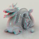
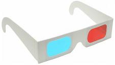
Anaglyphs - red and cyan glasses required to view.
 David Brinnen
Posts: 3,136
Still researching the anaglyph filters. A targeting system has now been added that allows the user to align the lens components by shifting an invisible (in the render) sphere - so giving more intuitive control over the setting up process. The render with the Stanford dragon was arranged that way.


08-01_C_3D_setup_LR_in_camera_dots_24_v3.jpg
750 x 750 - 644K


Image1.jpg
394 x 223 - 43K


Comments
Very nicely done. Effect is great and easy on the eyes.
Thanks Horo. Well, that render took about three hours - using True Ambience... Here's another, this uses one of your HDRI. The render time is more reasonable.
Note that you can get some decent red/cyan glasses at Amazon:
http://www.amazon.com/3D-Glasses-Movies-Gaming-Require/dp/B002TXYEV2/
Or use sweet wrappers... as I have done in the past.
Great examples, both of them. Easy on the eyes, great 3D-effect.
Thanks Horo, here's another... Think the pinkness of the floor indicates that I needed a greater raydepth than 8. But otherwise it seems to work OK.
An experiment then. Here the set-up has been modified to give a greater sense of depth (I reckon - and I admit it is a bit of a dubious reckoning) by making the monitor seemingly a window on a much larger scene... Maybe... So just see what you think.
Of course it is unnatural and exagerated. It's the view as a super giant would see it, with eyes meters/yards apart. Or it is a small model world. So much for naturalism.
But then, what's the sense of making 3D-looking pictures if most of it appears as 2D anyway? This is what 3D photographers talk about. With the distance between the eyes of an adult human, 3D stops at around 15 to 20 m (or yards). Then, the clues for 3 dimensionality come from haze which brightens the shadows, perspective and such. Natural looking 3D landscapes are limited to a foreground of some objects with the grandiose mountain background appearing like a flat picture.
There is nothing wrong with exaggerated "3D-ishness". There is no obligation to make every render look as perceived by the human eye or a camera. But beware, if you cheat with your scene setup, an anaglyph will show it. I like this example very much. The landscape is built up correctly, it looks spectacular and the 3D effect is profound.
The 3D specs that are included with "Future Sounds Of Jazz Vol. 9" CD match David's anaglyphs quite well, just in case anyone has that in their collection. I've packed it away now so can't report on the images in this thread, but the other ones looked great (allowing for the fact that this 3D lark does my head in generally - less is more for my tired eyes).
I experimented with 3D photography about [censored] years ago, holding little hand held slide (transparency) viewers to each eye that showed two images separated by about four inches. With foreground objects in the scene, the effect was both dramatic and realistic. The high res of 35mm film originals sat immediately before the eye helped too. Somewhere in a box are a few nice stereo images of the Omani desert.
.
Excellent 3d effects...
One i created for my Alien project
This is a very nice and effective anaglyph, @tlantis, and easy on the eyes. Looks a bit like a telescope under a dome.
Peter - yes, we used to have slides in small viewers that could hold one slide and had a simple optic to magnify it a bit; each slide in one viewer on each eye. Adjustments to bring the two pictures together was made by changing the position of the viewers.
I've been also experimenting a bit with the Anaglyph Lens System (ALS).
Excellent depth in this hall
Thank you, @tlantis. Here's Lake Mishio and Lake Massima as anaglyph.
And Stonepit - though the foreground irritates.
Another scene from my Alien project
( Right click image , and select view image for full size)
Nice examples, @tlantis. Great models.
Nice work @tlantis, Horo - the landscape had me wondering if you'd used a photograph. Very good indeed.
Here's an experiment with ALS_depth_plus.
I use DAZ models here, http://www.daz3d.com/shop/pausanias-cruiser/ and http://www.daz3d.com/shop/n1-interceptor/ both of which I note are currently on offer.
I made the image mostly monochrome to improve the effect since many of the details on the model were either red or blue, this did interfere somewhat.
Aw - cool. Beautiful effect. Colour: only red gets in the way; all other colours work (sort of).
Thank you for your comment on Lake Mishio and Lake Massima anaglyph. The clouds make the difference, and they are from you (apart from some minor tweaking).
Great pictures, all. I would like to here more about this targeting system mentioned in the first post.....
OK, we are still working on this, but here's an example.
From the overhead view.
1. Is the lens/filter system that combines the two images.
2. Is a target sphere that rides a path. This can be slid back and forth. Where this is put, is where the viewing surface will be (for example) your monitor.
3. Those blue specks is the Stanford dragon model.
4. That red blob is Vicky seen from above.
The lens system's parent is the camera, to it goes where ever the camera goes. By changing the relationship of the elements within the system, by them being set to track the target sphere, this determines if the objects appear in front of - or behind - the viewing surface. The aim is, of course, to make the experience as simple and intuitive as possible for the user. Once we have completed testing, we will start on tutorials and documentation. It has sort of proved a bit more complicated than expected. But we are getting there.
Yes indeed, we're still working on it. What David shows above is what? the 5th or 6th itteration. Things like that are extremely labour and time intensive. I had worked for a week on an accompagnying PDF, including a JavaScript calculator to go with the ALS. Meanwhile, all of that is redundant because the system has been considerably improved, much much easier to use and almost no distortions even if the camera FOV is at 150°. The brain of this system is David. The ALS (anaglyph lens system) is a byproduct of an entirely different project. So it often happens: you go for something particular and stumble over something completely different that is worth capitalising on. Bryce sports a couple of "impossible" features you will not find because it never crosses your mind such things could be present.
Those who watched the tutorials how to make anaglyphs on the Tutorial DVD know that I have been a great fan of those for a long time. With this ALS we can render an anaglyph directly. You can't imagine how enthusiastic I am for this ingenious setup David came up with.
Another try - Abkehr (Renunciation), the original is here http://www.bryce5.com/details.php?image_id=2241 and here it is hanging as a picture on a wall in this beautiful room http://www.bryce5.com/details.php?image_id=2564 (thanks Rashad).
Yet another try, colours work quite nicely. Original here http://www.bryce5.com/details.php?image_id=3014 The facade is from Urban Future http://www.daz3d.com/shop/urban-future/ and the toon bots from here http://www.daz3d.com/shop/toon-bot-chomper/
The little robot scene works very well for me. I like that one a lot. Here's a couple more from me. Dredging up some old Bryce 6 files and giving them a quick once over in 7.1 pro.
The Bug spaceship was a free model download from DAZ in 2006 or there abouts. It was in the free repository - maybe it can still be tracked down. I'd like to know who modelled it so we can put links in for their DAZ models if they have any others.
The other image is also robot themed, all made from Bryce primitives. Both scenes use the enhanced depth targeting system.
The one with the Bug is excellent. On the second one, the two bots and the cogwheel create ghosts for me. The cube is fine. Also the object above the door gives me a funny sensation. It appears as if it were not aligned properly vertically. The room gives a very good feeling, size and perception match. Looks natural.
And yes - thank you. The one with Urban Future came out surprisingly well. The mix of stage and hologram style works well. I discovered that I made an anaglyph of this scene before with the classic method of two renders and monochrome assembling. This one is better and the colours work well - and it looks quite good even without the goggles.
Me too. I don't know if it is colour interference or distortion. OK here's another one, you'll like this - not for what it is (although you may) but because I've found a way to effectively scale the lens system. This is good news, because scaling the scene doesn't always work very effectively - due to things like atmospherics and world space mapped materials not scaling along with the geometry. Here the ALS depth plus targeting was scaled up to make the model seem of more manageable dimensions.
Seems my response was too slow. The "me too" relates to the comments you made the post above the post above - so to speak.
awesome 3d!!!!!!!! love it :)
Yes, this one looks very good. Also stage and hologram mixed. Very 3D-ish and easy on the eyes. Scaling the targeted ALS sounds really exciting. By the way, the anaglyph with the black Vicki was done with the targeted depth plus ALS, the one with the robots with the non-targeted one.
David, we got your The droid in a room IBL9 as content with Bryce 6.0. I've took it and rendered it using the non-targeted ALS with the default settings. I get the same irritating feelings for the 2 bots, the cogwheel and the object above the doorway (a bit less to be precise). So it's not the distortion but the colour that does that.