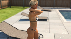
DoF question with an example
Hello, everyone! So, I have some sort of dilemma. 2 pictures attached with different F/stops. First one is default 22, second one is 35. I can't decide which one is better. I like how a girl looks with 22 more than 35. BUT it feels like 22 disconnects her from the scene giving her too much accent(not sure if it's the right word, English is not my first language, sry).
I guess I should describe the scene a bit more because that is the reason I have those mixed feelings. This is not a photo. This is a view from the eyes of another person and it is a part of a situation which is depicted by several renders. So it is...kind of moving, not static, well, at least I want the feel that it's not static. xD And this is the reason I feel like 22 blurrs it too much, dragging her out of the surroundings or, in fact, removing surroundings from the situation that is happening.
I have zero experience in anything that is even remotely connected to exposition, filming, photography, etc. Zero. So I completely understand that I might be talking nonse. But that is what my gut tells me. I suspect it might lie to me and I don't know if I should trust it. And that is what I'm asking from experienced community. :)
Am I bonkers? Should I trust my feels. Or maybe I should lower the blur even more? What would you suggest?


Comments
I like the second one, but that's just my personal preference. I think people overdo it with DOF and it makes their pictures look like a miniature toy set. Like in an old movie, you can tell they used miniature models for the special effects because the DOF just seems ... off.
My preference would be the second as well. I like that front chair being a bit more clear/in view. In the end I think it gives the image more depth. Very nice render Cant wait to see it done.
Photographers generally only use extreme DOF effects when they want to turn the background into something almost abstract. The F-35 image in this case seems to work well. If you had another figure behind her that also needed some detail, an even higher setting would be acceptable too.
A comment overall on the composition. Having your main subject directly in the center of the frame can also feel a bit boring. Try rotating the camera to the right so that she's about the 1/3 of the way from the left edge of the frame (see attached for a new centerline for her). This will have an effect of people seeing where she's looking and will make them feel curious about what is just outside the frame to the right.
Also tilt it up just a bit so there is some space between the top of her head and the top of the frame. Chopping off the top of the head feels a little odd to your viewers.
You have a really good start to the image here. These suggestions are just little tweaks from almost 40 years of practicing photography as a hobby. :)
Thank you all for your replies and suggestions! I understand using fov a little better now. Will definitely stop chopping off heads btw. xD