How to make colors pop in-render (renders are washed out)?
 Lissa_xyz
Posts: 6,116
Lissa_xyz
Posts: 6,116
I'm finding that most of my renders are requiring a tonal adjustment, as the stock renders come out with muted colors, almost like there's a gray haze over the entire thing. Is there anything I can do to get the colors pop without the post?
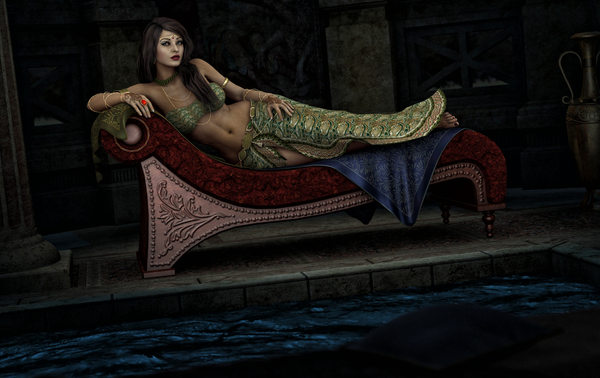
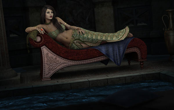
First is the straight render, second is the adjusted version. It's really noticeable on the couch and water.
Copied from Ambient Lights thread:
I have a ‘moonlight’ blue fill (zero radius) on a low intensity, a low-radius white over her, and a low-intensity blue set to just the water surface (that 99% diffuse lock is really handy). There’s also a low-intensity blueish distant to help bring out the flooring a bit.
Daz 3D is part of 
Connect
DAZ Productions, Inc.
7533 S Center View Ct #4664
West Jordan, UT 84084
Licensing Agreement | Terms of Service | Privacy Policy | EULA
© 2025 Daz Productions Inc. All Rights Reserved.
Comments
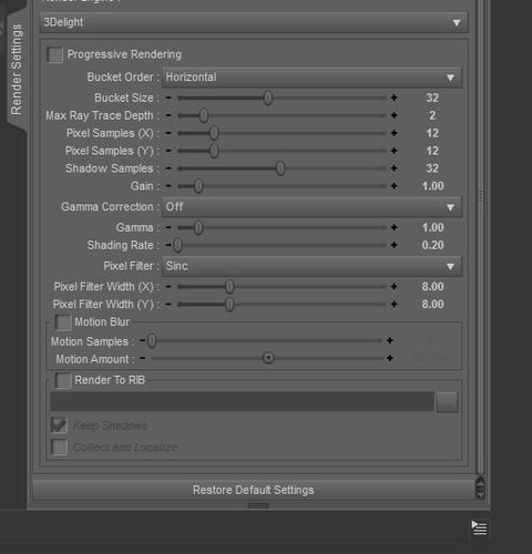
Have you tried playing with the gamma correction?
I've never actually used that setting. I know the ideal gamma monitor wise is 2.2. Do I just set it to on and 2.2 and call it a day?
You are right about that, though as I understand it, it's a bit more complicated in terms of how we use those controls in DS.
I was just checking my understanding, and came across this, which may help:
http://www.daz3d.com/forums/discussion/22310/
Hm. I'm not completely sure that's going to help. It seems the gamma will just brighten things and make the washed out nature of the image look worse.
Have you tried adding a soft spotlight on the areas you would like brightened? One good light can make a ton of difference when placed correctly and adjusted in strength and color.
I thought the same thing when I first tried out that gamma setting in D|S4.5, but it did help a lot with brightening colours and improving contrast. Try it and see, the worst that can happen is you'll have to turn it off again.
A few spots can help. Might try soft pink/ peach near the face and body. at low intensity.
I thought the same thing when I first tried out that gamma setting in D|S4.5, but it did help a lot with brightening colours and improving contrast. Try it and see, the worst that can happen is you'll have to turn it off again.
It seems the gamma may help more than I thought. I went back to the other thread linked above and caught that the on/off switch and the 'intensity' aren't linked. Setting the gamma on, but leaving it at 1.0 definitely removes that washed out look, but is a tad dark depending on the lighting already in the scene, but with the scene I tested it with, using gamma on with ~1.5 or so seemed to have brought it closer to what I would've gotten on that scene had I did the tonal adjustment in Photoshop.
The scene I tested with was just a simple pre-load of Curious Hallway with a single AoA Ambient set as a fill (zero radius). I'll give re-rendering my above scene with the gamma on a shot and see what happens.
The gamma slider controls the output gamma applied to the final render while the On/Off switch controls whether gamma correction is taken away from colour maps. The former lightens the output image, for positive values, while the latter darken the input images so that they won't be lightened once (compared to a notional gamma 1) in creation and again in render, which would wash them out. Though if you have having to apply negative gamma I suspect your scene is over-lit or your monitor is way too bright.
Thanks for the explanation, Richard. I'm not applying negative gamma, though. I'm just in the habit of using the tilde as "approx" (unary operator) where numbers are concerned.
Let me see if I understand this correctly. If gamma's off, DS assumes the textures aren't gamma-calibrated, but with gamma on, DS assumes they are? So it's more of a Yes/No than an On/Off, with the question being 'are the textures gamma-ready?'.
Good info here.
I've almost always had to pull the render into Photoshop and do levels (if Auto Levels changes colors too much). And I don't feel comfortable with Levels so sometimes I do an Auto Contrast instead. The flatness and darkness of the renders always bothers me. Sometimes I'll do a bit of dodge and burn brushing in selected areas, but it's usually not enough and the dodge starts looking washed out itself pretty quickly..
I think it was perhaps the version before the latest that added the gamma checkbox. I assumed (wrongly) that the number corresponded to target gamma. No wonder I've been having trouble lately with flatness in the other direction. :) Light and flat instead of dark and flat. I've tried some lower numbers and they're much better but I still want to test some more. I'm confident the sweet spot will be found
I think it was mentioned above, if the checkbox for gamma is checked and it's set to 1, it is NOT the same as before the checkbox was enabled. Keep this in mind when loading up a scene done in a prior Studio when the checkbox was unavailable. This has happened to me and it's a shocker when you see the render.
I view renders on my Kindle Fire for whatever it's worth. I set the screen brightness at 65% for indoors daylight and everything looks good. But that's relative. The renders look identical to what I see on my PC screen, but seem better. If my monitor is way off then so is my Fire. But I think the Fire is spot on. Everything from no matter the source looks great.
(I drag n drop a render into the Amazon Cloud folder on my desktop. I connect the kindle via wifi to my pc and just tap the Cloud Player and there's the folder with the renders. Easy process.)
Edited to add: a few messages I hadn't seen when writing the above and I played a couple games on my Kindle in between. Sigh. Let me digest.
Yes, I think that's a valid way of reading it.
Yes, I think that's a valid way of reading it.
Thanks for this explanation, Richard. Now it's making much more sense and I can relate what I've been doing to the results I've been getting in a more useful way.
Good to see the gamma controls might help some, and thanks Richard, that explanation clarifies what I've been beginning to understand myself about those controls.
Yes, I think that's a valid way of reading it.
Thank you! I always assumed it was just straight on=correction and off=no correction.
I'm finding that using gamma is kind of a scene-dependent setting. It seems to work fairly well for something that's all architecture based, but if there are skin tones in the mix it's harder to get right (it's either all dark, or all bright- it has a tough time with mid-tones on skin it seems).
As a side note, whoever's doing these dial settings sure has a backwards way of thinking. Surface glossiness is the same way-- bigger number is less gloss. o_O
Ooh, instructive thread! Thank you for sharing, everyone, I'm playing with the setting myself now.
I don't know that Glossiness is that counter intuitive - a glossier surface has smaller (and usually brighter) highlights) while on a less glossy surface they will be more spread out (and usually dimmer). You could think of it as smoothness, perhaps, which might give a clearer mental image.
That's my point, though. With the glossiness slider, at least every time I've used it, the higher the gloss, the lower it's brightness, ie- 20% gloss will be brighter than 60% gloss, which is the opposite of what you said. The dial is backwards.
Now if it were renamed to something like Gloss Spread Angle, it would make sense. 20% gloss = smaller area of effect, brighter, and 60% gloss = larger area of effect, dimmer. With it just being there as 'Glossiness', there are a lot of people who think it works like Specular in that higher percentages will make it brighter.
Vaskania you have that backwards. Specular color along with strength is how 'bright' the specular appears. Glossiness effects the size and sharpness, a low glossiness makes large fuzzy highlights, and high glossiness makes small sharp highlights.
That's my point, though. With the glossiness slider, at least every time I've used it, the higher the gloss, the lower it's brightness, ie- 20% gloss will be brighter than 60% gloss, which is the opposite of what you said. The dial is backwards.
Now if it were renamed to something like Gloss Spread Angle, it would make sense. 20% gloss = smaller area of effect, brighter, and 60% gloss = larger area of effect, dimmer. With it just being there as 'Glossiness', there are a lot of people who think it works like Specular in that higher percentages will make it brighter.
You have to combine Glossiness with specular color to get it to work the way you want, I think. Renaming them would be counter-intuitive because the terms being used now are the actual standard definitions. It'd be like renaming light "that shiny stuff that comes out of light bulbs".