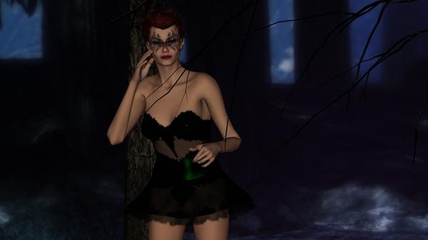
Dark Fae: first try
 Satyrrob65
Posts: 0
I am returning to doing Daz after a while away and many failed attempts. This is the first render I think looks okay. Just a basic render using Genesis, the Faerie woods, Rapture for Genesis and actual eyes. Reshaded the dress and couldn't get the wings not to distort. Constructive criticism welcome. Thanks R


Dark_Fae.jpg
952 x 535 - 196K


Comments
Nice lighting and miles better than my early attempts. I guess my only criticism would be to maybe employ a directional light to one side to help cast some darker shadows on one side of the model.
Sorry if that sounds picky, but like I said its miles better than my early images so you're definitely on the right track
Cheers
Jay
No that's exactly what I was looking for. I used zero lighting in this one I believe. Thank you for the look and answer. R
Phew! Glad I didn't offend there! You're more than welcome. Looking forward to seeing more of your work soon
Yes, more light to accent the figure without changing the mood. I can't make out her wings :). Move one twig so it doesn't look like a dress strap burying itself into her chest maybe.
I'm with Standfast on this. I can't see the wings at all. If you're having problems with them distorting, I'd suggest not fitting them to the figure, but rather, parenting them to her chest node instead. Especially if you're using V4 wings on a Genesis figure because fitting them with Autofit or Transfer Utility will delete the original bone rigging of the wings and, instead conform them to the various parts of the Genesis torso.
I agree in respect of the lighting. Dark scenes are very difficult to carry off generally and many DAZ characters have an ambience to the skin which makes it seem to glow unnaturally in very dark scenes.
And what is dark? If there were no light you wouldn't see anything. The fact that you can see something mean there must be a light somewhere. Even if it is the moon use it to your advantage.
Look at your scene as if you were a photographer placing strobes. You need to position the lights to best demonstrate the subject but without the result looking unnatural. also remember that while DAZ lights can produce shadows they can't produce reflected light so you often need lesser lights point in the opposite direction to your main light to represent reflected light. In a room this becomes more complicated as light may reflect many times.
Oooookay. Added the wings back and ty for that. Couldn't figure out why they were coming out like a 70s acid movie. Added moderate lighting to give it just a touch and moved the camera. I had to look twice because I thought that actually was her strap.