Mcjam's Playground
Hello everybody.....hmm....kinda hard to tell if anyone said hello back.....Darn the Simpsons for giving me unreasonable expectations.
Anyway, I'm kinda new to this after lurking around for a while and have lots to learn....but I learn by doing so I figured, why not do and share what I'm learning so here I am,
Right now my active project is to develop my lighting skills, so with that I'm going to be breaking things down into chunks....to start I'm going to use the same setup as far as figure and background, clothing etc and try different lighting setups from the Daz studio headlamp, three point setup, UE2 setups, AOAs' Advanced Ambient and Spotlight to different light setups that came with models or lightdomes...what have you.
For those who want to play along at home, I'll post my settings as I go, and for anyone who wants to say "Hey Dummy....you'll get better results if you do this...", well my mind is always open...which is probably why so many things have fallen out over the years...
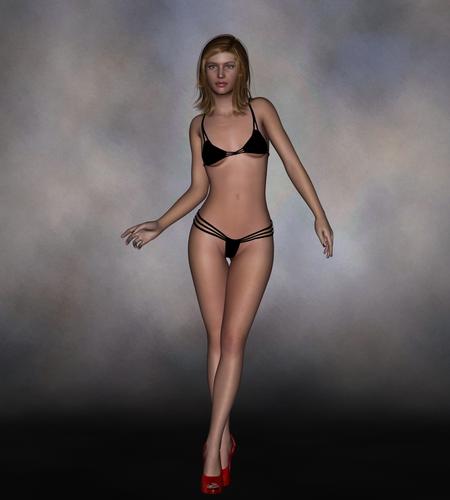
So lets get started.....right now my setup is using a simple background, Basic Genesis Female and some clothes so I don't get banned ;-)
First image is after I applied a pose and rendered (now I'm using the render preferences scripts graciously provided by Adamr001 located here http://www.daz3d.com/forums/discussion/306/ and have set it to Average quality to start...


Comments
So now its on to setting up a three point light setup...first run is using spotlights
Since I've read a lot about aiming for about a 45 degree angle to the camera, that's what I'm starting out with...when I'm adding the new lights I'm clicking on show options and selecting Apply Active Viewport Transforms, since my thinking is I want the angles to apply relative to the camera, so here then are my current settings.
KeyLight:
X Rotate -45
Y Rotate -45
Z Rotate 0
X Translate -732.35
Y Translate 1176.47
Z Translate 733.42
Illumination On
Intensity 100
Spread Angle 60
Shadow Softness 0.00
ShadowType Raytraced
Shadow Bias 1.0
FillLight
X Rotate -45
Y Rotate 45
Z Rotate 0
X Translate 726.3
Y Translate 1176.47
Z Translate 725.99
Illumination On
Intensity 40
Spread Angle 60
Shadow Softness 100
ShadowType Raytraced
Shadow Bias 1.0
Backlight
X Rotate -45
Y Rotate 180
Z Rotate 0
X Translate 5.34
Y Translate 809.11
Z Translate -663.74
Illumination On
Intensity 200
Spread Angle 60
Shadow Softness 100
ShadowType Raytraced
Shadow Bias 1.0
Ok, so what do I like about my first 3-point setup? Well, she's lit :-)
I am getting some rimming around her shoulders and arms which is good, but the shadows are a little blah right now
Now, my understanding is that there are two things that can help with shadows, the shadow settings of the lights and the placement of the lights...so the first thing I'm going to do is to change the shadow bias on all my lights to .2 and see what that looks like...
well...I guess the shadows are of higher quality....well what about changing the softness on my keylight?
I changed the softness to 60 and rendered again
Alright then....looks like I'm moving some lights
bout time you started a thread. Where is your orange?
Im a lighting noob, and all the xyz made my brain hurt. All I can see is you kinda lost her face, the body looks good.
Oh, and "Hi Doctor Nick!"
lol...I have plans for some guest appearances by the orange....;-)
And, yeah....there's a lot of numbers there....but it's helping me at least to see the relationship between distances, angles etc....and speaking of numbers....here's some more from the latest, left the backlight alone as you can see, I'm getting her face back, but not a fan of the shadows around her nose
KeyLight
X Rotate -10.77
Y Rotate -13.03
Z Rotate 0
X Translate -176.86
Y Translate 275.51
Z Translate 788.82
Light Intensity 60
Shadow Softness 60
Shadow Bias 0.2
FillLight
X Rotate -7.79
Y Rotate 31.36
Z Rotate 0
X Translate 320.14
Y Translate 192.58
Z Translate 639.93
Light Intensity 40
Shadow Softness 100
Shadow Bias 0.2
One thing that I see:
The backlight does not affect her head (hair). That looks a bit strange. The backlight is really cool on her shoulders but the top of her head is dark. There should be some light too! In this case (when the backlight is not hitting it) you could try another spotlight as dedicated "hairlight" with a very narrow spread angle, just to give her head some light, so that it matches the backlight.
Thanks for the tip XoechZ, I tried that out with these settings and, yeah...hair is now better
HairLight
Intensity 300
Spread Angle 6.46
X Rotate 153.97
Y Rotate 36.30
Z Rotate -179.84
X Translate 75.05
Y Translate 241.20
Z Translate -101.84
Yes, thats it :-)
Very good in my opinion. Well done.
We demand to see the orange!
Seriously though. Tackling lighting like this is great. I will take any help/tips I can get and watching others work and seeing their processes is very helpful.
Here's hoping that as I play you can get something from it then. Next up on the list is using distant lights...
You have already helped me with my lights. I worked on a render tonight and rendered with all lights off but 1 at a time to see what was going on. I usually don't have the patience for this but decided it was necessary.
Looking forward to more.
I also spent part of Sunday playing with Shader Mixer. I didn't come up with anything fantastic but I was learning. ;-)
Your tutorial was very helpful explaining not only what you did but why.
Took me a little while to figure out backlighting is so much easier when you turn off your other lights...and with the shader mixer tutorial I did, I went with the easier one which wasn't using a lot of bricks...it can get big really fast...but it was only the surface of what you can do....once I fine tune my velvet shader, I'll do another which shows things like layer mixing, using images etc..
But for now, this is using a distant light setup as follows, and because it still works well for this, a spotlight on her hair matching the backlight....
KeyLight
X Translate 42.39
Y Translate 131.96
Z Translate 748.41
X Rotate -12.63
Y Rotate -22.27
Z Rotate 0
Light Intensity 60
Shadow Type Raytrace
Shadow Softness 60
Shadow Bias 0.2
FillLight
X Translate 43.06
Y Translate 113.17
Z Translate 749.04
X Rotate -9.42
Y Rotate 20.28
Z Rotate 0
Light Intensity 40
Shadow Type 100
Shadow Softness 100
Shadow Bias 0.2
BackLight
X Translate 42.61
Y Translate 113.78
Z Translate 747.43
X Rotate -44.95
Y Rotate 170.18
Z Rotate 0
Light Intensity 300
Shadow Type Raytrace
Shadow Softness 100
Shadow Bias 0.2
HairLight
X Translate 60.37
Y Translate 195.70
Z Translate -7.37
X Rotate 167.49
Y Rotate 83.40
Z Rotate -180.00
Light Intensity 200
Spread Angle 16.71
Shadow Type Raytrace
Shadow Softness 100
Shadow Bias 0.2
I found that because of the time spent setting up the 3 point spot light, using distant lights was a lot faster to get a decent result, about the biggest difference is the shadows she casts on the background while using spot lights, pretty much non existent when using the distant lights
And here she is again...this time, I'm using a specular only spot light at about her shoulder level pointed at her, and using UberEnvironment2 at 80%, leaving the other settings at default, the first time I rendered it, she was looking a little flat since I wasn't getting any backlight, I know I could add one, but wanted to see how well UE2 was a lighting a scene, it wasn't bad, but by turning on depth of field on my camera, I got the separation of her and the background, but now it looks like her face has lost a lot of weight...
And here she is, this time using only AOA's Advanced Ambient Light...not too bad out of the box....but not quite there yet.....
So...I added one AOA Advanced Spotlights to the scene, and rendered again.....wow....out of the box this combo is strong....time to tweak some settings.....
Air Detonation? a wee strong :) Surprised the EMP pulse from that blast didn't shut your comp down.
I think maybe the plane of her face in relation to her body is messing with experimenting a bit. rotate it up a few degrees maybe.
You won't have to tweak it with every change you make, I'm guessing.
And a slight interlude....
ROFL You two are killing me. If I was drinking anything when I saw this I would need a new monitor.
Lol he got Agent Orange!! that was gonna be my next haa haa. Great :)
Amazing job man, really good concept!! award for you. Super sexy.
Gorgeous work already!
Juicy and ap-peel-ing *giggles*
Well, I can tell you that just like UberEnvironment....if you don't knock down the intensity when using AOA Advanced Ambient....you get the same kind of washout....that's what was going on in my last lighting experiment image....the AOA lights take a little to get used too....but the potential control is amazing....once I get to the point I can take advantage of it all.
So this image I'm posting is with using the AOA spotlights and the Ambient...again, 3 point setup roughly the same positions and intensities as the others....and aside from some slight differences not too much different....I did tweak the head slightly as suggested by Teofa and if nothing else, the pose feels a little more real to me.
So what did I learn from the previous light setups? Well, for portrait based lighting....nothing really seems to have a dramatic edge over the others....yeah I can spend more time tweaking positions and colours to change the feel, and by no means complete, but for this setup, pick what you're used to and work with it.
Next up cause I was getting kinda bored with the pinup style, is working on an outdoor scene....for this I'm using the Worldbase XT and playing....so this is an out of the box render with some poses applied to my two models....there is some basic lighting provided with the set
And here it is again, this time with lighting provided by twelve distant lights arranged into a light ball, probably one of the longest renders I've done, and still getting some artifacting with the background....and the haze isn't working for me, but still...
And a special render just for tonight
On a technical note though, her fingers are a bit too straight and rigid. You might want to curl them a bit so that her hands and fingers cup her face more.
@Tramp Graphics....thanks for pointing that out...I tweaked her fingers and rotated the camera just a bit, still waiting for the render to finish, now I'm understanding why UberEnvironment became so popular....much quicker than waiting for fourteen or fifteen lights to number crunch
And here it is....finally...sigh