New Character - Catherine
 MGHSFAN2k
Posts: 125
Hello, DAZers!!
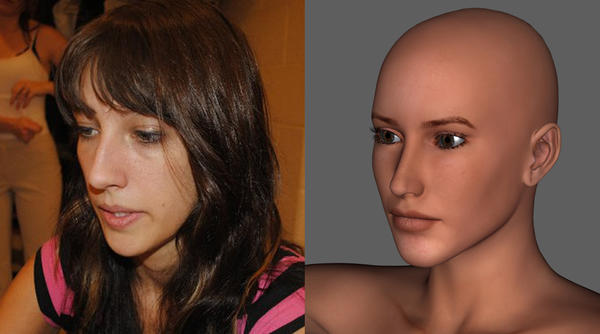
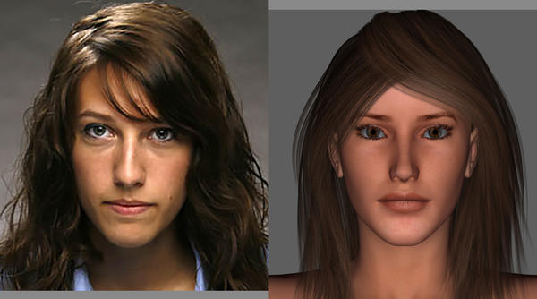
I need some help... this is test run of a character I did years ago based on a person I know but I lost the file and I'm starting to redo the character again, I need help and criticism to help gear it and me in the right direction. And I'm using DAZ Studio to create the character. Here's the previews with the real person I'm basing it off of:
Thanks!

CatTest2.jpg
1500 x 834 - 484K

CatTest1.jpg
1500 x 834 - 496K
Post edited by MGHSFAN2k on


Comments
chin need a little work - coming along nicely
chin need a little work - coming along nicely
Thanks, what do you mean about the chin needing work? just curious
There are three differences between the photo and your 3D model:
the tip of the chin is rounder and a bit larger in the photograph, while on the 3D model, it's more squared off and flat on the bottom
the tip of the nose is a bit rounder and larger in the photograph, while on the 3D model, it's smaller and thinner overall.
her lips are thinner in the photo, while in the 3D model, they're fuller with less room between the bottom of the nose and the central divot of the upper lip.
THANKS FOR YOUR INPUT... I will look into that tonight! :-)
Next Test:
Worked on Eyes, Cheeks, Jaws, Chin (still needs work), Nose, and Lips
Am I in the Right direction or Going back a few steps? And Please give me some tips on what morphs to use to help with this! Thanks
Looking much better. The chin still needs to be a bit wider and rounder. The upper lip also has a little too much "peak" to it on either side of center at its highest points, and needs further thinning The valley between the peaks is now actually too deep. Less "bow" and a bit more thinning to the upper lip is needed.
Certainly coming along. My only thought is the shape of the eyes is different; the lower lids in the photo seem much rounder.
I would also suggest the photo girls mouth turns down very slightly at the edges.
UPDATE:
Looked at notes you guys gave and continued on them:
LATE TURKEY DAY UPDATE:
Worked on eyes, nose, chin, lips, and the "valley" between and added hair! Verdicts, Notes, Comments, Changes, etc?
Much better. I don't think there's much more you can do with the lips; I think the issue lies more in the texture than the morphs. I'd ay your eyes were closer to the photo before your most recent adjustments. The outer corners of the eyes are a smidge too high now. The only real issue the eyes had that I could see was the shape of the lashes, which aren't something you can change. Your second to last picture had them near perfect, your last picture is a bit too much. Either that or her head is tilted down slightly.
Obviously perception of an image is very subjective, I think the eyes look better.
As I'm sure you have, overlay the model on the image and reduce the opacisity of the model to compare. You can do it in Photoshop subsequently or apply the images to planes within the modeling program. It isn't going to be perfect because of lens parallax but may help.
UPDATE:
Did some tweaks and did a expression shot! Comments?
Very Very Close, but the tip of the nose needs a bit of tilt up, very little and the width of the thing under (has some odd medical name) needs thinned. Then your spot on to my eyes.
New Tweaks: Comments?
Well, beyond here will depend on the Morph set/sets your using. But here is what I see.
Tilt the Inner Eyebrows down just some. Arch the Eyebrow more to get the outer lift.
Under the eye add some Puff and definition, the picture has a bit of need more sleep to it.
Still needs a bit more tilt up to the tip of the nose, just enough to JUST see the nostrils.
Which would then let you edit the lower tip of the nose to match the tip better also.
Add the outer edge of the mouth lines as seen in the photo.
Then to me You will have made as good as possible from that photo. Remember, KEEP the Profile matching. It's done to me.
NOTES Taken:
Fixed Brow, under eyes, noes, and minor tweaks elsewhere.
Comments?
Well, no bags under the eyes, and the septum is still not a match. But we are limited by content. I really like it. Well done.
Yeah, I'm kinda limited... I did add some bags and septum but it's how the lighting is makes it not noticable...
Yep. I Figured as Much. Still very recognizable to me. Well done I say yet again.