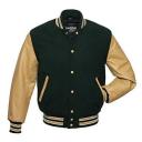
i can somone please help me with md i want to make this collar
 lasagnaman
Posts: 1,001
in New Users
but i dont know where to start i keep trying but i cant do it does anyone no please can somone help me with this
i am using marvelous designer 8 this is the pic


61kRSA5rjWL._UX385_.jpg
385 x 385 - 15K


Comments
Not familiar with MD8 but the collar on this item in the DAZ store is pretty close: https://www.daz3d.com/urban-college-guy-fashion-for-genesis-2-male-s
yeah iam going to make my own jacket but the collar is very tricky to make
Jackets have the appearance of volume, as opposed to something like a T-shirt, so I would say this is for advanced users.
But, if you don't care about volume, I would just create a rectangle, curve the ends, and stitch one side into the jacket collar. If you want a puffy collar, then you'll have to take two rectangles and stitch them up, like a pillow.
Volume is an important word here.
Here is a quick attempt to start to make a model of a collar using Hexagon. First I made a sort of "C" shaped polyline and I used the Sweep Line tool or feature to sort of extrude polygons out sideways or edgewise from the "C". The red arrow suggests the path that I took as I imagined the neck of the jacket in my mind's eye.
Second screenshot shows a different view of the same thing, more or less.
Do you want me to try and close it off at least a bit, and apply smoothing and a knitted (say) fabric shader in DS? Beginners should note that this would be a static model; I won't be incorporating nodes or insertion points for rigging or morphs or any advanced (I assume!) features like that.
The good news is that this tends to get better, every time you try it.
Here, I started off with a fresh outline shape that was more like an ear or some sort of letter "G" - with more points along the line. Notice how I flared out a bit around the base of the neck, as per the sample jacket, and then I took it almost all the way back up to the top, leaving a gap of a single row of square-ish shaped polys along the inner surface of the collar.
Although I am above average at plasticene and things like a potter's wheel, working on a laptop is not easy for me and I actually find this very hard to do, even after I've had time to think about it, and to design or pre-plan some sort of logical approach to the problem.
nah thats ok my friend ty so much for trying
see what it is i only use marvelous designer to make my clothing
but i think i actually figured it out this is what i got when i was done what do you think
actually this one looks alot better i saw the mistakes i made and fixed it
Well, you certainly managed to give it volume so congrats on that... except for the collar I guess... you seem to have lost a lot of volume. And the original collar was round, not a v-neck sort. Even the Genesis jacket in the store, that I mentioned, had a rounder collar.
I'm still working on getting a better collar shape, and then I'm trying to avoid having to do individual segment extrudes by giving the shape a single bend (using the Bend tool in Hexagon). I got some nice knitted examples done earlier but now my shaders (by JenGreenlees) have blown up for some reason... I may have to ask her for pointers on what I might be doing wrong.
The next issue that cropped up here at my end is that the flaring at the base of the collar got inverted: I've now got it on the INSIDE for some reason.
Perhaps jackets are lighter in southern climes, or you don't need one, but up here in the NE they are usually thicker around the collar. I concede that I have been leaning towards a "taller" thicker collar, perhaps even subconsciously. Oh, well. Got to try and figure out why everything is haywire at this end.
The original jacket had prominent knitted cuffs -- rather like my shape, heh -- and the waist fits snugly.
Yeah practice makes for perfect in this game! Maybe some leather or knit/heavy fabric shaders on the sleaves, to cut down on the wet vinyl look, sort of thing?
Also I wanted to concede the point that if it was indeed a girl wearing the first jacket then the fit might be a bit awkward, yeah.
here it is now with school patches added
ahh much better sleeves look more like leather now
I mean, you can tell the difference between clothing made in a modelling program vs MD. A modelling program creates clean edge loops, and the clothing is perfectly symmetrical, while MD doesn't.
so your saying mine didnt come out good its the software i know how to use and i think it came out great i workedveryhard ont this
but i think i know what you mean whatever people are comfortable with
i saw tutorials onyoutube and thats how i got into md
mabe you should take the course i took
its a great software if you know how to use it
I'm commenting about my own experience using MD. MD doesn't give you perfectly symmetrical clothing because of its physics simulation. That's only possible using a modelling program. Yes, it lets you create clothing with zero modelling experience, but I still have issues with it.
thanks for your help roman i appreciate it very much
thats the pic i was going by it looks like the sleeves are the same height
to me
No problemo. Just sayin'. I know the sleeves would eventually sag a bit, esp. if the sleeves are leather, but on the sample there two white stripes visible. Only one on the girl's jacket. No biggie - just sayin'. The collar looks better, that's for sure.
I wonder if the letter "R" should be on more of a flat, sloping plane though. I'm not sure if the "folds" where the letter R is (say) add anything of value to the picture. Again just musing; for me having text of any type undulate on the fabric covering a human torso is a challenge.