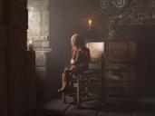
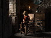
Folks... Need your help for a decision of which image i should use (style)
 Lothar Weber
Posts: 1,611
Please help me to decide... first... or... second?


4F9CE09E-8232-46A8-A535-FDB175F1D625.jpeg
1280 x 960 - 168K


17D0AD7A-4A27-403A-902A-318F6EE6A12E.png
1900 x 1425 - 4M
Post edited by Lothar Weber on


Comments
Second. The first looks too grainy, like an unfinished render.
Thank you. First one is with atmo cam and Dust. Forgot to tell;-). Maybe i could the first one improve?
Well, i'm not sure, but it seems in the first one he wants to add some dust in the room.
maybe a good idea to add some godrays too and make the light a little darker.
That was the plan... but failed... had 10 renders for a total of 15 h in addition... but none came out as i wished. Godrays was the plan. No plan
You are Talking about the Environment Lightning? Will try that... and increase the indoor candle lights... i will Show that tomorrow... After another 2h render ;-)
I like the concept of the first one better but yes it neesd some improvement to be less grainy but with more atmosphere its working better for me
I‘m with you. Fiddling with the projector... don‘t have much experience with atmo...
Btw. It‘s made with daz beta 4.12 ;-] great performance
No, i mean the light from the AtmoCam Pane , it is for my taste too bright.
Oh. Have to look how i can reduce this... search the documentation tomorrow. In germany it‘s now 22:53h. Time to sleep. Thank you all. Will Post new results soon.
I think it must be somewhere in the Surface Tab.
I have also a scene in work with Godrays and a Dust Pane from the AtmoCam. But so far i'm not happy with the result the Dust looks like. Maybe have to find another solution.
BTW, i'm from Germany too. Good nigt.
Using Iray I presume? God rays are a bit of a pain, even when using the products designed to provide them ... I'd prefer the first if it had cleaned up a little more. I might be tempted to take the second (crisper, cleaner) one into a program that allowed me to messwith it to add effects to suggest an oil painting.
The 1st looks more like a photo because it hides details that aren't accurate. The clear one has it's place too so to say you need a 'style' like all your renders will be dusty or all will be clear seems a bit odd.
I like the second. The only reason the second might break for me is it is a little clearer to the eye that something needs to be a bit more settled with the weight of the figure in relation to the chair. The figure needs to be pulled by gravity to the chair more. The haze hides that a little... Drop the figure a smidge and the detailed one would resolve a little better.
I like the first one better. But it is indeed too grainy. Perhaps you can lessen the effect of the atmocam?
Also, godrays can be done in post. Google "godrays on black" , pick an image, and layer it on the finished render using an image editor. Give the godrays layer the blend mode "screen".
I know much of the feedback is about the grainyness of the first one, but I honestly think I like it the best. I think it depends with what you are going to do with it, so maybe if you elaborated on that you would get different feedback.
As a base image to take into PS or something like that, I really think the first one has some distinct character, and if you were to render out at a large res and scale down, I bet you’d see much less of it (and what you do see will help it from feeling sterile).
Im a novice, though, and either way you go that’s a kick-ass render. I really like it!
Thanks everyone for the great opinions and to @rakuda for the tip with the chair - didn't saw that.
And since we have the week of cats i think, i had to add one ;-)
Now i think i'm done - whats your opinion?
The back of the chair might be a little too glossy, but otherwise it's fantastic.
Thank you for the tip, will try that tonight ;-)
looks pretty good now
It looks fantastic! Though, I'd (considerably) decrease the opacity of the smoke from the candle (by the window), because it's glaringly unrealistic in comparison to everything else. Since it's a candle, the smoke shouldn't be that dense or that apparent. It might just be a tendril of smoke or none at all. Otherwise, great job!
That looks really great now! I like the addition of the cat. I also snapped up that cat during the sale. Good deal!
^__^