Sci Fi Funk Ep 9 Preview thread
 Sci Fi Funk
Posts: 1,198
Hi,
It starts with a large city sweep. It will be the most spectacular scene yet. Rivaling episode 8.
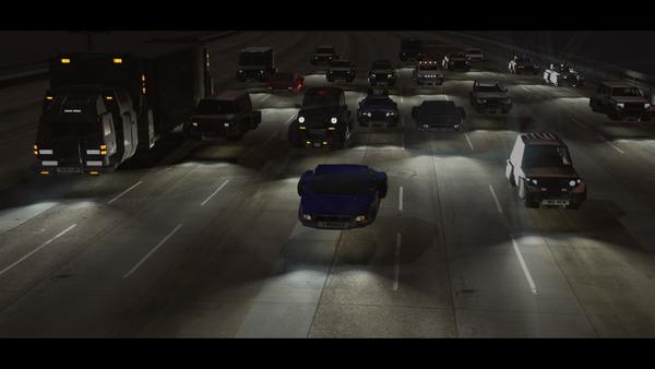
I've been working on the city cars. They are mainly ordinary cars (with a few dents here and there to simulate increased damage cuase by living in a big city), with the ability to fly. However most level 3 citizens have to stick to the motorways.
This image has some post in it. Still a WIP (I can't get glow to work properly - I'd like to take my glow output from carrara and apply it to after effects. Can anyone help? I can only do it with the built in effects - not my GLOW pass).
Anyway after 3 days modelling here is the state of play. (nb the lorries will be duplicated to outnumber the private vehicles).
NB the Level 2 cars are all a bit flash, with personalized show off number plates and shiny cars. Not a scratch on those.
More progress at http://www.facebook.com/scififunk


Comments
I precisely have just put a small comment on episode 8, and here the continuation: always so much excellent !
Thanks DUDU. Today I start replicating these cars. I can't wait for the massive scene that is to come. I will post some pics here, with daily updates on facebook. https://www.facebook.com/scififunk?ref=hl
Have you tried the 1-1,000 value slider in glow? If you need an image map in there, I think you can still multiply it by up to 1,000. I've never done it - but I've heard that cranking above 100 just keeps on getting brighter.
Yeah, thanks. I used to do this (or was it in DAZ?). I've forgotten how to override the 200 limit. Thatwould definitely solve my problem if I had a reasonable number of cars in the scene. As it goes I have literally hundreds so I can't use it in the full scene, but if you or anyone knows how to get that 1000 value again I'd be grateful.
Ooops. For never using it, I didn't realize that it's actually 10,000, not 1,000. so you can really crank up that glow!
Simply go to any shader that needs to glow, even if it has a map to control where the object glows, which is very common for cars and such. If there's already something in the glow channel, leave it in there. Now use the drop down arrows on the glow channel and select Operators > Multiply
The original glow channel setup will now be in source 1. For source 2, use the drop down arrows and select "Value 1 - 10,000" and crank that baby up. Anything over 100 will take it beyond what it was, so you have a lot of variability - and this can be animated as well!
For turn signals, I make one end of the animation time bright, the other end dim, then use an oscillating tweaner to control the speed of the blink. Try different methods of oscillators to have different styles of blink in the same scene. For example, have one use a square on and off sort of thing, another could use bounce, while yet another has the sign wave for a smooth on off effect.
Excellent! Thanks a lot my friend.
I use multiply all the time in combining elements of shaders (texture maps and colour, bump maps even glow) yet it didn't occur to me to use it mathematically only. Great stuff!
Ooooh, I need to catch up on this, last time I looked was in November. Got to get my speakers hooked up again or find my headphones. The amount of time and detail you have put into this just totally blows me away. Great stuff...you are very very talented and must have buckets of patience!
xx :) Silene
Many thanks Silene for your kind words. The latest completed episode is 8 http://www.youtube.com/watch?v=ZI7EFSkju6o
The prep for that was an awful long time.
Now I can start to build on that modelling / scene set up to speed up dramatically!
I'm hoping to show a pic of the large scene that will greet you at the start of episode 9, but real life is in the way atm. A preview pic will be out soonish.
Cheers!
The first Teaser Pic! a WIP.
(The other one was a modelling pic).
No Post applied to this yet. It looks like I need two distinct layers of glow effect on this. I'll do a tutorial on this once I've cracked it.
That is so cool. You're a master at scene creation.
That's very kind of you. Thanks.
This is animated! I'm having to re-render it as I've spotted 12 errors, but still it will happen soon.
Thanks Dartan. :)
Opinions please.
Which one is better? You'll need to click on them to really see the colour difference.
The dark version (which emphasizes the traffic lane vehicle headlights in the sky), or the light version (which shows more detail, but is arguably less like real night time (less detail shows at night)).
OR forget what is supposed to be right, which one looks best in your opinion, or what would you change (colour wise - everything else is set in stone now - it takes 40 hours to render this sequence!).
I prefer the second one.
me too
me too
Me three.
But my opinion is probably too late. :)
Thanks guys.
Certainly not too late. I'm going to sleep on this one.
It's 3-0 to the Darks atm. Any lights out there?
Also what is the reason. Look? Realism? Anything else?
I would have to go with realism.
Thanks nDelphi.
In my heart of hearts I'm swaying to that image too. It's the hardest thing not to show all that detail you've slaved over for a couple of weeks, but realism is where it's at.
The fact is at night without light it's awfully dark and things don't show up too well, plus headlights and strong lights get blurred as the camera lens struggles to take it all in.
hmm.
I understand exactly what you are saying. Ever seen a movie and not know what the heck was going on because it was too dark or a director, like that Transformers' director, Michael Bay, decided to film close-up robot battles and you didn't know who threw what punch or pulled what hair? LOL!
But in this case, the dark one really isn't losing anything over the lighter one.
Yes thank you.
A combination of lighting (I like this lighting but lets not kid ourselves it doesn't look real), obfuscation of image (not seeing all of the object), blur, DOF and camera movement all help make it look not so Squeaky clean 3D.
I'm hoping that my unbiased skills will improve enough for episode 11 so that the first issue (lighting and how light falls on objects) can be semi-resolved, but that's a whole new ball game.
I really like both. I think that whichever one makes it will be absolutely cool... wow there's a lot to look at! :ahhh:
Very cool!
Thanks man. I'm still deciding! I have to make my mind up by this afternoon (its morning now).
Having consulted another website as well (Team-Dystopia) I'm going with a middle path.
In other words I couldn't settle on either so made it semi-dark. As was pointed out over there it depends on the Gamma settings of the viewer as well.
p.s. I've got two tutorials coming out, one today and one on monday on Glow Passes.
Sweet!
I do so enjoy the reports from Sci Fi Funk Headquarters!
The realism and the small difference is lighting or more the diffuse of the light.
Hi - a cheeky request.
Want to be in Episode 9? I have 5 one line voice parts. Each one is a mini-advert.
I'll give you an example "Your own drone Trooper! Re-serviced and without malfunction." Said in the "Off-world Colony" type voice from Blade runner.
Please message me or reply to this to get a credit in episode 9 (I mention your name and a website or social media profile that represents you).
Thanks.
the sky is too dark to lay over a futuristic metropolis; I would add some flare and haze like in this photo of Chicago
You are right and I want to. I ran out of time this time out. Perhaps I can ask your advice on how to do this on the next city scape?