argus1000 latest effort: "TRANCE"
 argus1000
Posts: 701
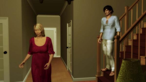
Is he really sleepwalking or does she only pretends to be? Check it out.
I rendered at 1080p but I uploaded to Youtube at 720p, because it takes too long to upload. At 720p, it took me overnight.
EDIT: I replaced the address. It was in the wrong Youtube channel


shot0001.jpg
1920 x 1080 - 101K


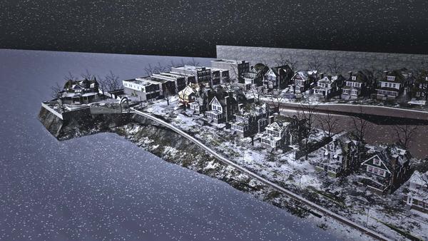
shot0002.jpg
1920 x 1080 - 358K
Post edited by argus1000 on


Comments
Argus1000,
For the sheer amount of time this animation is alone --that's a pretty amazing project for one person. So great job. You certainly have put a lot of work in this and since you have ---you probably already know where its strong and where its weak. But congratulations on doing it man! Nice job.
Rich
I have an idea, but it might not be the same as yours. But thanks for the praise.
Big, big episode Argus!
That's a lot of material to work into a play there congrats.
Thanks, SciFiFunkl. Coming from you, it means a lot!
great work Argus, who did the voice acting? very effective
Far out!
Very cool, Argus. Say, what did you do for the dynamic cloth simulations? Is that Optitex done in Studio and brought into Carrara using duf? Looks great.
Thanks, head wax. It's a woman by the name of Melissa Epp whom I found on the Internet on one of those talent search sites.
Thanks, Dartanbeck. When I began this animation, more than a year ago, there was no DUF. I had Daz Studio 3 and I did the Optitex dynamic cloth there and imported it in Carrara 8.1 with Daz Collada (.DAE). It was a bitch, but it worked.
Nice job Argus. I was able to watch it before my bandwidth crapped out for the month.
Great job on the movements, and neat that you were able to utilize the simulated cloth.
My only real criticism is the lighting. I'm not a fan of the shadow buffers in this one.
Thanks, evilproducer. Yes, I got a great deal to learn about lightning. Unfortunately, I wasn't able to use soft shadows because of the outrageous rendering times. And raytraced is fast, but it's a little crude, IMO. But I'll make a note about not using shadow buffers in the future. I also think it's unreliable.
I'm still using C7.2 Pro, so I can't test it, but C8 and later come with negative lights. It is my understanding that they're meant for situations like those created by shadow buffers. Some examples would be when a figure's mouth is open and it looks as if it is lit from within, you would stick a negative light in the mouth with a very short range.
The other possibility is using soft shadows, but excluding those objects in your scene that would significantly increase render time. The conforming hair is a good example since it has lots of trans-maps. This I do have experience with. I set my light with the soft shadows the way I want, then exclude the hair model. I then duplicate the light and turn off soft shadows and include only the hair model. You can do this with as many models as needed. Note that if it is a rigged figure like V4, conforming hair, or clothes, then you would exclude the model under the figure's hierarchy.
Just something to think about. Every scene and every artist is different, so what I do may not be right for you, and that's just fine.
By the way, I like the kind of Twilight Zone feel to the story. Your voice actress was good. Kind of reminded me of a reading of the Tell Tale Heart I heard once.
To improve the lighting, I'd study three point lighting. I've made a few tutorials on three point lighting, plus there is the example scene file that comes with Carrara.
All I ever do is import that scene, use the objects to line it up with the subject in my scene and remove the initial objects and the plane. Sometimes I'll have to expand the range of the lights but the principle is the same.
It will take your animations to a higher place. All imho.
I've read both Eviilproducer and SciFiFunk advices ("exclude the hair model" and "use the objects to line it up with the subject") and I'm not sure I understand them.
Like I said, I'm no expert on lighting. I generally use the light in the scene to guide me. For the example below, the is the blueish distant moonlight coming through the window (raytraced shadows); there is the yellowish bulb light coming from the incandescent lamp (shadow buffer) and I added a weak spotlight on top of the camera (no shadows).
Of course, if I had all the rendering time I want, I could have added a soft light (spot? distant?) behind the actors? Or I could have put the spotlight which is on top of the camera to the left of the camera? I'm not sure.
The major flaw, the way I see it, is that I couldn't put soft shadows on the moonlight because that would have considerably increased rendering time. But I like the result.
Hi there.
If you want to pursue lighting I'm suggesting looking at the 3 point lighting scene. It comes with C7 and C8. Load it up. render it. Now take out the lights and add a single distant light. Note how the 3 point lighting makes everything look more 3d (i.e. so much better).
Now take just one part of this scene. say the bed and the people in it. Take all other objects and lights out. Make the scene lighting basic and 0% (It should render a black scene at this point). Add in the 3 point lighting scene so that the objects in the 3 point lighting scene are in the same place as the bed.
Now delete the objects and the plane from the 3pl scene. What you are left with is your bed, and chars with the 3 pl lighting rig. It will only line up in a crude way, but it should do enough to convince you that your scene can look much more 3 dimensional when characters have a combination of white, orange and blue around them.
Please post the image if you have the time and inclination. Good luck!
I did what you said. Eliminated all my lights. Replaced them with the 3 point lighting setup found in Carrara. Adjusted the lights to for this particular room. Respected their respective positions. Applied the same color correction system in Premiere as I did for my movie. This is the result.
Ok. That's not the result I was expecting.
Please try taking everything out except the bed and the couple. Please use the default lights in the 3pl scene and don't apply any post. The 3pl should be applied to a totally dark scene as the start point for its magic.
The 3pl scene should look like this or you have other lights in it.
Like this? Everything out of the room. No color correction.
Hi Angus.
We'll get there. What I am after is
1. nothing but the bed and the couple in it plus the floor. No walls, no door, nothing.
2. no other lights
3. for now please leave the two objects from the 3pl scene (unmoved) then I can see where your lights are shining,
4. everything but the bed area should be black.
** Try to get the same result as my reference image, but with the bed and chars in it. Then we are on the same page. **
Cheers
Here you are. 3 point lighting setup untouched. Looks pretty good. No other lights. I attach the position of my lights here.
Brilliant!
That's what I'm talking about!
Look how the colours come alive. Look at the depth - without even DOF applied!!
Also you can move the lights around to get a different effect.
Here is an example by rendering from the other side of the Key light (the white light).
SciFiFunk,
Lighting is important. Everybody says so. Thanks for the advice. I'll try to base my technique on 3-point lighting in the future. See where it leads me.
I think that's a wise decision.
Can I be bold? I want you to succeed because I like your work.
I think you come up with interesting stories. Some of the shot selections are great (they make me want to pause and look at the frame), like that driving up the road shot in this animation. I also think you are good at animation, better than I at character creation too.
The three things that have been hammered into me from rg5a over on the Team-Dystopia Board, are
1. Lighting
2. Camera shot selection and speed of change.
3. Not wasting time dwelling on something. As soon as they've got it move on.
Lets face it this IS the presentation - you could be average at animation, but if these three things are in place, you'll look good.
Looking forward to seeing your lighting improvements.
Well, thank you Sir. The episode 8 of your series also blew my mind. I thought I was seeing "Blade Runner" for a second. No small feat. You're an expert at scenery and lighting. I can't wait to see the characters.
Thanks man. I've learned enough to get out of noob mode, enough to make some images I'm pleased with, but not enough to get into "is it real?" mode. However as I've said elsewhere, Octane for Carrara is coming. A chance to level the playing field. esp. combined with cloud rendering at $1 per hour (per GPU).