Figure Materials Not Rendering Like Product Preview
Hi; across many, many figures I get very different results for surfaces than the creator got in their images, and wonder what settings or lighting are needed to get similar results (see attached images, which also have two comparisons in each image, where I do get results that look close to those of the promo images). Any tips would be helpful.
First, some things that I have tried:
1) Maybe they look different because of lighting. I have tried different lighting/light sets/exposure values/HDRIs, you name it. Many of the "basic lighting techniques." The light set in the attached example pictures (below) for example use "Barcelona Rooftops" for HDRI and a portrait mesh set.
2) Maybe they look different and/or render different due to my computer: I have tried both rendering and simply looking at the images across at least three different computers.
3) Maybe the default surface settings need to be tweeked/changed. This could be the case (though I don't know why figures would "ship" with settings that get different "out of the box" looks than those used in the promotion pictures). I have even used N.G.S. settings to try and get a different look and while that sometimes helps it doesn't always. Note that in the below attached example pictures they were all rendered with their "out of the box, as sold, as installed" materials and surface settings. So while I have tried changes, I didn't "mess with" anything for the purpose of the examples below.
What follows are three of the sorts of things I'm talking about. In each case I'm not attributing this to one specific vendor (these are all figures by different vendors, all of who are reputable. I'm not focusing "blame" I just want to know what to do to get results similar to theirs). The image in the middle is the one with clearly different results from those in the promo pictures. I included one of the promo pictures as an inset in each, so that the different results can be clearly seen. The other two figures that flank the figure in my example are just to see two other figures (also sold on Daz) so you can see how they look under the same lighting and rendering conditions.
I've been pulling out what's left of my hair trying to "fix" materials on lots and lots of figures so they render like the ones in promo images (these are just three examples). It's probably something fairly simple I'm missing, because I see a lot of other users (more experienced, perhaps) getting really, really good results from the same exact figures (like I said, I'm not pointing blame at the vendors), and would like to know what they (you) might be doing differently that results in the different outcomes.
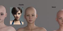

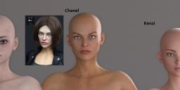

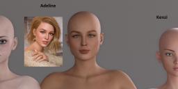


Comments
Hello!
The results you get on any character are going to be dependent on what lighting you are using and the materials setup on the character itself. That being said lighting is the bane of my existence and I tend to rely on premade light sets or quick build sets. I've linked a few below that are really great deals and work great.
Easy Portraits - Light Presets (Daz Original Set)
Click N Render IBL Set (PC+ Set)
LY Leonine Pro HDR Lighting (Brokered Set)
A couple of quick tips:
If you're doing portrait renders and the eyes look more like frosted glass and not as clear/crisp as you want them to. Just select G8F and her Eyelashes in the scene tab (using CTRL + Click) then go into the Surfaces tab, Select the "Eye Moisture" surface on both figures and then go into the Content Library "Shader Presets/Daz Uber" and apply the "Water - Thin" shader to them, this will give them the wet eyes look but still allow the texture details to come out fully in the render.
You don't have to use the default settings for the lighting from Studio. Usually studio loads in with the DTHDR-RuinsB-500.hdr loaded into the Environment Map section of the render settings this gives a nice mid range cool light from the figure's left side but if you want it coming from the right side try shifting the dome rotation dial in the "Render Settings/Environment"section to 135. You can also play around with the brightness of the lighting using the Environment Intensity, Environment Map and Environment Lighting Resolution as well.
Lighting probably is a major part of it - if you want to use a pre-made set look at the promos for something that gets close to the look you want on the figure.
I recommend all newbies to focus their efforts on learning lighting. Don't do what I did as a newbie and try to replicate promo images without learning lighting. It takes effort and disciplined practice to learn lighting inside Daz Studio especially if you have limited knowledge of lighting like I did.
Well, here's an example(below) of a character I did using the skin from Hinako for Mei Lin 8( https://www.daz3d.com/hinako-for-mei-lin-8 ) and the eye textures from Juniper HD for G8F ( https://www.daz3d.com/juniper-hd-for-genesis-8-female ). I used a grand total of 3 spotlights: two of them are generally in front of the character with color temp at 6000K and spread angle at 90(one is 80k lumens & the other is 90k lumens), and one behind + above /w color temp at 7000K & spread angle at approx. 33( at 50k lumens). Environment mode set to Dome & Scene, Environment Intensity set to 0.20, Draw Ground OFF. Both renders use the same light set with the exception that I had to reposition them for the second render due to how the changed character pose moved the character from the origin. Also, I added earrings, bellyring, and nose piercing to the character and made some surface changes to the leggings. I'm still learning how to light stuff properly myself, and those two renders below are probably the best I've done in regards to making a character look somewhat "believable".
Thanks for the tips. I'll work on it and see how things progress and maybe post a couple examples if results improve or maybe even if they don't.
I have been using basic lighting rules like three-point lighting, and I had changed the HDRI for my examples (to "Barcelona Rooftops" instead of the default). Is there a good tutorial video on lighting in DAZ? I have looked into general basic lighting tips and tutorials but I'm still getting these results so there is probably something I'm missing.
Hi again!
Here are a couple of links to YouTube lighting tutorials!
Dreamlight's Intro To DAZ Studio Iray Global Lighting And Render Settings
WPGuru's DAZ Studio 114: Introduction to Lighting Series This link is for his actual tutorial playlist for Studio the lighting specific ones are the last 4 videos but his tutorials are really user-friendly and worth looking at.
Elli