Still struggling with lighting issues
 comixfana
Posts: 268
comixfana
Posts: 268
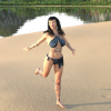
Okay, I'm rendering a scene using Tesla's Studio Type room #2 and the results invariably turn out too dark. I took a chance and got the Studio Light PRO HDRI Iray Wow Lights; I'm still tweaking settings but it's coming out like this...Sheila's face (Cataleya) still isn't very visible...I'm sure there's a setting I'm missing. Keep in mind I'm a noob, my current version of Daz Studio is the 4.12 Pro...if there's a setting somewhere that will fix this, please take the time ti indicate which menu/folder/subfolder I'm looking for ;)
Thanks in advance! :)
Daz 3D is part of 
Connect
DAZ Productions, Inc.
7533 S Center View Ct #4664
West Jordan, UT 84084
Licensing Agreement | Terms of Service | Privacy Policy | EULA
© 2025 Daz Productions Inc. All Rights Reserved.
Comments
Are you using ghost light or shader/surface light along with? This light require indoor wall remove "...or in any indoor scene with big windows or ceiling removed."
Look at your lights: is there any light actually shining directly on her face?
The other objects in the scene impede the HDRI light from reaching your central figures. You'll need to place other lights (photometric spotlights, mesh lights, etc.) into the scene to get additional lighting where you want it. One such light correctly placed may be enough. Remember to switch to "Dome and Scene" in the render lighting settings if you do this.
You could also try to remove parts of the set that are blocking the light from the HDRI from reaching your figures - set them to invisible, turn their surface opacity to 0, flat out delete them from the scene, etc.
There are also tricks you can do with visibility panes (I'm not getting the term quite right here) that change how scenery is accounted for in the render that might help, but I've never used them, someone else would have to provide that info.
I haven't been able to figure this out either. I use IG Studio Lights and point lights... I sometimes get "lucky" with the effect I want, but mostly I get darks that appear to be impossible to work around (eg. I can't seem to find the key to remove or brighten them) or everything is too bright from the get go.
I thought I'd try a cube against a background plane... once again everything is a complete surprise.
I guess I should have known that a cube floating in space against a "wall" is going to produce a strange shadow, but no. Complete surprise.
If your entire scene is too bright, you can either turn the luminence of your lights down, or adjust the tone mapping settings.
For the image you attached, it looks like the main light source is above, behind and to the left of the camera - is that right? If so, the shadows are where one would expect them.
Found a workaround of sorts, I changed the environment mode to scene only, and tried using a new camera rather than the ones that come with the set, not perfect, but better!
A bit of poke through on the robe for illustration 3 we can see a bit of her bra through the black robe
ghost lights are your friends....they save me loads of time and effort and they are so easily tweakable for some amazing results.
I should go back and read the instructions about the luminence as to date it has done absolutely nothing for me. Tone mapping looks like a category to explore though - thanks very much for this suggestion.
Wikipedia's mostly historical article on tone mapping has an example of a church interior with a wide range of dark corners going right up to super bright colors in a stained glass window... I was struck by their take on the problem as it is kind of like what I have been doing - I'll often make several different "exposures" (eg. renders) and thereafter I'll combine bits and pieces in an image editor. Like in glamour portraits where historically you would burn and dodge stuff, esp. pesky shadows around the nose and cheeks. See attached experimental lighting on G2F: hair is a big problem in this case since any frontal bangs in the hairstyle will almost always give overly dramatic shadows.
Hahahaha, Wikipedia even goes back to Ansel Adams (famous B+W photographer) and the Zone System!!! Incredible. Been a while!!!