Lighting Advice
I'm going through some lighting tutorials and trying to get a better handle on lighting and realism. Part of my problem is I don't have an eye for it, I think. Here are 4 with different settings, except for the last 2 which are just w and w/o the helmet. Thoughts?
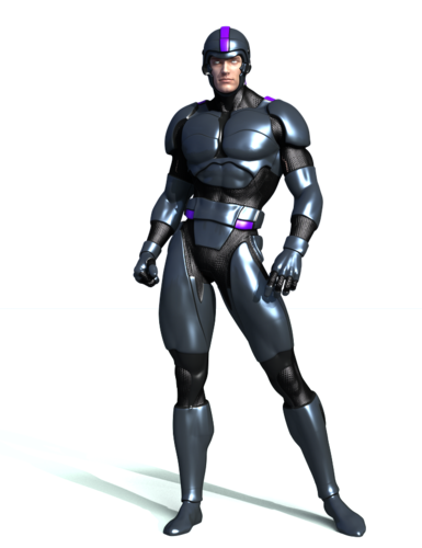

2Distant_and_1Spec_No_Mask.png
700 x 910 - 525K
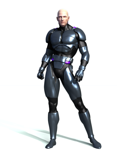

2Distant_and_1Spec_No_Helmet.png
700 x 910 - 522K
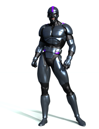

2Distant_and_1Spec_Only.png
700 x 910 - 524K
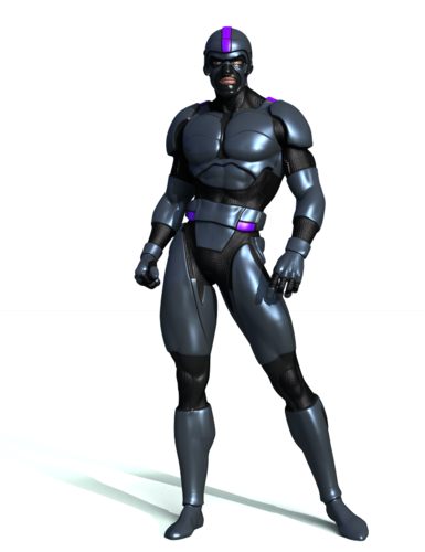

2_Distant.png
700 x 910 - 516K
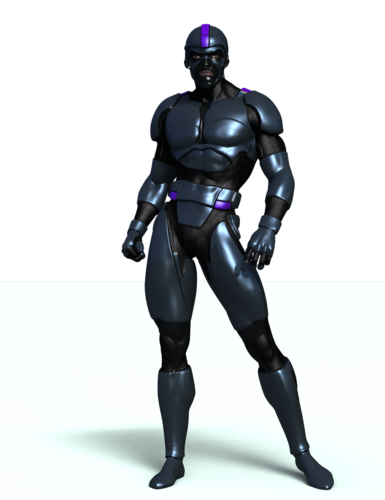

1Distant.png
700 x 910 - 600K
Post edited by HitManWA on


Comments
Fixed the eyes
I think it's hard to comment without any backdrop. Lighting hugely depends on the setting - indoor/outdoor, time of day, lighting sources, and so on. Add to that the mood you're going after, and you can light the same scene in lots of different ways :)
Definitely the backdrop. It's common to have surface settings that react to whatever the surrounding scene might be; if this is "nothing", then it'll affect the appearance of that surface as much as the lighting does. Watch out especially for very shiny or mirror surfaces, they will need not just a full scene in the camera view, but also a full scene around and behind the camera.
Ok, thanks guys. Working on something now, will post in a bit. I really appreciate the feedback.
Gonna do something different. That render took ages. I think I need to choose a BG that fits what I'm looking for then build into it.
Another...
That last one looks cool. the bright sun seams to be coming from a good angle.
Things I stumbled across.
Shadow color other then pure black (0r,0g,0b) , can affect SSS shaders sensitive to light the same way as if Ray-trace shadows was off.
A hint of blue from the rest of the sky, mixed with a bright sun like you have it there looks good outdoors. making that sun light a hint of yellow can add to the effect. color difference of 244 vs 255 in that number box thing.
If you have many lights around the figure, 75% brightness is as hi as a light should be that is aimed directly at your figure. I tend to go much lower then that with more then five lights in a room aimed towards the figure.
There is that Camera looking thing in the top bar, it lets you render small parts of the View-field. That tool alone has been the most Epic thing I discovered this month, and has helped with setting up all kinds of stuff in the scene.
Well best of luck, I must be off to bed before I pass out on the keyboard. best of luck to your endeavors.
Thanks, I'll do some adjustments and see how it goes. Yeah, I like the spot render tool as well.
Also, I have Bryce, Carrara and Hexagon. Daz is the only one I use currently though. My environments are crap, IMO. Playing around with Bryce atm, dunno what I'm doing though.
Different Lights.
Different Render
Still playing w lights.
Guess I should stop playing around and actually do something.
The 'Opportunity' is, when you start to "Do Something", your still playing around. That is why 3D is so much fun.
Your renders have looked good so far.