Need some suggestions for post work
 dakkuuan
Posts: 305
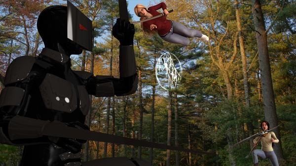
Here is my latest piece called, Battle in the Park: Before Impact. It's a scene from my book. I'm sort of clueless when it comes to post work, so anyone have any ideas of what could be done to make this piece look its best. I know the claw closest to the camera might need some work. Otherwise, I don't know. Any suggestions would be greatly appreicated.


Battle_in_the_Park.jpg
1920 x 1080 - 2M


Comments
Hmmm, I don't know- but interesting scene you have going there. I think perhaps a glint of light on the outer rim of the helmet- the back of the head, some outlining type of light, would make it pop more.
I think my question is more with the figure in the air- doesn't seem outstretched from this angle. Are they attacking the figure, or did the figure levitate them? I'd like to see more of the right arm, in front of the figure. It seems tucked just because of the perspective. I know you didn't ask about the render, just postwork, but thought I'd share what my initial reaction was to the scene. :)
That's fine, Novica, any suggestions are welcome =) Thanks! And yes, the figure in the air is attacking. She's interupting a fight between the other two. Will probably play with her pose a bit.
I'd try show some movement with the figure in the air, maybe add some motion blur to the lower legs and rotate the blade up to imply a forward stroke stroke is in the offing. Add motion to the orb and maybe add ambient with the parameter lock off and go over 100%.
There's a motion blur thread here:
http://www.daz3d.com/forums/discussion/6052/P15
I use Gimp for some postwork and you can get some good effects just by duplicating the layer and running through the options to blend together.
The first thing i noticed is the trees in the background of the image seems to be predominantly lit from the left, sun on the left, but all the characters in the foreground have their lighting from the right side of the frame. It causes a disconnect. If you consider doing another render, place a strong distant light coming from the left to emulate the sunlight, you could add it as an additional layer in post work to give a strong highlight, which would help to add a metallic glint off the armour and blade.