Shop icon Designs
 XpiderMan
Posts: 426
XpiderMan
Posts: 426
I like the use of icons to identify the type of Daz products being sold (hair, figure, environment, etc.)! I always had something like this in mind if I ever did a Daz product. The only thing that it's a bit off is the title since it's white just like the background. But overall, good job!
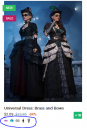
store-icons.PNG
300 x 442 - 217K
Post edited by XpiderMan on
This discussion has been closed.
Daz 3D is part of 
Connect
DAZ Productions, Inc.
7533 S Center View Ct #4664
West Jordan, UT 84084
Licensing Agreement | Terms of Service | Privacy Policy | EULA
© 2025 Daz Productions Inc. All Rights Reserved.
Comments
yeah i also loved the idea to have the icons, the current issue is which "many of the products are missing they icons and i also would hope to see those icons being used to add a "new filter" were you can filter the products by they type for exemple if i want "only cloths" only characters, only props and so like the others filters.
I hadn't even noticed till you brought it up.
The site already has that for years. You can select from the top menu choices and narrow it down as needed.
I'm not a big fan of the new layout. It reminds me of an old html layout. The icons are a good idea but the sales discount is too small. I'd like to see the discount rate a little bigger and with a bold font. To let it stick out.
But I'm sure I will get used it. I think my feeling about it is just because it is a new layout. But I really would like to see the discount rate a little more noticeable.
Well seems they are rolling out the new shop on us bit by bit. The look of the What's Hot and the Product Grid changed already.
One can use icons but they need to be pretty good once that small to work as identifiers. Most of them are fine but the sword for props is rather strange and the icon for lights could have been much simpler using the analogies to the brightness icons used everywhere. They did so with the mountains used for environments which are often used on cameras. In my opinion they should have further diversified with those like the mountains for (outdoor) environments and a building maybe for houses, flats or indoor environments.
it never really worked righ for met, many times when choosing wearables it also pick characters or props, the site system is a little mess you can't really "choose only outfits or hairs, for exemple if you choose hair it also will pick characters because the system see "brows as hair" and things like that or some "fur outfits" or fur characters can be recognized as "hair" and hair tutorais or any thing which a "word hair" even if just a reference, can be picked, that is the issue with the site it really don't work as it was supposed to work you can make a proper "refined search without getting stumble by "random stuffs".
I must be getting up in age as I'm having to look extra hard at the area under the picture to see the price. For some reason, however they changed it, it's not jumping out and it's hard to see unlike before. Maybe it's the new font, I don't know. And then in fast grab, they have sale written on the top left hand side thus making it difficult to see if something is on your wishlist.
I do not like them at all. This layout reminds me of the utter fail of Dungeons & Dragons 4th Edition; in addition to a bad game experience, they also were a layout disaster.
I do not like those 'forced' modern design layouts that try to press a lot of information in a tiny space by icons in icons. In the end, it is just cloggy.
In this case, packing everything in a white banner under the cover of the asset just makes the site ugly.
Overall, the UI experience is worse than before.
Just my *not so* humble opinion.
One problem - the 'add to cart' symbol and the 'already owned so download' symbol are now both white on green - makes it much harder to filter out items I own from a scroll-list. (looking at the $5 items today).
Also the sale icon covers up the "in wishlist" icon so you can barely see it
Great!
And the "Sale" icon seems to be coming up for every DO and PC+ item (as a member - it's OK if I'm not logged on) even though it's just the normal PC+ discount.
ETA: I'm also the wrong side of 40 and finding the price details a bit faint and small compared to the old layout.
https://www.daz3d.com/forums/discussion/440242/is-this-the-new-daz-store-software#latest
Locking this in favour of the longer thread on the new design