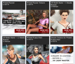
Anybody else think the newsletter's product grid layout seems designed to confuse?
The past couple of months, I've gradually started looking at the newsletters again while waiting for the site to become usable again.
When I look at the smaller product images that are arranged three per row, one thing stands out that I can't believe I'm seeing.
The first several weeks I just started deleting them from my e-mail because the titles above the images - which are clearly part of the image - didn't match at all.
Just this week I looked again and realized that the titles for each image is positioned at the top of the next item below. There's clearly a broad division between the product image and the box that contains the title of the product. This is in Outlook 2010 on Windows 7.
Does anybody else see this? It looks OK in Chrome and IE when I click on the viewer browser. Not in Outlook or on my Droid's browser.
BTW, when you click on the Newsletter Subscriptions link on the Account Page, where there is nothing but a checkbox labeled General Preferences, a Save button and a Back link.
???????????????????


Comments
Wow! Talk about false advertizement! :lol:
I don't see any problems
The titles are at the bottom of the image where they are suppose to be. I'm not seeing an issue.
Yeah, the worst part is I work as a web developer. After what must be a thousand times telling users "Just click on the link and look at it in your browser" - I never clicked the link until last night.
Karma, I guess. And Outlook... :)
Yeah, different email services have been showing them in different ways. It always good habit till they get the bugs worked out to view it in browser.
I would agree. I was very confused until I worked out what they had done.