Just looking for some feed back.
 Adruzo
Posts: 28
I am looking for some feed back on my work. What I did right, what I did wrong ect.
All of my images are rendered in IRAY and any post work is done in Corel PaintShop.
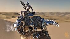

Drake Rider.jpg
3840 x 2160 - 2M
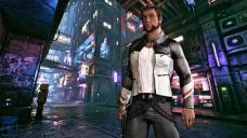

Character concept.jpg
3840 x 2160 - 2M
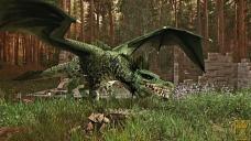

Green Dragon.jpg
3840 x 2160 - 4M
Post edited by Adruzo on


Comments
Technically they look like alright renders. Artistically, you may want to make the "intention" of the renders more explicit - like, what are the characters in each render doing, and why are they doing it?
The render of the man in the cyberpunk environment - he's standing there. What is your intention with that render? The file name you gave it is "character concept". So I guess you are presenting a concept of a character. Can you make your character concept more explicit? We can see his face and hair, his body type, and the clothes he's wearing. And we see the cyberpunk environment. How someone looks is only half their character.
There are several things that can make your character concept a lot more powerful. You could pose his body and facial expression to express his personality and what's going on with him. The more explicit, the better. You could have an expression of terror on his face and you could pose him running away, looking back over his shoulder. Or you could have an expression of rage on his face, and pose him in a fight position ready to attack someone. Or you could have him in a relaxed stance, but pointing a gun at someone, with an expression of smirking superiority on his face. Or you could pose him collapsed on the ground sticking a hypodermic needle in his arm, with an expression of totally peace on his face. Or you could have another character in the render that he could interact with - such as seducing a woman, or being kind to a lost child, or pressing the bottom of his boot into the face of someone he's knocked to the ground. You can also express character by the position and angle-of-view of your camera. If you place the camera up very high and point the camera down and show him alone in this place, it will give the character an expression of isolation or alienation in a desolate environment. If you place the camera close to the character, but at ground level, looking up at the character, it will give him an aura of superiority, strength, and mastery, like a superhero.
These look really good! You got the fundamentals down and then some, now it's just about further refining.
I'm generally not a huge fan of the kind of post work filters you're using but that's just subjective. And you're using them quite skilfully!
Desert scene: I find it really interesting how you use the Oil Paint effect as a kind of DOF, it did make me look twice. But I'm not sure it really works. I'm also not sure why the beasts breath is steaming if it's really hot, isn't that a winter thing?
Cyberpunk scene: The character reminds me a little too much of Hugh Jackman as Wovlerine, but otherwise nice portrait!
Fantasy scene: I really like this one! It took me a while to see the fallen figure in the foreground and it really tells a nice story. I wonder if the scene would be even better if there's another character in the scene. Right now there's no POV character. The dragon is not the POV because they're the subject of the scene, and the fallen figure is also not the POV because they're dead/unconscious. Which leaves the scene just a little "stagy" becausethe dragon seems to be posing for no one in particular. But that's really a detail, I really like the scene as it is!
Thank you very much for the feed back Fauvist. You bring up some great points that I had not really considred. when I put this image/scene together I had in my mind all of my knowlege of the character and his back story, but I had not given consideration to the fact that people looking at the image will not have that knowledge. I can definatley tell more about the character by putting some of your sugestions to use.
Thanks again Fauvist I really appreciate the input.Thank you kindly Hylas for your feed back. I understand that not everyone is going to be in love with the style/technique of my post work. With that said I feel like no matter what I do, not everybody is going to like the asthetic result. I am partial to the look I have developed though, it is something that I think is still in an evolution of sorts and so I continue to tweek and tune as I go.
In the desert scene I used the oil paint effect in an attempt to emulate the rising heat effect one might see in desert planes. I think maybe if I had softened it a little it may have worked a little better. As far as the creatures breath goes.... um maybe its fusion generator is venting gas? to be honest it's mostly there because I liked the way it looked, you are correct though, it doesn't really fit.
As for the cyberpunk scene and the character looking a bit like wolverine. I think it's the side burns that are lending to that look, but I really, really like the side burns... so there staying :)
As for the dragon scene I absolutely agree its missing that POV character. I liked the render when it finished but I kind of felt like it was missing somthing, maybe having one of the dead guy's horse backing away or something.
Awesome! thank you so much for the feed back.