Is Anyone Game 2?
 NGartplay
Posts: 3,160
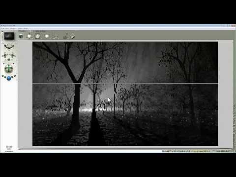
I had, what I thought was, a great idea. Another Bryce exercise. In this one I'm curious how different everyone's image will come out using a 5 minute tutorial by David Brinnen found here: 
You can use whatever objects in the scene, they don't need to be trees, you can change colors, the terrain, lights and the fog. Whatever suits your taste but you must have a night scene (or very dark...twilight), you must use a fog or haze and a light somewhere in the scene. I would like you to use the random instance if you can but it's not necessary. Just let us know if you did or not.
If anyone needs me to upload a beginning scene to modify, let me know.
The reason that I chose this one is that it's very fast and the tutorial makes a very simple image. I wonder how it can be changed to make it even more interesting. You all are so creative that I hope you give it a try. If there is no interest after a week I'll erase what I wrote and edit my post to say that it is closed.
I'm off to give it a try.


Comments
Here's mine. I used the fog recipe but I added a touch of green. The light is set to 100. I tried using instance with the random replicate (make sure to click Y rotation only) but it didn't work so I unchecked 'instance'. I made 3 replicated horses. Transparency isn't perfect but it took an hour to render and I didn't want to mess with it anymore. I rendered on Regular setting but the transparency is what made it take so long.
I did another one. This time the light is in the front. I added color to both the fog sphere and the light The creatures are from Mat Creator.
Wow another Game, I remember this tutorial and doing a few at that time, maybe I will revisit and make another for this thread.
ETA: both your renders are very nice
Another good idea, not sure I'll come up with something. I did three examples of this video six years ago.
Mermaid and Horo, go ahead and post the images that you already did. I'd like to see what your results were.
My first attempt, just a quick one - I followed the tutorial quite closely, but made the fog a pale green and the light a yellowish-green.
I just noticed you went green too, NGartplay - the horses worked out surprisingly well and I like the dusty atmosphere of the sci-fi one.
That worked out perfectly MelanieL. What I liked about this tutorial (besided how easy it is) is the shadows and the foggy look. Your image has both and is wonderful.
ie - my horse image...looks better small, lol. Maybe I'll fix those transparencies another time.
Thanks - I did look at your horses full-size: OK so they have stylised-looking tails! By the way when I first saw the horse at the centre at the back I could have sworn it was a woman wearing jeans and a light-coloured shirt bent over, facing away from the camera! (Trick of the light - the horse's head looks like her arm)
I decided that I didn't like the horse in the light in the center back and deleted it. What I notice now that I redid it is there is terrible gradation on the black bodies of the two closest horses. I'm sure that's something to do with how I saved it. Not sure what I did wrong.
And I did try to fix the transparencies on the manes and tails but couldn't get it any better. I think this needs to be done in Daz Studio first. I would have shortened their manes and tails and forelocks and tried to lay their manes down a bit.
NGartplay : cool idea, beautiful renders.
MelanieL : spooky fog is awesome.
MelanieL - very nice render.
@NGartpla: I assume you set the transparency maps for the manes and tails correctly. They could look like this, if you used a too less Maximum Ray Depth in Render Options. I often decrease MRD from the default value of 6 to 4 for quicker renders and then the transparency can look like in your picture. Hope it helps.
Made some kind of night/fog scene.
The sky : as explained in the video, added the sphere with the fog material and two radials.
There was no instance, the pavillion is a free object as well as the bridge, and the tree is a bryce tree. There are four terrains with the 'coal' material.
Electro-Elvis, thanks, yes, I did regular render setting and it took over an hour. I rendered it without any tails and manes and it rendered in a couple of minutes. Super Fine or Premium, I'm thinking 'ouch', lol.
MelanieL and adbc - two nicely done examples.
adbc, beautiful scene and render. I like that you can see the shadows cast by the pagoda, nicely done.
adbc - thank you. Your pagoda is a nice scene too.
mermaid, Horo - thank you too.
Horo, NGartplay, MelanieL : thank you.
Nothing new from me. This is the best I made after the tutorial in March 2014.
Horo, you are so clever. That little house in the tree is delightful and cute. So glad that you decided to share.
Horo : really beautiful scene, spooky !
Adbc - very nice render I like the addition of the the pavillion and bridge.
Horo - I remember this one, awesome work, very spooky trees.
Here's a new one from me the fountain I modeled in Bryce 5.5.
Eta: to correct post
And a Pinterest link to an older one: https://www.pinterest.com/pin/504192120755426616/
NGartplay - thank you. The little house is actually a lantern (which came with Bundle 1, now discontinued) but it is a bit dark to see.
adbc - thank you.
mermaid - thank you. Well done and nice fountain. I like the one on Pinterest even more.
Mermaid010, impressed that you modeled the fountain and the scene is beautiful. I like the fountain water dispersing the light.
Horo, I tried putting my face right up on the screen to see if I was mistaken about it being a house but eyesight isn't what it used to be. I have a pier light 1 and pier light 2 from Bryce premium. Is it one of those? It even looks like there is the pier in the image.
Horo - it might be old, but it's still good!
mermaid - that's nice. I like the terrain in the background.
Here are two variants of my previous image. First is meant to look something like a snowglobe. Second changes colours slightly and adds a few more random-replicated objects.
MelanieL, the snowglobe is so cool. I love clever images. The cemetary image is wonderful. You got the brightness of the light backlighting the tombstones perfectly. I'm a sucker for cemetary images. Would be a great backdrop for some ghosts and creepy crawlers.
Thanks Horo, NGartplay and MelanieL
MelanieL - both your renders are awesome, the graveyard one very spooky
mermaid : awesome image, good bryce modeling, I like the image on Pinterest as well.
MelanieL : Both renders are very well done.
MelanieL - thank you. The snow globe is a cool idea and looks great. The one with the tombstones looks vey good.
NGartpay - like my above old render with a narrow camera and an additional light to show the lantern, which is very dark in the main picture. At right is my sig, which I usually remove for the examples shown here at the forum.
Adbc - thanks
Horo - nice close up of the lantern