Feedback please
 jason-2455927
Posts: 51
in Art Studio
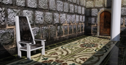
Just finished this with Iray render. Any feedback on making it more realistic?


ThroneRoom.png
1584 x 817 - 2M


Comments
All the textures are pretty low resolution, and the geometry is too smooth.
I would recommend using Depth of Field on your camera. Focus on the main spot of the scene, let the rest be blurred some. Do you plan to add any figures to the scene?
I would perhaps also suggest placing some item outside the view on the right, all the way up enough to cast a shadow on the floor and/or the wall on the left. Flower pot, a cat on the parapet, anything.
Interesting... what do you mean by the geometry being too smooth? Are you suggesting stronger bump maps, or creation of some dents and dings in the chair and such?
The wall, for example, is clearly a flat plane, whereas the texture implies depth.
As for the walls, on the second look, the corner line seems a bit too noticeable, and the two walls seem a bit artificially put together, as the positions of the stones in the walls do not match at the corner.
The texture of the wall in particular is too low-res. Here's some free textures:
https://cc0textures.com/
https://texturehaven.com/
It looks like the Glossy Roughness of your floor is at 0, which makes it look very shiny.
If the floor is supposed to be ceramic tiles or marble, increase Glossy Roughness to about 0.3
If it's supposed to be carpet increase it all the way to 1.0
Not sure about the light situation... it looks a bit like the room has no windows and no ceiling? Which would be strange.
Hope some of that helps you getting started!
I see, I had used a bump map in an effort to show the depth. Isn't that the normal way of doing walls like this? I don't think one would model the wall and have each brick rather than using a plane would they?
Using Depth of Field will make the walls a bit blurry, making using high-res textures redundant, saving up resources, given that the scene will have a focus point, such as a figure near the camera.
The bump map doesn't appear to be doing much, so you could try increasing the strength. A normal map will help draw out the details of a bump map as well, and displacement will do even more since it actually affects the geometry.