How To Make DAZ Library More Visible
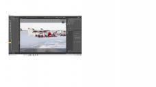
I know this is a dumb question, but after a lot of poking around, I can't get DAZ to look like it did this morning. The Library on the far left of the screen is almost completely obscured when DAZ opened. How do I readjust it so that it's more visible?


UI.jpg
1920 x 1080 - 139K


Comments
Hover your mouse cursor over the dividing line until it changes to a little left-right arrow cursro, and you'll be able to adjust it.
Thanks for the answer! For some reason this didn't seem to be working before. Thanks for ending some frustration!
You might also want to save your workspace as a layout (window - workspace - save layout) once you get things where you want them. that when when a window or toolbar misbehaves, you can just reload the layout.
Note that there is another layout option (there almost always is in DAZ|Studio) that you might like to try. Instead of splitting the Library pane into side-by-side skinny slices, try changing to a top/bottom split. This uses the full width of the pane for both halves, so you can see more without wearing out your mouse wheel finger with all the extra scrolling.
Open the Library pane Options menu (the button in the top right of the pane, with four lines and a little arrowhead) and change View Side By Side to View As Tree. I don't recommend View As List — it produces a massively wide (scrolling, scrolling, scrolling again) folder view that I've never been able to visualise or use properly.
Another layout option is to change the pane tabs to running along the top of the pane instead of sideways down the edge. The big advantage is, it gives you a little bit extra width for the actual pane contents; the bigger advantage is it's readable — I can't read sideways tabs, and I've never been able to understand how they ever became A Thing. Go to the Window>Workspace menu, and select Orient Tabs Along Top.