Show Us Your Bryce Renders! Part 8
 mermaid010
Posts: 5,633
Here's a render for Pam to start the new thread :)
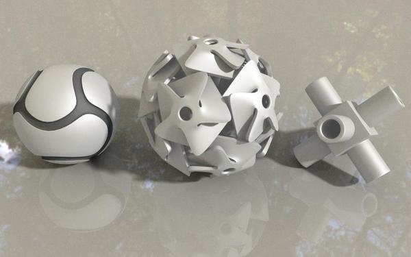
I managed to do David’s latest Wings 3D tutorials, and here’s a quick render showing the geometry.


goodgeometry.jpg
800 x 500 - 36K
Post edited by Chohole on
This discussion has been closed.


Comments
Hi
Thanks all for help with my problem with displacement. Here are some pictures i have render the last days.
The first image is randomly created when I placed a light source in a bowl. The last picture is especially for Horo.
Cool ! My experiments with Wings fail.
Roland4
I like your objects, very real looking.
Pam, the link to the previous thread just takes you back to this one. :)
Here's my first one for Part 8
@mermaid010 - nice Wings3D shapes.
@Roland4 - abstract looks interesting. The shape is beautiful and thank you for the awesome ruby. It will be helpful if I'm gonna look for a bride :lol:
@Dave - yes, this makes sense, the fence is indeed a bit small. Cool idea, as usual and nicely done.
I've been fiddling adding some water that runs off this eroded terrain but after all the labour, I decided the result is rubbish. I think the second one is better even if it is wrong in its dryness.
Oops. perhaps I was trying for an infinite loop, or maybe even a mobius strip. :red:
Horo
I don't know about water but it looks like late winter snow caught in the crevices.
Cool ! My experiments with Wings fail.
Thanks, You are making such cool objects in Blender and Hexagon, I wish I were in your shoes. The Abstract is lovely too.
Dave- another great render.
Horo - Thank, both the landscapes are lovely, but the 1st is my fav.
While Horo makes amazing landscapes I've become quietly obsessed with weird little shapes. Nice to see I'm not alone.
Wings 3D experiment - bad geometry remade better(ish) - by David Brinnen
Edit.
After seeing Horo's comment in the gallery I decided to do another render with the broken/bad geometry to exploit this issues. Here with the gigantic wide angle lens from the Lenses and filters set plus one of Horo's HDRI supplying specular and enhanced by a hypertexture effect, placed inside a mirrored box... some chaos that looks rather interesting.
New thread is off to a great start. awesome renders.
Still playing around with Houdini, figured out how to export 1 frame of a Fluid sim as polygon geometry that Bryce would recognize..
still working on textures for the water, and there are some artifacts, I should probably try smoothing.
@mermaid: Nice Wings objects, I've yet to try the center and right ones.
@Roland: Those three new images are terrific, especially the center one. Material on that one is spot on for the shape.
@Dave: Your shower image is great, as is the newer one.
@Horo: Like mermaid, I like both of those images, though leaving the white on the first is as Sandy said, snow still on the mountain.
@David: Nice video and shape. I thought of a mirrored box while watching that video.
@Rareth: Terrain in that image is very nice. Hope you get the water ironed out cause it's going to fit in well with the terrain.
Impressive! This is an interesting idea and direction to go in.
Jamie, thank you.
Here's a reprise of this topic Make an additive background image for example scene 1 version 2 - by David Brinnen
For reasons of well... you'll see.
Thanks all for compliments. All pictures i see are Cool and very interesting. Here are some new images i make the last two days and saved it to a stick that i can upload it in a Internet cafe.
@Sandy - yes, that's the problem: the water looks like old snow.
@mermaid010 - thank you (even though you prefer the wrong one) ... ;-)
@David - the shape presented in the second images looks very good and the 3rd abstract reminds me of an owl. The first image has an extraordinary quality to it and I think the high contrast outline is responsible. I somehow don't like the interrupted lines (like anti-aliased with a low setting) but I'm really not sure whether a perfect outline would be an improvement. Perfection is nice but sometimes, a bit of imperfection may be an improvement.
@Rareth - looks promising.
@Jamie - thank you, that the water looks like snow is what bugs me.
@Roland4 - you're doing nice object work.
Thanks Horo, yes almost on the lines of "feature not bug".
Here's another space related video Digging deeper into the DTE with example scene 4 - by David Brinnen
Houdini does a great job with fluid simulations. The issue I am running into is one of scale, to make the water look more realistic (for a canyon scene, I need to scale everything in Houdini to near real size. doing that eats up my computers Ram in no time flat. I may have to shelve the white water through a canyon and do things like splashing water in a glass.
well i had a bit of fun today with bryce, this was my favorite of many renders...so i thought i would share :)
Wow, that turned out very well.
Hi all;
I have certainly enjoyed everyones images and got a good laugh out of Savage's "Bigger Fence" image.
Finally got around to loading DS 4.6, Genesis 2 and bought some outfits/hair stuff for G2.
This scene was just fiddeling with the new stuff. To get the g2 figure to load properly, I had to export from DS, into Modo (re-topology to fix the suit "poke through"), then exported to B6.3 (because neither B7.1 or DS could find the image textures and then saved for B7.1 (whew!).
The swimsuit is by Mindvision and the hair by Out Of Touch (two of my favorite content creators).
The building is from Stonemason.
Backdrop and IBL from Horo's Deep Space HDRI set.
Render time about 4 hours at Normal AA.
Thanks for looking!
dan whiteside
A nice render, just one quirk. Her leg has sunk into her knee ;-)
@Horo: Even though the water looking like snow bugs you, it actually fits with the overall look of that terrain.
@Roland: Those new objects are really good.
@David: By any chance do you remember the movie 2001, and the space station? The new video is really great, loaded with lots of information. And those two images are very nice.
@Tim Bateman: My first thought of that snake image was it's a real nice photo, because that's what it actually looks like. That is an awesome image.
@Dan: Nice work, except for what Sandy mentioned. Wasn't there a character called Elastic something years ago?:cheese:
@Tim - incredible render, i took it for a photograph.
@Dan - excellent render, great composition, colour choices superb. You've mastered how to bring in G2 ladies, she looks really very good here. I haven't noticed the oddity with the legs before Fishtales mentioned it. Composition obviously fascinated me too much to look for details.
Here's the second render (actually the third) I made with the eroded terrain. Here in the morning, the night had washed the dark clouds away and the sun came up on the other side.
@Tim, the snake render is wonderful. Great subject, nice lighting. Photographic.
@Dan, nice to see the Deep Space HDRI in use. But my main purpose on commenting is that your image has prompted an email from the lesser spotted Pumeco. With a message to convey to you. That you should be congratulated for the hottest Bryce render ever and that you should keep up the good work. I am also required to call you an "Old Dog" and post a thumbs-up smiley - er... hmn.... I think Len must be testing me here, since I don't see a thumbs up in the list. So just imagine that if you will. Anyway, well done Dan!
@Jamie, yes but any resemblance to real people and places is purely co-incidental. I don't want to have to make the video a third time!
@Horo. Outstanding. The foreground area with the greenery and rocks sticking through the sandy soil is particularly compelling. The curvature filtering and the fine landscape details are working together brilliantly.
A few more pictures. The last is back for Horo (I know he love gems).
Wow...this thread moves fast.
Below: "Why red, because it goes with my dress, of course."
Jay
Mermaid: Great shapes... Take a portion of the middle one and make a little windmill like you see in people's gardens or stuck in sand castles :D
Cool snake Tim... very much like a photograph.... perfect texture and matching lighting.
Dan: Nice, I rarely put people in my renders because it's such a phaff... Well done. The leg issue is a tricky one because I see that if the legs didn't overlap so much, the right leg would be way too high because the flesh of the back of the leg doesn't squash like in real life. I think you've got a good compromise.
Horo: Excellent as ever, your terrains are certainly very well made and detailed and your use of materials and lighting is spot on.
Roland: I'm enjoying following your experiments with shapes modelled in other applications... From the latest batch I especially like the top one... great flowing shape well proportioned.
Jay: Great material on that dress (and I presume on the car too) and the finishing touch of the exhaust smoke is great.
I've been playing more with stacked terrain materials on a terrain I generated in Bryce and I've done this series of four on the same scene.
These are quite big renders and only took just over an hour each.
Quick experiments Wings 3D - further experiments with bad geometry - by David Brinnen
Nice work following Horo's more serious and useful video Dave!
Cheers, Savage...and yeah dress is super-reflective, super associative (but think hair clashes with the background leading to confusion). Nice terrains-mixture, too, by yourself...so much acheivable through this process, I'll presume?
Horo (and of course David)...phew...those terrains are defintely worth investing in.
Jay
It certainly allows a lot of differentiation across a single landscape. With all the 4 channels in the Mat Lab and three in the DTE for each material then having three terrains stacked, the ability to create variation is limitless... It's very engaging and fun to play around with.
thought i would share today's wip...im really happy with this because it only took me about 30 minute's to set up and another 12 to render :)