rendering difference
 VicS
Posts: 1,273
VicS
Posts: 1,273
I first started using daz because I fell in love with the way the redners looked but mine never have looked half as good, I have tried with the lites that come with products or making my own lites but the result is always around the same, also I have also used 5 different computers, the latest is a powerful one with an up to date powerful nvidia card-if someone can help me get over this hump I will be estatic as I just love the look of a great Iray render
-basically mine look washed out compared to a proper Iray render in dz3d-I would describe mine as possibly having more noise, not looking as clear and not having anywhere near the color depth as the promotional
images
thanks in advance for any help
Daz 3D is part of 
Connect
DAZ Productions, Inc.
7533 S Center View Ct #4664
West Jordan, UT 84084
Licensing Agreement | Terms of Service | Privacy Policy | EULA
© 2025 Daz Productions Inc. All Rights Reserved.
Comments
Your camera has a light associated with it called the headlamp. In the preference pane, you can turn it off and get rid of that washed out quality. I would recommend a good HDRI to provide realistic lighting with maybe a point light for reflections.
There are a few thing you need to figure out.
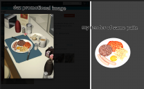
1. I maybe wrong, but judging by the promo image you've posted, it doesn't look like an Iray Render, more of a 3Delight
2. The object you used may have been made for Poser
3. as Nemesis1.0 has pointed out, the headlamps on your camera may have been on, giving the render the 'flat' uniform lighting look.
Using proper materials/shader and renderer along with proper lighting can produce more realistic renders.
That one looks like an old product, ie. 3Delight not Iray materials.
here's the product.
https://www.daz3d.com/interiors-the-diner
It's really old(2010), and given the version of ds listed, no DS materials(dsa), imho,those are poser renders.
Full conversion time.
oh that would make sense an old product, however the same happens whichever scene i try to render no matter what i never get that great crisp colorful look as everyone else who sells daz products is able achieve , i will post an example maybe city hall, his compared to mine, or others , if i can get help to get over this hump it will be huge!
ps yes i know aboput headlamp on the camera,
. I would recommend a good HDRI to provide realistic lighting with maybe a point light for reflections. - wrote Nemesis-is one hdri lite is all that is needed to get a great render? then it must be settings because i have tried that and everything many times without good results
i had planned to show an image/s of the promotional images compared to mine using the lites that came with any set to illustrate how mine just dont cut it-some renders ive seen are just unbelievable-will be on it as soon as im free-thanks everyone!
That product is old and does not have modern materials, you can convert them to Uber shader but they may lack certain texture maps and settings. Even poser will not always have the right maps settings associated with object materials and require tweaking. To convert them you need to click on each item and select all their materials from the surface tab and then select presets and then search for UberShader and click on that to upgrade them. But like I said they still may be lacking. The BEST way to update them is to have a good selection of shader sets and to find approrpiate shaders to replace the old ones with. There is also a tool in the shop for converting 3dlight to iray and it will help you identify which objects have the wrong shaders and upgrade them for you. But it is not ALWAYS accurate, and often reports false positives so be sure to look carefulluy at what it is going to replace.
You can use HDRI maps but results vary A LOT and IMO it's best to just setup your own lights, point lights, spot lights, ghost lights so you have more control over the ligthing in your scene, ESPECIALLY when the scene is indoors.
Also as mentioned above TURN OFF HEADLAMP on the cameras!
I personally prefer lighting with a single HDRI and adding lights only as highlights. In this scene, the elf and plane primitive background are lit by one DimensionTheory HDRI with one tiny light to cause an eye glint. At least for me, this makes the diffference between a 7 minute render and an hour and a half render:
As others have noted, it looks like you have the headlight on and this will kill most of your shadows, which in turn will kill the 3D-ness of your render. Also, be careful with lighting, too many lights can kill the interplay of light and shadow which is very important to making things look 3D.
I always recommend that people start off simple. As you gain experience with lighting, you can gradually increase complexity as needed. You can actually make pretty decent images just using the default HDRI that comes with DAZ Studio (you may need to use Iray Sectional Planes to get the lighting for the HDRI to fill the scene properly). Just be sure to rotate the HDRI 20-35 degrees, it's default orientation has the main light coming from the right (90 degrees to the default orientation of the scene). It also has/creates a really nice rim light. The images below are some examples showing what can be done with the default HDRI (be sure to zoom to full resolution the see the details).
the renders shown are very clear,
here is a render using my own lites, (primitives made emmisive), i know it also looks like a render except it lacks around 10-15% of the clearness of the renders sent above-especailly the one wit hthe red lite saber-it is that extra 10-15% that would make the difference i feel
i guess these 2 renders have simlar lighting so i used them to show what I mean
Are you sure you are rendering in IRAY?
What are your rendering and environment settings?
see what i mean about seeming a little washed out ?
Ah, crispness! The default pixel radius for Daz Studio is 1.5; set it to 0.8 to 1.0 to get those crisp edges...
-where do i go to change the radius? thanks
Render settings tab, under filtering section. Personally I usually change from gaussian to lancos or mitchel, and lower the raduis. It depends on render size, smaller the render size, the more the radius needs to be lowered.
i can see a difference - looks about 10-15% clearer
i dont imagine there are any other settings that can be adjusted maybe one to get more color depth for example?
trying to attach image but the image wouldnt load now ill try a different time thanks for now
If you mean like more vibrant colors, lower gamma. I usually set gamma to 1 and do color corection in post. If you mean more depth like 32 bit, in the advanced tab in render settings, turn on canvases, then click the plus and add a beauty pass. Don't be fooled because it comes out looking pure white, in photoshop go to image mode, than drop it to 16bit, then tone map it there. I find the best way is to use exposure, then lower it till it makes you happy.
Render with the Beauty canvas and open in an HDR editor. It will be white at first because it will be overexposed. Reduce the exposure by about 11.
Color depth... change saturation in the filtering section also in the tone mapping section of the editor tab. Contrast is a mixture of white point, crush blacks/ burn highlights.
This is an extremely quick Iray render, just 24 iterations, no Iray capable card, using sun-sky environment lighting.
To avoid the washed look try boosting saturation.
Also on your surfaces tab, adjust the Diffuse color or Base Color toward white.
If you want your images to really pop. You can use compositing to create a fake HDRI image inside of photoshop or gimp. Just go to youtube to see how this is done.
I think part of the problem is your model and the skin shaders/textures. It looks like the base G8F figure and skin materials. G8F Base renders with .... well lets just say fairly uninspiring quality without quite a bit of tweaking in any light. Poor shaders with great lighting will look bad, and great lighting with poor shaders will also look bad. Below are some quick examples of 1) the base G8F, 2) the base G8F with Shaders/textures from Charlotte 8, 3) the base G8F with Shaders/textures from Charlotte 8 and levels adjusted in Gimp, and 4) a modified Charlotte 8 figure (shaders and morphs modified). All images use the default DS Iray HDRI (the last one also used a low intensity spot light to highlight the face), so no real special lighting, just better shaders and minor post processing on the last two images. You can get the base G8F shaders/textures to look much better with some tweaking, but it will take some work. Getting an add-on figure with good shaders/textures will make it much easier to get great renders.
If you want to know more about the set-up of any of the other images I posted, just go to me Deviant Art gallery. I typically give a bit of information on lighting and modifications that you might find helpful (very general though, no real specifics, so It also may not be extremely that helpful).
G8F Base
G8F Base with shaders/textures from Charlotte 8
G8F Base with shaders/textures from Charlotte 8 - Levels adjusted in Gimp
Charlotte 8 with shader tweaks and additional morphs
You don't need to imagine, I've revealed some of my tricks in Lights AND Render Settings in this video:
Part 02 is in process soon.
Great Stuff!!
One last example that I think improve on the base G8F. I tweaked the skin shaders a bit (still not really happy with it, but it should give you an idea what can be done), and adjusted levels and added a bit of sharpening (un-sharp mask) in Gimp.
I think one of the problems is the meshlight that's used, try proper spotlights instead.
The background is not the HDR used, am I right?
Now I know why many users avoid Vanilla Victoria, is more difficult than a paid one!, this setting is named Keyshot SSS emulator
thanks for all the comments/replies-i do usually use skin from other g8 charaters not the g8f default-but what im trying to do i want to keep simple for new users to use, people without any experience or purchased products-im trying some tips posted here, so far not so much luck, i will watch Dust riders videos next ,i will be happy if i can make my renders like those shown in the videos-they are along the lines of what id like to be able to acheive
Oops, I should have mentioned that! Correct, it's the paper role prop from IG's Photo Studio 2 with the shaders converted and modified for use in Iray. I also have two Iray sectional planes to allow more backlighting from the HDRI (default Iray HDRI).
Nice work on the base G8F! It's definitely a challenge to make her skin look good.