Which hair looks better?
 thoreandan
Posts: 151
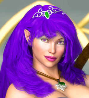
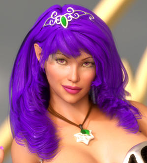
I created two renders recently with the same character (workflow: DAZ/Reality/LuxRender/Photoshop). In one, I left the hair essentially as-is after rendering. When I rendered the character again for another image, I was not happy with how obvious the edges of the ribbon-shaped hair geometry were, so I tried doing some clone-stamp work and eliminated the edges.
Now I can't look at either objectively anymore, I've spent too much time with both to really "see" them properly. I've attached a snippet of each image to compare the two approaches. What do you all think? Was the postwork worth it, or does it look less realistic? Is it too obviously photoshopped? My post-work still has a long way to go and might have been a little ham-handed, was it a good idea but should have been applied with more subtlety?
I know unrealistic hair is one of those things we kind of live with at this level of the 3d world. Is this at least a step in the right direction, or did I waste my time? Maybe there are other post-work techniques that work better?
Thanks for any thoughts or suggestions you might have.



Comments
First, did you use smoothing so the crinkley type edges were smoothed out as much as possible?
I think postwork is very beneficial, I like that one better. But I try to eliminate it as much as possible by getting the hair as smooth as possible first when it has crinkley bends.
The one on the left looks better to me, but it also has a darker color in general and more shading is showing. =-)
It's a bit hard to know exactly what you did because you seem to have two different renders with different lighting. One thing to note is you have some tangents going with your background and the figure on the image on the right. Edges of different objects flowing into one making it look like one object where there are actually two.
The one thing I notice on the one on the left that is missing on the right is contrast. Hair almost always falls into locks.
One thing I recommend is clone onto an empty layer (Select on the art and clone onto another.) so that you preserve the original. Or at least copy the original and then work on a duplicate. Then you can use a layer mask to bring back some of the original where needed.
There are a lots of different ways to work.
I did use smoothing, but I used a very low value, I find that if I use too much smoothing on most hair models it makes the "ribbons" too thin.
Yeah, this was not an ideal comparison. I do everything non-destructively, so I don't know why I didn't think of posting the exact same image with and without the clone-stamp applied. I've done that below.
I always duplicate the original render and keep one unchanged. I keep it on top of all the other layers so I can see the original vs. the postworked version, but blending it back in for certain areas could be a useful idea, thanks.
I guess my question shouldn't be, "which is better," since "better" is obviously very subjective. What I'm really trying to ask, I think, is how obvious is it that the second one was photoshopped? Both of you are right in that the second version is a little too smooth, too flat, not enough layering and contrast. But the geometry is too obvious in the first one, so I need to try something. Next time I'll try a more subtle approach, maybe blending the original and a clone-stamped version will work.
Also, I know that there's not enough gloss in the hair in either of these versions compared with the first example in the original post, it's hard to find the balance between too flat and something that looks like molded plastic or a glazed ceramic statue.
To give you some examples: This is a render with no post and with some post (I was trying to keep it minimal). Many times 3D hair can look crimped, so those are most often what I fix by painting. In addition, there is always a lack of the fly away hair that all hair has, so I will paint those in. For promos, it's about enhancing while keeping the part that is the product as true to the render as possible. In this case, it's morphs for the faces and bodies that I made.
Thank you very much for your thoughts and example. I see what you mean about the crimping now, and how subtle corrections can still make a big difference. Painting in fly-aways is an intimidating concept to me because I am not a 2D artist (digital or traditional) by any stretch of the imagination, but it's something I can play with and maybe if I practice enough it could yields results. Ultimately I might just need to use a different hair model for this character, or maybe just de-emphasize the ribbons a little bit rather than eliminating the layering effect all together.
What product is that promo image for, by the way? I couldn't pick it out by looking at your store. Or is it something upcoming?
Somehow I didn't get notified that you had responded.
Quicktip on flyaways: I do all corrections on separate layers. So you can paint your flyaways and then erase/modify/paint again as needed. Always preserve your original image.
The promo is for "It Takes Character" which is a morph set of interchangeable head and body morphs for G2F.