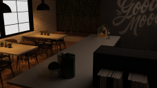
Help about light for render
Hello everyone. I'm new user for Daz Studio, therefore i need help. I'm preparing a scene for evening hours, but I couldn't because the window was white. Whatever I do, I couldn't fix the white thing reflection of window. I've searched a lot of information about that but couldn't find any solution. Even though I changed the time of scene from day to night in "environment" tab, the windows still looked white. I just want to know how to fix this situation. So, I want the window to seems black for the evening.
I, a new user will be happy and be grateful for any helps.


1.png
1920 x 1080 - 1M


Comments
It can be that your evironment is set to off. In that case a solid background color gets rendered.
You can activate the dome drawing in the environment tab.
... or maybe your environment is set to "scene only". In that case the emvironment does not get rendered and does not contribute to the lighting.
You want "Done and Scene" in your case.
You have my gratitude, thank you so much for helping me.
You are welcome.
There is one more setting that can be relevant:
Beside the dome in the render settings environment there is another panel also called Environment (it is a bit confusing in DS to have two sets of settings which are called the same). In case it is not visible in your interface you can activate it via [Window] -> [Panes].
If that Environment is set to Backdrop it will replace the dome drawing. This backdrop can be a solid color or a texture. If the Visible in Render switch is on then this backdrop will be visible and not the one from the environment in the render settings. But you still get the lighting from the render environment settings.
You are my hero!
There are two questions in my mind about that environment and backdrop settings:
First one, which resolution should I choose for outdoor shooting? I want to use in backdrop by the way.
Second one, backdrop photo is rotating along with the camera angle if i tried to use it. In fact, I do not want to rotate with camera angle, do you know how to stop rotating it?
Thanks in advance!
Welcome to the world of 3d rendering. It is a Hydra - once one question got answered at least two new ones grow up.
Backdrop and resolution
There are two aspects to consider:
Resolution:
We like to have image files with resolutions that deliver sufficent detail in the final render result. In case of the backdrop we need to know that the image assigned to it gets squished to the render resolution. E.g. if the render is set 1024 x 1024 pixel then the loaded image gets adjusted to that resolution even if its original resolution is different.
The first render example is 1024x1024 pixel and the image in the backdrop is 256x256 pixel. Issue is that the image does not provide enough detail because of the low resolution - It looks blocky.
For the second render an image with 1024x1024 pixel was used which is the better decision in this case.
I dare to say that in case of backdrop usage the image should closely match the render resolution. But if the backdrop image is anyway a blurred one e.g. like an out of focus blurred backgound picture it might work with a much lower resolution.
Aspect ratio of your render
This one is relatet to resolution because the x and y resolution define the aspect rato. If we load an 1:1 image but have a 2:1 render then the image gets streched to fit the 2:1 ratio.
Render 1024x512 but image is 1024x1024
Render and image are 1024x512
The background images I made for the test.
Regarding the backdrop rotation. There is no way to stop it from doing this as far as I know.
That's the reason the backdrop can be of limited use sometimes. But we can use a simple plane and put the image on that one. This plane can then be handled like any other element in the scene.
[Create] -> [New Primitive...]
Scaling direction and rotation depends on what Primary Axis you used when creating the plane.
Limitation of the image plane:
It blocks light. An image plane is normally like a solid wall. Light from the environment or other sources does not go through (the backdrop does not have this limitation).
But you can be tricky and make the plane a light itself. Any geometry in DS can be a light source. Because the plane is geometry this can help sometimes.
Anim, best wishes for you, you are a noble hero!
Thank you so much!
Thanks and happy rendering.
I can sympathize. That set is a PITA to light. Ideally, you want to light indoor spaces realistically with "functional" lighting, i.e. window light and light from lamps, candles, etc. With the lights in this place, I don't know how anyone gets any work done.
Like @Sevrin wrote - I just quickly dropped a few candles into the scene and mixed environment, imageplane and spotlight plus a few adjustments in post.
I think in the end it is about understanding the basics and then mixing everything together.
Not: The render contains objects of different sets.
As I wrote in the other post. Once one detail got solved others kreep up