Z Sauna Room and Poses for Genesis 3 & 8
 Mr_Fluffkin
Posts: 128
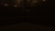
I bought this sauna room(https://www.daz3d.com/z-sauna-room-and-poses-for-genesis-3-8), but the lightning seems to be broken in the preload scene. All light sources are superlow on intensity, they barely give a little glimmer. I dont think this is how its meant to be, since the product is advertised by "It has been packaged in a way to make it very easy to use, so when you get ready to make your first render, it just works every time". I know i can increase the luminance by myself, but a update would be very welcome.
See the attachment, thats the untouched preload scene.


sauna.png
1920 x 1080 - 2M


Comments
The Preload just loads the objects. Is there an icon for "Ready to Render" or similar? That will (should) load Tone Mapping/Environment settings customised for the scene too.
As an aside, what are the emissive settings for the main light source? If they're at the default 1500 lumens, that's 100w equiv at the default luminous efficacy. so you can set your own Tone Mapping settings to shutter speed 1 and f-stop between 2.2 and 2.8 for a reasonable starting point and tinker from there.
Long story short, light settings probably not 'broken' but tone mapping needs loading/adjusting.
Hmmm, then it´s the first environment product i bought where i have to adjust the environment settings manually, to even see anything. But you´re right, there aren´t any default render settings coming along with this product. Lights are at 500000 cd/m^2, candles at 1000000 cd/m^2. Increasing tone mappings cd/m^2 factor to about ~7 makes it look pretty similiar to the product images, so i wonder why the light defaults arent´t much higher by house? I think it would be quite sensible to adjust the lights to something, that lets you see the environment with Daz´s defaults render settings. I mean, this product comes with its own lights, so why do i see a black screen when i hit render with Daz´s default render settings?
Does it rely on a headlamp being switched on? I notice that it is an older package, so could have been assumed normal at the time.
Regards,
Richard
((Loads the full scene))
Wait, this thing has no treefeeding DOOR? Just WALLS? 0o
((Hides the front wall to get a better handle one what he's dealing with in there))
((Creates a camera, moves it inside, unhides the front wall again.))
((Does a spot render in Iray... toggles the camera headlamp between Off and Auto))
Yeah, looks like it assumes you're gonna have the Headlamp on. I'd try inserting some ghostlights.
((Goes and twiddles with the wall lights))
Actually, just adding an extra 0 to the Luminance values (with the prop selected in Scene tab, go to the Surfaces tab, and in the shader values for Light, look inside Emission) on each of the light fixtures lights it up nicely in there.
((Goes back and pokes it again....))
No, wait, forgot to turn Auto back off on the c--- GAH....
((Adds another zero to the Lumanance on all the lights....))
Okay, that worked a little. You'll probably want to experiment a bit with the Lumanance levels in the light fixtures, in spot render (that is, with Iray view turned on in Viewport) with the Headlamp turned off.
But yeah, adding some ghostlights might be another approach.
You should be able to get a brighter scene by reducing the Exposure value in Tone Mapping. Remember that the default setting of 13 is for an overcast daylight scene.
Yeah, there´s no door or window in this scene, its completly closed.
I tried all your suggestions, but turning on the headlamp isn´t enough, it´s still quite dark compared to the product images. Increasing the lights luminance light up the scene very well, but the light around the lamps burns quite heavy then. Decreasing the tonemapping exposure value seems to do the trick quite well, but also results in strong lightning reflections on the walls, which looks like the wood is heavily varnished. Adding extra ghostlights gave me the best results by far, i think i will stick to this approach. I´m still quite disappointed by this product since i think the lightning should be much better by house, but well...
Really appretiate your effort guys, thanks a lot!