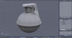
Hand Grenade ~ Very first W.I.P.
 Stubby
Posts: 0
Figured its time to actually post something. Being completely new to all this I'm a little nervous.
Anyway, made this following a Geek at Play tut series. Still have to go thru the UV mapping part.
Ok let me have it... How bad did I do? =/


Granade-AO.jpg
800 x 419 - 60K


Granade-WF.jpg
800 x 417 - 65K


Comments
Hey, Roy, you did real good! - very neat and clean.
Only crit I have have is there is no hole for the pin - maybe a bit of thickness on the handle? but that's minor.
What does the underside look like - do the loops terminate in a pole with all tri's, or have you made them into quads?
As someone who was in the Army, and has actually thrown those things, you did a bang-up job. It's damn near perfect. Well done.
Thanks!
Yeah, I thought about the hole after I posted this last night. He didn't do it in the tut so I didn't even think of it till I was done. Gonna go back and try and put it in. And now that you mention it, the spoon could probably use a bit more thickness.
As for the underside? I could be wrong, still get a little confused on this part, but all the faces(?) along the very bottom have 4 sides so I am assuming their quads. Added a screen so you can see. Then maybe you can tell me, lol!
Thank you very much! :-)
Well done Roy, I followed the same tutorial many moons ago and you made a better job of it than I did.
Thank you, Wee Dangerous John!
Trust me, It wasn't a one time run thru. It took many many tries to get it to where I was happy with it. well... semi happy. Still think it needs a little tweaking. Hoping to have some time tonight to at least start the UV mapping.
Yes, they are quads, but still converge on a pole - this can cause a problem with some renderers. I wouldn't worry about it at this stage, but bear in mind for future - it's good practice to avoid poles by reducing the edges converging on a point to four, as you can see in no 2 in my pic - this gives a nice finish and a neater mesh.
Same goes for caps on cylinders.
This really dates me - in my army time we used the old Mills grenade - chunky, heavy things - well-known as a Pineapple.
Thanks for the advice, RoyGee! I'll keep that in mind for the future. Would you recommend dissolving the edges or deleting them? I remember in one of the tuts I was watching one time(cant remember who's) that one was better to do than the other. Gonna have to go back and see if I can find it again.
I remember the pineapple style grenades. Well, not by experience but the look of them. Was actually thinking of trying it out. Dont think it should be too hard to pull off.
GREAT job, Roy!!
The ONLY critique I have is that the body isn't perfectly spherical; it's slightly elliptical.
Good god, Roy!!! How old ARE you? Pineapples were WWII and possibly korea...I'm 64 and was in from 66-69 and we only had this type. I've never even seen a pineapple with my own eyes!
Like I said, this dates me - I'm 69! Did my time 62-65. The last grenade model I saw was like a small tin of beans - you left it "as is" for percussion, or slipped a steel coil with segments over it for shrapnel - a lot lighter and easier to throw than the old Mills.
Roy G - dissolve. If you delete you'll have holes. The way you cast off is to select the last ring of edges and do an "extract along" inwards towards the centre point . That makes quads between the old ring and the new and tri's within. Select each alternate edge within the circle and dissolve. Repeat until there are only four edges converging on the centre point.
This got me remembering.
I did make a pineapple grenade once.
-
I used it for a Easter picture.....
-
I have actually thrown one of these. Many,many years ago, But it was a dummy, for training.
And if I remember correctly... I failed...
Sorry for just getting back to this. Had a little PC trouble.
Anyway... the UV mapping became a complete epic fail on my part. Haven't given up on it, gonna keep trying. Just a little harder than I thought.
But I did get a little anxious to see it rendered. So I exported it out to Carrara and painted it in there. Just added a few basic shaders to it and dropped it into a lighting preset.
Looking good. :coolsmile:
Thanks! :-)