You can do better
 Hansmar
Posts: 2,999
Do you also have old renders, hiding in your computer, that are OKísh, but you know you could have done much better? I certainly have. I came upon an old render and decided to redo it, not from scratch, but by modification, addition of elements, etc. The general view is similar, but I hope the new version is improved.
So, I thought, would it not be nice if all of us select some of our old works and try to improve them and show the progress here?
It is not a contest, but it is meant for inspiration and to show that practice makes .... well, maybe not perfect, but at least less imperfect.
These would be the rules:
- you select an old render
- you modify the scene without changing it completely
- you can e.g. add elements, change camera viewpoint, textures, sky, lights, etc.
- you describe why and what and how you improved in the scene
- you show both old and new render in this thread; watchers should have no problem to agree that it is basically the same scene
I'll make a start here.
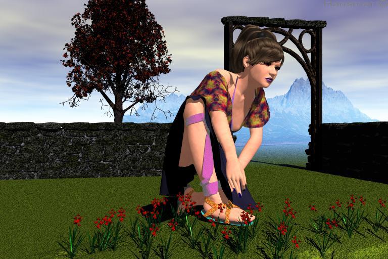
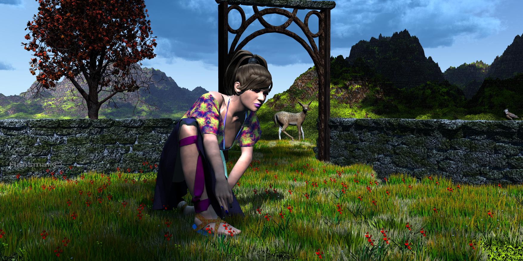
The scene is of Antonia, with clothing I made years ago with Marvelous designer (when it did not have the subscription approach yet), bending over in a garden.
I added lots of grass and flowers via instancing, changed textures on the clothing (removed lots of ambience), added a fawn and a crested tit as well as a copy of the original mountains. I also changed the terrain texture and the sky and I added a volumetric sky slab by David Brinnen. The document setting is changed and so is the camera position. There was already a distant light, that I modified a bit to fill up the shadows a bit.
Here are the old and new render. Tell me what you think and please show your own progress too.


Comments
Hansmar - it is not difficult to see which one is the newer render. The first is a nice try, the second beautiful.
Good idea, I have a few old renders I remade. I looked for inspiration what I could do, found a "so-oh-la-la" scene and redid it, often kept the original or part of it and modified. I keep this thread in mind and go looking what I have already to contribute.
Hansmar - what a lovely idea. The new version is awesome.
I found 25 renders I made twice. I'm not showing all of them at once. I like the idea and hope others will also jump on the wagon.
0185hc Conjunction: made in Bryce 5 on Sep 2004. The curtains are terrains, the water as well. The planets are spheres and above each one a spot. Rendered with Gamma Correction on.
00962 Many Spaces (Conjunction II): made in Bryce 7.1 on Dec 2017. Same setup but the Bryce 5 file is not fully compatible. Materials were changed, one sphere got an atmosphere, some lights added and the spotlights have edge softness. There is no Gamma Correction. More flowers (Lisa), a galaxy in the sky. The Bryce sun could not be rendered visible as in the first version and was replaced by a radial with a glow.
Hansmar : nice idea, the new version is very beautiful.
Horo : difficult to choose, I think I like the one with the flowers most.
~ interesting and Well done _
Horo - both versions are very nicely done, the newer version is much better with the addition of the flowers and galaxy.
What a cool idea. It's a shame that I hardly have any old files. @ Hansmar: The second version is of course much better. This difference is fantastic. @ Horo: Both versions have something, with the second of course looking more mature with more details.
Thank you adbc, ed3D, mermaid and drachenlords.
Horo, They are both very good. I think the flowers and the galaxy are a good addition. In both, I am not convinced by the water from the pipe. I think you can do that better (I probably would not).
Thank you Hansmar. There is almost always something that could be improved.
Long time user of Bryce. Original member of Renderosity. The following image was posted there Dec.16, 1999. Adapted my workflow over the years to using 2D picture objects of .pngs of figures imported from Daz studio instead of importing 3d figures - saving on file sizes, rendering times and also avoiding import issues. Looking at the original pic, I was using a Bryce metal texture on the Poser 3 figure since it captured light pretty well, but I had no real idea of what I was doing. Used a Bryce stone texture on the stone head. Flat plain - so funny to see that now. That and the tiled texture I used on the column to the left - that was from a found texture source which itself is lost in the sands of time. In redoing the image I used a .STL downloaded from the Scan the World project for the main fallen stone statue, converted to .OBJ in Zbrush and w/the standard snowy mountain terrain material applied in Bryce. Four terrains are used w/modified Bryce materials and the floating moon w/aura is a 2d picture object, as is the figure of the woman. So that's the you-can-do-better re-do. This was such a good idea for a thread. This is my first forum post, being only a lurker. I have learned a lot from this discussion forum over time. Thanks for all you're doing here.
mdk1960 - welcome to this forum and thank you for participating in this thread. You certainly did a great job re-doing the old artwork - which is in itself already very well done.
Ah, thank you, sir! Bryce is a godsend for creating artwork, so glad that there is a forum devoted to it!
mdk1960, welcome to the forum. Nice of you to rise to this challenge and show your progress. Very nice idea and great work, specifically on the second one with the terrains.
Ah, and thank you for the kind welcome, Hansmar! I know I'll continue to find new ways to explore Bryce in this forum, I especially like how so many resources have been carefully collected and are easy to find!
mdk1960 - welcome to the forum, two very nice examples and both are nicely done. Hoping to see more you your work.
mdk1960 : welcome to the forum. Both examples are awesome.
Browsing my folders, I have more incomplete work than those I would like to improve on. Here’s one which I entered in a challenge, I think the Resolution one, which I think needs a bit of improvement. I only changed the sky and added a galaxy.
mermaid : The new sky makes the details of the scene better visible. The galaxy is a nice addition.
mermaid - very nice scene, the new one is definitely better. The windows in the buildings are better visible and there are shadows cast on the ground by the chaps and the sky fits the scene.
0247wc Vault: made in Bryce 5 on Apr 2005. Walls and arches were drawn in Visio, converted to grey scale in Photoshop and imported in the TE, so the building consists of terrains. The armour was exported from 3D Game Studio, the lamps were made with spheres.
01236 Mad Passage: made in Bryce 7.1 on Sep 2019. The terrains were kept, the lamps became bulbs, the material was adjusted and three Daz figures added. In front of the camera the EWL (fisheye lens).
Thanks Adbc and Horo
Horo - the 2019 version of the Vault is definitely fantastic, much more details and the EWL gives the scene a cool effect..
Thank you mermaid.
Horo : I agree with mermaid, the 2019 version of the vault is outstanding.
Thank you adbc.
Horo, both versions are very good, but the second one is even better than the first.
Thank you Hansmar.
~ pretty good _
Thanks ed3D.
~ you're very welcome _
Lovely idea Hansmar and great re renders by everyone
here is one from me
original
update using things I've learned since
changed the viewing point added building and derelict car added a background turned off the sun and lit with a coloured radial light ....just to make a plain scene pop a little