Storypath's Tinkerings
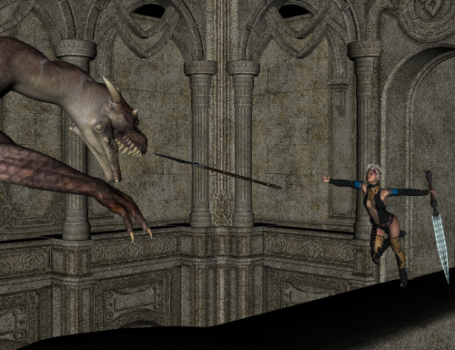
I finally had enough of the ads, and so decided to pick this up and toy around with it for a bit. This is my first render, with the aim being her throwing the spear at the dragon. I'm not happy with the elevation on the weapon, and the angle is a little awkward as well, for both the spear and the shot. On the other hand, at one point I managed to flip the dragon around entirely just by clicking the "Point at" option, so at least everyone is looking in the right direction!


First_Shot.png
500 x 384 - 425K


Comments
And this is the second render I've put together. The female character is the result of me fiddling with the morph options. I prefer Genesis over G2 for that, as it seems that G1 has a little more leeway with things. Unfortunately, I also discovered that my laptop can't handle more than three models at a time, and will autokill Daz if I try to decorate a fourth.
Your first renders are admirable. I especially like how you were able to get the sword to glow in the second render. Have you done any postwork, or were those just the tricks of the light? Also, did you take care of any of the lighting yourself, or did you use the default settings? All in all I think you've done a great job starting out!
Look for reference when you are in doubt. I searched "throwing a spear" and found this Edward Muybridge image which may help you.
http://sillydragon.com/muybridge/Plate_0360/Plate_360_Semi_Nude_Male_Underwear_Throwing_a_Spear.jpg
Your pose indicates she may be running and dragging that awfully big, heavy looking sword, but not that she has just thrown a spear. You might show more of the dragon, try lots of angles. Stand up and try the pose so you can feel how you have to stand to be balanced, position of your arms, legs, hips.
You've taken the first steps in a long journey of 3D art discovery. Enjoy the ride!
I always thought this promo by tentman was a very dynamic spear throwing image. It might inspire some ideas for your heroine.
The lighting is a stock default job that was listed under the smart content. I believe it was one of the designs that came with the program, as it had the art work for the chasm piece as its icon. Not sure which of the four it is.
This one is an idea my fiancee came up with. Originally, the girl in the picture was supposed to be throwing a spear wielding dragon at the pigeon, but to make the pigeon noticeable I had to scale it way the heck up, which meant scaling the dragon up. So she is just summoning the dragon from Hell instead. Not sure why she is glowing as brightly as she is; I went in and played with the lights, with the coloring, but nothing I did could make that aspect go away.
Looks like a corrupt SSS shader; go to the temp folder (default on Win7 is C:\Users\[username]\AppData\Roaming\DAZ 3D\Studio4\temp\) > shaders > brickyard
and delete what's there so DAZ Studio will recreate the shaders.
Good chance that's it. This is an 6 year old laptop which has been hard reset about four times now. I think its actually running Vista...
Two new shots. I've been doing more tinkering with the lights, and ended up doing one with the Bree textures and one without. I'm thinking whatever problem I'm having with the glow is associated with those textures. Not only did I do these on a different laptop, but I didn't get the same glow effect on the shots without lights or without the Bree texture.
More color fiddlings!
As often as I have messed with the color options for cloths, and even some figures, I've never thought of trying that with the dragon.
That is cool. :coolsmile:
I was actually surprised by the sheer number of options available on coloring the dragon. It seemed like most, if not all, of the different sections were unique enough to handle their own base. I've also figured out what's causing that glow effect on some of the earlier renders: its the Bree skin textures for sure. Not sure how to correct it at this point, though.
Just a little summer fun to make up for the two feet of snow outside...