Attempting UNCHARTED 4 Level of Realism
 ShawnBooth
Posts: 465
I just watched this video on youtube about Uncharted 4 and thought, "maybe I could pull that off."
youtube video: https://www.youtube.com/watch?v=70jVUBnp6lQ
Here are the images that inspired me and I referenced (I will also "recreate" the last image in my own way) -
*** I will post the final render shortly. It will be straight out of 3Delight with no postwork (all done in Daz Studio 4.7). If anyone is interested, I'll post all of the details on how I accomplished the render (ie, lights and their settings, props, figures, materials, shaders, etc.)
So welcome to my journey to create something like:
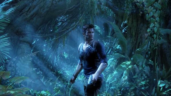

Uncharted-4-Nathan-Drake.jpg
1920 x 1080 - 254K
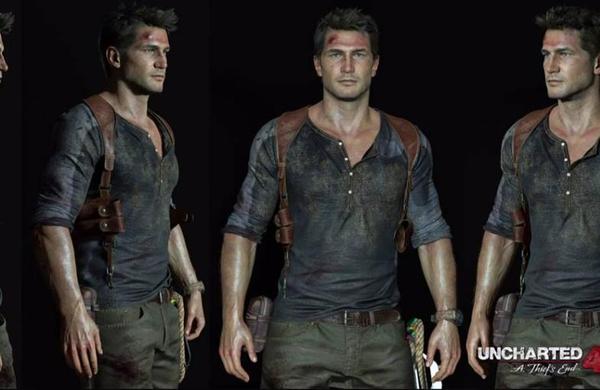

uncharted-4.jpg
785 x 510 - 45K
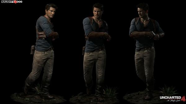

uncharted-4-a-thiefs-end-modelos-de-nathan-drake-hq-pn-n_00002.jpg
1000 x 562 - 64K
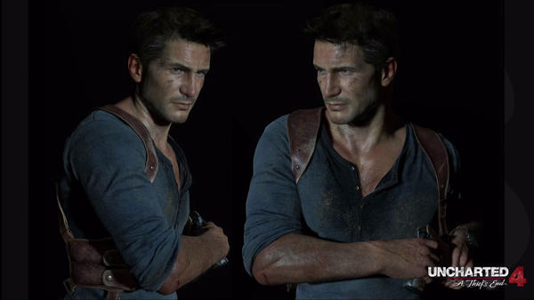

uncharted_4_drake_2up.0_.jpg
1920 x 1080 - 209K
Post edited by ShawnBooth on


Comments
Still tweaking... I wish I had a similar shirt to Drake.
Obviously, without any postwork, there are a lot of limitations to what can be achieved (no excuses). My main goal is to see how far I can push myself within Daz Studio only. I have yet to dive into Reality 4 as I'm comfortable with 3Delight but with this particular render I can see then the need to jump into the world of Reality 4.
Render coming soon (I promise.) I can't wait to get to my version of the jungle shot...
Finally got this render out -
Still need/want to tweak the lights, add sweat and dirt to his clothes and skin... I have a loooooong way to go to get to the original goal of getting close to Drake. A lot is lost in the image size reduction due to the limits of this forum (original render is at 4000).
All thoughts welcomed.
Here's a closer shot of "Bauer" (file name I chose :) )
As you can see, there is a lot of work to do. A LOT. Eyes, skin, gun, a new shirt is needed, and I'm not happy with the lighting.
Just curious if there is a slider for the veins? They jump of the skin so abruptly. Otherwise good start. I watched the video about the making of that Drake character. Looks like much of the texture in their model is the result of bump maps and all? I am just learning... The mesh looked fairly simple as they manipulated it. Curious to watch how you progress on this.
-Rak
I agree, the veins are drastic in places (arms). The achieved everything through both the sculpt of the figure as well as shaders and textures.
Here's a different version -
Yes, one of my favorite game series!
I haven't watched the vid yet, but I suspect with careful attention to SSS and Translucency on the skin you can really start dialing it in.
The shirt isn't an exact match but really the only thing you have to remember is that Nate always has the "half-tuck" look lol. I thought I saw a shirt somewhere in the store that had a half-tuck...
Anyway good luck and I'll make sure to stop back in here to see the progress.
Thank you!
The current shirt can be tucked ;) Honestly didn't like the look though. I'm still dialing in everything (working on the textures to get more dirt and grit, getting the skin right, and of course the lighting...)
(forgive the zombie eyes - playing with settings)
Still tweaking -
Decided to start over and pose him myself as close to the reference pics as I could. Has a lot of fixes and tweaks still...
I like the improvements on the way the pockets fall in the new renders. I can see how not having as advanced collision and gravity/physics system in DAZ, making the clothes have the right sense of weight is a challenge to seeking realism. For example the way the sleeve hovers around the bicep evenly, versus hanging from the top surface. Or the same effect around the thighs with the pants. I wonder how that could be dealt with?
Great points - I'm not sure how to fix. I adjusted the morphs of his arms and the shirt adjusts right along with it, so I believe it's a matter of the shirt model itself. I'm currently teaching myself ZBrush and hope to get into modeling things I wish were available in the marketplaces.
Other than postwork, I don't know how to fix certain details. Would love suggestions.
I'd love suggestions on how to improve any aspect to this render.
I also think postwork is going to be necessary to achieved the final results and fix certain issues.
I use Hexagon because I am not lucky enough to have Zbrush, but I would just send it to either Hexagon or Zbrush and play around with the pants and such to see if I could make a morph that gave a little more naturalistic "hang" to things, like the thighs and pant cuffs. Not sure if you could simulate some gathering at the end of the pant cuff ends... perhaps widen them a bit to match the width of the pants at the calf.
Looks nice!
Speaking of realistic looking games, this one recently caught my eye - https://www.youtube.com/watch?v=ENyIbLd_g48
I think the graphics are just amazing!
And notice how the towel bounces when she walks, dynamic clothing! : D
I have zero clue about creating morphs... Perhaps I should attempt to create the clothes from scratch myself? lol since I am only just now learning ZBrush.
I like this - gonna have to do postwork to be happy though.
Not happy with how it appears online versus my computer (I understand the whys of it).
I'm going to add a couple of lights and do a Reality render with some sort of BG. I'm determined to see this as realistic as possible.
If anyone knows of better clothes out there, please point them out. I don't see anything in the marketplace at this time though. My skills aren't developed enough to model my own clothes just yet. Any and all comments/suggestions greatly appreciated and welcomed, even if it's, "you're way off," "it sucks," - anything to help improve the render. I have thick skin.
Might take a few days away from "Drake" to be more objective about it. I have a comic book to work on anyway.
With some Photoshop touchups/adjustments...
Thanks to the free Newport shirt and some Photoshop to the texture, I'll be posting a new version as soon as render is complete. Also picked up the Real Feel line of shirts as they're 70% off right now. If you haven't already seen DYLAN (in my renders thread), check him out. I'll be doing a couple other butt kickers in the coming week.
http://www.daz3d.com/forums/discussion/46453/ PAGE 6 is where you can find DYLAN.
Very well done! Love the last close up render!
Thank you!!
Here's the current version of "Drake".
I failed to adjust the bump on his torso and ears. Also not sure why there's a line where his neck meets his chest (perhaps the difference in bump between the two?). Also, need to redo the shirt so it isn't straight up black with zero details. Oops.
Any comments and/or crits welcomed. Seriously.
Here's another version without hair (takes 17 min to render this, a hour and a half with hair). I changed the shirt texture (not too happy with it) and adjusted the bump on his ears and chest.
Anyone have any idea why there's a line where the neck meets the torso?
I've also included a screen grab hoping to show what his face looks like up close without losing the details. What I see on my screen is infinitely better than what I see posted.
Next piece of inspiration...
(From The Division)
I'm gonna capitalize of the use of DoF and "lack of lights". It looks like maybe a "sun" and an ambient light/UberEnvironment2 will work quite well. Perhaps I'll add a specular light as well. Mostly, I want to recreate the feel of this image, its realism.
Not even close... I'll keep working on it. Will probably start over completely.
Was this image only for lighting or did you try DoF on it as well?
Here's a tutorial on how it works, if you need it.
https://www.youtube.com/watch?v=4AGMU46mGKs
Here's what happened when I started from scratch. Not happy with it at all. I think the best approach from here on out is to just focus on my comic and go for the inspirational things within my own work rather than copying someone else's image :)
Necklace just ruins everything else.
Was this image only for lighting or did you try DoF on it as well?
Here's a tutorial on how it works, if you need it.
https://www.youtube.com/watch?v=4AGMU46mGKs
Thanks Cris. I actually watched that tutorial when I dove into DoF in DS. For some reason, When I attempt close ups with DoF, like when using an 80mm/100mm lens in the real world, DoF doesn't work very well. Everything is in focus or the BG is barely out-of-focus. This function in DS isn't the greatest but when it does work, it works nicely.
still plugging away in 3Delight...
Shawn, in regards to your post #23, I don't know what's causing the line you mentioned, but I had forgotten to say, unless this is a WIP where you have the figure turned only to demonstrate the texture error, be careful with the placement of the arms in this forced perspective. If you made a silhouette out of that pose, you'd be hard pressed to know what the pose's action was.