Dodgerrecords render thread...
 dodgerrecords
Posts: 123
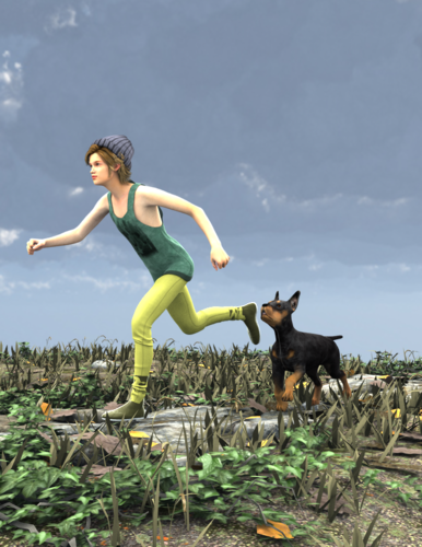
So I guess instead of creating a new thread for every pic, I'll make one thread and post them all here. Here's an image I'm working on, i need to adjust a couple things but I really like it.


the_fool3.png
641 x 830 - 817K


Comments
New one I'm working on :D
I like the pose in the second one a LOT.
However, I feel like you need *something* to make the character pop off of the background. Right now she kind of blends into it. Maybe try using a more extreme Depth of Field with the camera so the background is slightly blurry? Or else toning down the ambient/background light to help the character stand out more. Different colors might help too... right now the browns on the character do not really stand out vs. the earthy tones behind her. A brighter suit might work. Or else a different tone of the building... say white walls or something.
Pretty nice work there so far. That sword the girl is wielding in the second picture is waaaaaayyyyyy too big for her. She can barely grip it with her small hands. Her fingers don't even fit halfway around the hilt. Other than that' I'd say the only problem with it is that her shoulders and hips are still "perfectly squared"when, instead, her waist should be twisted so that her shoulders are closer to 45° to her hips. The pose of her left arm looks a bit "off" too.
I'd say my biggest "issue" is with the first picture though. There is a lot of poke-through going on between the kid's pants and boots.
Hey I appreciate the input! I love the way the sword is so huge, she's supposed to be some kind of super fighter so I figure her grip is so strong that she doesnt need to have it all the way around the handle. You are right about the squared shoulder pose, I think having her free arm pointing downwards will look alot better.
As far as the first one I realize there is poke through, it's not finished yet, thats something I'll have to fix, its supposed to be the fool tarot card, but a more modern version. I love the lighting in these pictures personally, it's the best lighting ive ever done.
Hey thanks for the feedback, I need all I can get! I agree with you about the colors, I'd say a depth of field would look amazing in this pic.
Hey I appreciate the input! I love the way the sword is so huge, she's supposed to be some kind of super fighter so I figure her grip is so strong that she doesnt need to have it all the way around the handle. You are right about the squared shoulder pose, I think having her free arm pointing downwards will look alot better.
As far as the first one I realize there is poke through, it's not finished yet, thats something I'll have to fix, its supposed to be the fool tarot card, but a more modern version. I love the lighting in these pictures personally, it's the best lighting ive ever done.Actually, having the free arm pointing forwards would work better.