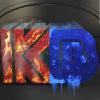
My New Artist Logo
 Kode of Bliss
Posts: 36
I decided to try and make a new Logo for my Music using Daz, this is what I came up with, what do you think?

You currently have no notifications.
 Kode of Bliss
Posts: 36
I decided to try and make a new Logo for my Music using Daz, this is what I came up with, what do you think?


Licensing Agreement | Terms of Service | Privacy Policy | EULA
© 2025 Daz Productions Inc. All Rights Reserved.
Comments
TBH I would suggest changing the "K" ... it looks too much like "I K"
The KB at the top is my old logo, perhaps just remove it from the new logo altogether.
Or move the "I" part closer to merge with the "K" part ... so those that are familiar with your old logo then realize it is still you.
At one time KayBee (pronounced KB, Microsoft also calls their knowlege base entries, KB) was a well known toy store chain so I think your logo does need to be spelled out. As you see though spelled out it is too long for an avatar image.
Maybe you can use a simple geometry outline such a circle, triangle, square, pentagon hexagon, and so on as the visual logo with Kode Bliss inscribed within the outline of the plain geometry you choose?
My real name Initials are K.B., the short story is I decided after I started making videos and images for my music to get a Artist Name and I still wanted to use the videos and images and came up with Kode Bliss.
The old logo uses Forty Second Street Font which has the line in the K. Until you emtioned it I never saw the I before the K. The old logo had a lot of post work on top of the render so I don't relish doing anything to the old logo. Thanks for the comments though.
No problem, you're welcome. I realized it was a type of font - have seen several similar ones ... but that was what my eye first saw it as. Figured I wouldn't be the only one.
All the best with however you make it!
OK, I see. If you pronounce your initials with an accent you can call it Kabbie (cabbie and have a taxi as your logo. )
)