Show Us Your Bryce Renders! Part 9
 Horo
Posts: 10,821
electro-elvis - hair and skin of the lady look goof. It appears that you've mastered them in Bryce.
@Dave - nice atoll.
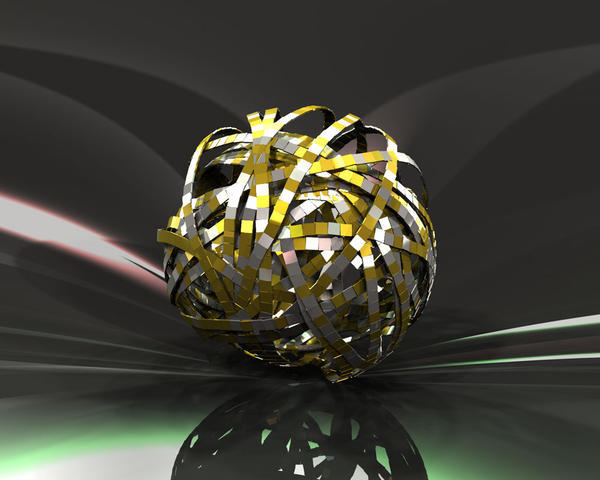
@mermaid010 - have you noticed that the ball you showed on the previous page consists on two meshes. Here I gave them gold and silver.


RibbonBall.jpg
1000 x 800 - 90K
Post edited by Chohole on
This discussion has been closed.


Comments
Horo- beautiful render. No, I did not know that the object had two meshes. Maybe the other models have different meshes too Thanks for the info :-)
@mermaid010 - thank you. There are only 3 with more than one mesh that I discovered. Arc Sphere has 3 (the one I used in the render on p.94 previous thread); Ball (this one) has 2 and Default has also 2.
Horo- I will look at the other models, but this one that I used for this render has lots of meshes.
My attempt at Bryce 10 minute material project - using the rainbow texture and scene converter - by David Brinnen using an object from Structure Synth. I don’t have the Scene Converter, so I made my own Hdri using the rainbow material on a ground plane and exported it as Hdri.
Looking nice. By the way, I have a free rainbow probe on my website: Raytracing > Resources > HDRI Page 2.
@TheSavage64 - RandomHills is beautiful. Realism!
@Horo - I found your work with lenses pretty amazing. I need to study that more. Thank you for your advice on the Fool on the Hill image below.
@DavidBrinnen - Your Bryce 7.1 video about grass plains using Leopard in 2D at 90Deg works well in Bryce 5.5 as you can see below. This one could be tuned better, but I thought I was done with this until I looked at your video and realized this image was a good candidate to try it on. I'm done, now. Instead of your method, I duplicated the existing terrain, copied the bitmap into Paint Shop Pro XI, and used the "Add Noise, Monochrome, Random at 100%". Then I used the terrain editor to "lower" that, and finally lowered the duplicated terrain on the Y axis about 5BU. I tried to use the Bryce terrain editor to add the noise, but got cones. Using PSP XI, the loss from 48bit to 24bit does not matter in this case. (Or is it 24 bit to 16 bit? I get confused sometimes, but you know what I mean.) I also modified the colors of the existing terrain material for darker greens and browner yellows.
Have spent the day re-doing the material and lighting on the Crater Island... Added more vegetation while I was at it.
Done now I think. 3 and a half hour render.
Thanks x2 for the comment and the probe, downloading it now. I checked the objects which I saved from Structure Synth only the Ball and the Arc Sphere have few meshes, my version of the Default has many meshes.
Using the terrains to create spikes for grass and also for distant trees (that can be done too) is not a bad idea but it has a few limitations - well as does any approach you might take really - grass, fur, trees, hair... are not really that render friendly. The best you can hope for most of the time is creating the right impression. For fine structured surfaces like fur and hair, anisotropy might be called upon. For grass and trees there is the option of approximating the structures with geometry or and and/or using materials and transparency. I've not made exact measurements but I know from experience the closer you get your camera to the subject, the less of an impression you can get away with and the closer to simulation you need to get. And the cost of this is a steep ramping up of render times. Particularly as you have more light sources. As someone who likes to have everything in one scene and not resort to building scenes up on layers (unless it is a commercial project and then that is necessary) the price is usually paid in the fine tuning of the components even more so than in the final render times which are often measured in hours. As they say, "There's no such thing as a free lunch". As it seems you've also found.
Something new for today :)
nothing like a little light gardening at the weekend. :coolsmirk:
@Chohole - You're funny!
@Tim Bateman - Really cool idea. You sure make good use of material. I also admired your lantern, and cars ... speaking of good use of material.
@TheSavage64 - Nice atoll. The shadows work well.
I decided to have more fun with EmotiGuy. This uses ELEMENTS, (nudge, nudge Chohole), from EmotiGuy and Safari Starter for DAZ 3D, and Bryce Pro Volumetric Fireballs and Bryce 7.1 Pro High Resolution Terrains - Set 4. I used Paint Shop Pro for the grey scale bitmap for the text applied to symmetrical lattices in the word bubbles, and to create the black and white data for the 2D picture objects for the shadows of the audience. This was rendered in Bryce 7.1 Pro, with no afterwork, other than the conversion to JPG for uploading, (since I rendered in BMP), which I also used PSP for.
@ CTippetts, thank you :) ....and that is a very cool little comic strip you have going there :) ....great job
something else new for today :)
@CTippetts - thanks. The clouds got better. Grass can also be made with trees. Look at the foreground grass of this image Pond in old park by Slepalex and read his comment below how he made it.
And I like your comic, well done.
@Dave - the Crater Island looks really great.
@Tim - that's a really beautiful render - the land in the bulb, the newest is also nice.
CTippetts - The clouds look better. The comic strip is so cute.
Dave - the Crater Island looks really nice now.
Tim – both the renders are great.
Another attempt at Bryce 10 minute material project - using the rainbow texture and scene converter - by David Brinnen using an object from Structure Synth, and the rainbow probe from Horo’s site. Horo this is the default model, with countless meshes.
ETA; David has a tutorial at Bryce info Grass Tree Recipe
I thought i would share a work in progress :)
ooh nice. Look forwar to seeing where you go from there.
The main thing in this scene are the sunglasses. I modelled them in Hexagon. Harder work than I thought and still a WIP.
@Tim Bateman: Wonderful and atmospheric WIP
Salute to you, Vulcan...you lived long, and prospered.
Jay
thanks for the nice comments :)
@Electo-elvis, your glasses turned out great, awesome job :)
@Jamahoney, thats a interesting and cool looking render, nice work :)
here is an update for the previous image i shared, its no where near completed...but i am liking how its turning out so far :)
@mermaid010 - looks very nice.
@Tim - beautiful.
@electro-elvis - nice render, not only the sunglasses. I congratulate you to your Hex success. I haven't mastered it yet.
@Jay - well done.
@fzr999: wonderful model and good render. It will be difficult to get into that lighhouse, but now it is burning down anyway.
@Fishtales: I like your new lighthouse render (what it that with lighthouses; is that our new theme?)
@TheSavage64: Lovely little pony and jig saw render. And great landscape. The atol is wonderful.
@kevinodwyer: wonderful abstract! Keep going!
@electro-elvis: She looks good. Very good pose in both renders. Sunglasses look OK to me.
@Tim Bateman: Love your landscape render(s). Great small garden. I guess if you put it into the socket, there will be enough lights for the plants. The armour looks good.
@CTippetts: Great little comic!
@mermaid010: strange form, but nice render.
@Jamahoney: Nice dedication.
Here is a new abstract (sort of): Abstract space. Pure bryce work.
A very different version is here: http://hansmar.deviantart.com/art/Abstract-Space-513940903
Cheers, Tim...I could do well right now with a relaxing place like that.
Love the shadows created by your glasses, Elvis - a slight transparencey to the glasses's glass might show the girls eyes a bit, not too much, mind, as some glasses are very dark indeed?.
Thanks also, Horo ;)
Yeah, Hansmar...he'll be missed, but at least we still have the old archives. Nice abstract - kinda like craters and a planet in mind.
Jay
Thanks Horo and Hansmar
Tim - really beautiful
Electro-elvis - nice render, the sunglasses, look great.
Jay -nice render
Hansmar -lovely space render, love the colors of the one posted at Deviantart
Using David’s simple landscape scene from Hdri4fun pack to try something different, I used a reflective material on a sphere. The buildings are from the Dystopia City Blocks.
@ Mermaid, that sunset looks really nice :)
@hansmar - interesting subject. Looks like Uranus and below a cratered surface.
@mermaid010 - good idea with the reflecting sphere. Great render with the double sun.
I've been experimenting a bit with instancing trees. There are several hundred in the dale with translucency on the leaves. I've also been experimenting with portraits. Here Aiko 3 LE with the materials adapted. The first in front of the SmallWorld1 HDRI with the HDRI light for ambient and the sun as key. The second is a true render with natural light. The HDRI provides the backdrop and all the light.
@ Horo, very nice renders...the forest one looks amazing!!! ....very nicely done :)
Great work, all!
Just a couple of quick renders.
Blue/aluminum dragon is a curvature metal experiment I'm working on.
A closeup view of the infamous iron ant. Similar to carpenter ants, but they only work with metals!
A twisted dodecahedron covered with a bark material from David/Horo's Vegetation product. Looks like newly laid asphalt to me, so I added yellow road "markers" along the edges to define the road. I call it the "Road to Dodecahede". :)
Another curvature metal experiment (rusted aluminum), but I'm not sure I like the amount of reflection on the metal. Too much and kinda takes away from the rust in the curves. Will play with this some more.
Thanks for looking.
Art
I had a bit of fun today with one of stonemason's models in bryce, slightly modified :)