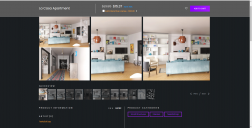
Hoping this new product listing page style is not final.
 MeneerWolfman
Posts: 429
MeneerWolfman
Posts: 429
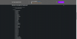
While I'm all for refreshes of the website, and some of the recent ones have either been nice or at least neutral, this new product listing page design is highly inefficient. I have to scroll through about three pages of text and even wth the collapasable sections, it's still way longer than the old listing. Also the listing the included items one at a time vertically seems like a lot of wasted space. To me at least, it also seems way too busy.
Hoping this is just a prototype.
Daz 3D is part of 
Connect
DAZ Productions, Inc.
7533 S Center View Ct #4664
West Jordan, UT 84084
Licensing Agreement | Terms of Service | Privacy Policy | EULA
© 2025 Daz Productions Inc. All Rights Reserved.
Comments
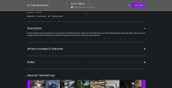
I heartily agree. The new design is a horrendous waste of space, especially for those of us who work on a laptop, where screen real estate is already at a premium. Navigating this layout is ridiculously inefficient. Also, we're now back to the old image issue of having both the full size and thumbnail versions of the main promo art show up in the image gallery. Please change it back!
I honestly thought the page bugged out. Then I realized this was the new design. I'm all for a darker theme (I don't have the best eyesight, so I usually prefer darker themes) but it seems like it requires a lot more scrolling than the old layout.
No one would believe it.
Your entire store is portrait images, but we can only see the images in ultra wide landscape.
https://www.daz3d.com/forums/discussion/543816/daz-website-improvements-and-updates-discussion-thread#latest