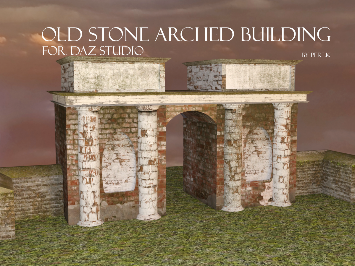
Old Stone Arched Building
Free over at Deviant Art or Renderosity, I modeled this building in Hexagon.

https://www.deviantart.com/perlk/art/Free-Old-Stone-Arched-Building-for-Daz-Studio-903954185
https://www.renderosity.com/freestuff/items/90717/old-stone-arched-building-for-daz-studio
As with everything I make, if it was perfect, I'd be selling my models, so you'll have to live with the fact that it is not high quality! I find texturing particularly difficult to get realism with free stuff. It would be good for distance shots, though.
Enjoy.


building-promo.png
1200 x 900 - 2M
Post edited by perlk on


Comments
Thank you very much for this.
Nice building, thanks!
That looks awesome, thank you!
You're welcome!
Gallery link
That looks great, Hylas! I love the lighting!
Tahnks, this looks great
I hope you don't mind if I make some comments. They are intended to help future projects be even better, not to criticise or make this one seem terrible, because it's great. I do like it, and know that my current equivalent project is a bit stalled through a lack of gumption.
Right, the brick size is a bit huge. In reality bricks including mortar tend to be 9" x 4.5" x 3" (225 x 110 x 75mm). The main bricks are HUGE in comparison, looking at 8"/200mm high. The 'Stones' in the pillars don't look like bricks, so can be believable the size they are. It may be worth scaling the texture so it can be closer to reality. The thing I tried was to tile the texture. Oh dear. That didn't work. It may be worth trying to use a seamless texture for bricks so that it can be tiled by the user.
Next comment. In your original texture, the mortar aligns around a corner. This is great. If the user, however, uses a different shader, then due to an offset in the texture mapping, the shader bricks don't match up around the corner.
OK, that's enough comments, now to show it in use. I used UltraScenery instead of the ground, and used some Victoria 3 based characters to remind myself how good they can be in iRay. Then used the 'Sunflowers' HDRI from PolyHaven as the background.
Regards,
Richard.
Yeah, it's not the best. I'm still practicing texturing for sure. I realized these issues but I couldn't figure out how to best solve them. I think what I will do instead is try to set textures in DS (as you suggested) rather than try to map it using Hexagon - unless I am making clothes. That's what I did with my Tuscan Dinner scene and it worked out better (although still, there are lines and gaps in places).
Thanks for the feedback! Your render looks great.
Map it, that is vital, but try to keep each panel of brickwork separate and mapped flat so people can apply a tilable map there and repeat it as needed.