Daz 3D is part of 
Connect
DAZ Productions, Inc.
7533 S Center View Ct #4664
West Jordan, UT 84084
Licensing Agreement | Terms of Service | Privacy Policy | EULA
© 2025 Daz Productions Inc. All Rights Reserved.
Comments
To me they just obviously look like CG characters as in video games or a Pixar movie. They are not realistic enough to have an Uncanny Valley look. Uncanny Valley refers to an attempt at realism where it almost looks real but there is just something slightly off but yours are obviously toons.
Thank you so much for saying everything you've just said!
All these replies have provided me great relief!
Thanks everyone!
I don't know if this will help with "uncanny valley" problems, but here's one tip if you want the pictures to look more like the ones your friend posted.
Think about background seperation. You want your characters to stand out from your background (unless the details in the background are specifically important). one way that has been mentioned is depth of field - you should use DOF almost always, even if just a bit (but sometimes you can use a lot of DOF too... just experiment).
Another way is lighting. That's a fairly complex topic but one thing you should try sometimes, is to have the background slightly darker than the characters - this helps with background separation and it's something that you can see in the pictures your friend posted.
It's so subjective and really depends on what we're used to seeing.
I don't really get "uncanny valley" but I'm fairly certain my boyfriend would. He isn't interested in CG art, doesn't play video games, and rarely watches CG animations.
In any case, I do think the image leaves space for improvement... no disrespect, you are looking for critiques, right?
- Melanie has a very strange expression, and Sophie as well to a lesser extent. I find that getting Genesis to emote is one of the harder things to do in DAZ; the "bigger" the emotion, the harder it is to get right. I like Soft Expressions 2 by P3Design but that's only for subtle smiles. The best "big" smile I know of comes with Akemi by dieggomasamune on Renderosity. I'm lukewarm on Akemi herself but her smile looks great on most characters I've tried it on.
- The lighting is rather flat. That's actually not unrealistic, if realism is the goal... I've been in many flatly lit kitchens. But perhaps for the sake of aesthetics you could try something more dramatic, and/or flattering?
- The scene just doesn't make much sense. 3 ladies standing in a row, in a kitchen, for no apparent reason... one looks kinda angry, two of them are smiling. All of them are looking at different corners of the room, there appears to be no one single thing that holds their attention. Nor do they seem aware of each other. One of them is... presenting her breasts? It's just a bizarre set up and I think part of what makes the image look "off" is that it's not telling a story.
I hope some of that was helpful, good luck!
The biggest problem with the image is Melanie's shrink wrapped clothing. Run a dforce simulation or change the clothing model to something that will adapt better to the extreme silicone. Both her pose and expression could be more subtle too. The arms up like that just looks strange. Sophie in contrast, comes across far more balanced and "real" even though her smile expression is bascially the same as Melanie's.
Whether your friend is using the uncanny valley terminology appropriately is a moot point, there are certain things that draw the audience's eye to the 3D shortcomings of this medium. Dforce isn't perfect but it can help. Poses and expressions are the other tools available. Then of course lighting and composition. Once you finish the couple thousand renders for your visual novel you will have most of this sorted out.
To me, it looks like it HAS been simulated, but the chest didn't react to the simulation due to how the shirt is weight mapped.
I think we here are also so used to look and feel of the genesis characters, so we don't necessarily see them like someone not that familiar with them.
But, comparing your picture to the one you were given for a sample, yours tend to look "sculped with an ax" (local saying) especially Melanie, where the sample women are softer and rounder in their facial features
This.
Always funny how gamers playing a "fantasy game" will get hung on this isn't real, WHILE ignoring all the other non-real stuff that they happen to like.
DAZ is awesome because you can create any new reality you want, and it's just a question how much money and how much work you want to do for an audience.
"Reality concern" comments dismissing this and that are as common as flies and sunrises everywhere.
Special characters in file names can cause that. Use alhanumeric, hyphen and underscore only.
Only ask for an opinion if you want to hear bad stuff - as well as some hopefully good.
No matter how nicely someone puts it, criticism is tough to hear.
If you don't want to hear bad stuff - why waste your time asking for opinions?
Mwokee's response WAS uninformative, though:
What is the OP meant to take away from that? How does that help them improve the character? Mwokee doesn't even articulate what the actual problems are, just saying that they're obvious.
"Uncanny Valley" has become one of those words that people throw out there although they really have no idea what it actually means. Your renders are obviously stylized figures and wouldn't trigger an uncanny valley response anymore than Woodie from Toy Story. Even highly photorealistic renders don't tend to trigger an uncanny valley response because if you thought it was real and someobody had to point out to you that it wasn't then you weren't triggered -- the image passed the photo-realism test.
Here's an odd thing I've noticed about perceived realism: I can work on a scene and decide that it looks good - it looks realistic and I'm sure that anyone else looking at it would agree. By the way - I don't show my renders to anyone else so I can never check that. However, I might still have the image a month later and I open it and think - how could I have ever thought that looked realistic? It looks like what it is - a 3D render of simulated humans.
That's one of the reasons I delete most of my work shortly after completing a project. The main fun for me is in working on the project - it is my creative outlet and it keeps my occupied for hours every day. When I finish a project I might look at it a few times but I generally can't wait to start the next one. The old one usually gets deleted pretty soon although I might save some scenes for future use, perhaps with different characters. The old renders are never satisfactory.
There's an artist who posts examples of his work in a thread here about photo-realism - you've probably seen that thread: the young women are usually situalted in their room at home and the images look like selfies or taken by a friend with a point-and-shoot camera. That's the kind of realism I strive for but I'm a long way short.
I think many times what people confuse the Uncanny Valley with just bad modelling. When a character just looks fake or somehow grotesque ir not human, that's bad modelling. When a character looks human enough but yet it still tells you nothing about the character's emotional state, that's the Uncanny Valley. I think I remember reading someone that it doesn't come from the fear that your friend had been replaced by an alien (why would it), but rather that you can't tell whether a stranger from another tribe intends to kill you or cooperate with you.
It's about the ability to infer what someone is thinking and intends to do from their face, not necessarily how human the face looks.
One thing that makes characters look unreal and creepy, is when they are not looking at anything. ie. having a "thousand-yard stare", especially in a scene where they are supposed to be interacting with other people or objects.
I often use "Eyes Crossed" at 10-15% with "Point at" to give the characters some brain activity.
Sorry, but I disagree.
... Did you see the shrink-wrap around the breasts; no way should that strike you as being realistic in any way or form.
I'm presuming that is what he was alluding to. It may be common in Dazland - especially before Dforce - but is still not unusual even now - just not to anywhere near the same extent.
I not only saw the shrinkwrap around the breasts, I've made multiple comments about it already, including in my initial post about it. And the way mwokee's post is worded suggests that they're referring to something about the FACE that is obvious, but again, doesn't say what that is.
If someone asks "what is wrong with this?" and you say "it's obvious what's wrong with it", then you are being uninformative. I don't see how you could possibly argue otherwise.
So I actually was in art school for a little while and critique is one of the fundamentals you learn. Most people don't really know the groundrules of how to critique. And that is not a critique in and by itself, but I feel it is something you need training in as well. However, when doing it, the most important parts are :
- Be specific ("It sucks" is not a critique, it's an emotion / attack)
- Place it in its context (an abstract art can't be critiqued for it's lack of realism for example)
- Consider the experience or background of the creator (I can't talk to a beginner painter about the specifics on Rembrandts Oil Techniques)
John Cleese has made this great comment :
“In order to know how good you are at something requires exactly the same skills as it does to be good at that thing in the first place,” Cleese elaborates, “which means — and this is terribly funny — that if you are absolutely no good at something at all, then you lack exactly the skills you need to know that you are absolutely no good at it.”
You can't know what you don't know.
Before you mentioned the PA, I was going to bet 100 Units that Melanie was a Krashwerks model.
All of that PA's models look incredibly similar, and to my eye... kinda pastic surgery fake. On Melanie, there seem to be too many flat surfaces on the models face... forehead and cheeks, coupled with the tightness yet fullness around the mouth that make it look too much like a bodybuilder prepping for a competition.
When your scene adds a bunch of bright light, it only highlights any "not quite natural" aspects, and I think (my personal opinion) that is where it is starting to drift into UncanyValley.
I have A LOT of Krashwerks models, but I tend to just dial them in a bit, and not use them straight up. If I need to make a character slightly more fitness-like, I give em abit of Krashwerks... not so much the faces though.
I'd play with the lighting a bit... or maybe change her smile....
Lucy looks really good, and Sophie is a typical fashion model Daz beauty.
I'd be curious if you could tone down Melanie by using a different skin... (or try it on Sophie for that less than perfect realism)
Anything from Bluejuante or especially IsourceTextures has some really good natural beuaties, warts and all, so to speak...
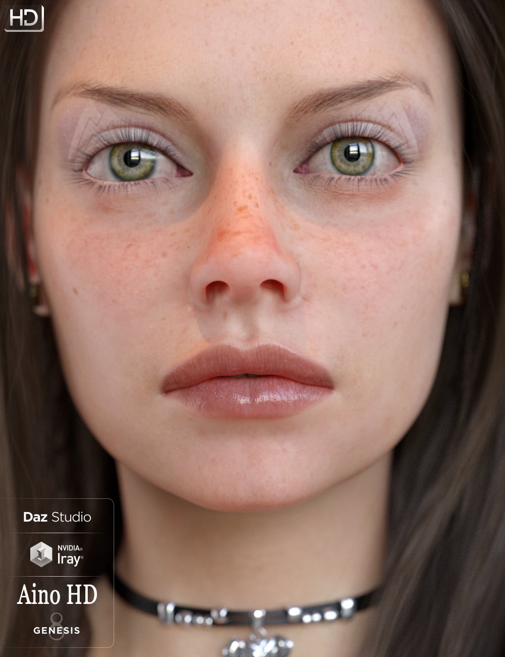
Here is Aino, as an example
The danger of realism, is that once you go down that path, the human eye is very unforgiving and picks stuff out...
If its slightly cartoonish, it covers a bunch of sins, and allows the mind/brain to establish that its not real, and allows you to deal with it and go on.
If your customer is happy, then that is all that counts really, but count yourself lucky that your "friend" is friends with you enough to make constructive critisism... and not just say, "Yeah, its great".
I do think the DoF is the biggest issue with the image, and maybe also the camera distance. The models look sharp, except for some details like Sophie's hair, which looks a bit fuzzy. But then the background is razor sharp again. Overall, it's almost like the models were photoshopped on top of the background image, or somehow floating in front of the background. I won't say it makes me nauseaus, since it doesn't, but it does give me a strong sense of "that isn't right, they somehow don't belong where they are". For people less used to rendered images, this is harder to pinpoint, they'll just feel that it looks realistic yet at the same time doesn't, and since the models are the main subject, blame them.
We'll have to agree to disagree; I do see, how I can argue otherwise.
That is probably exactly how the image is built. It looks like a Visual Novel screen, and each element is assembled individually in front of the background in that type of game medium to reuse and save on memory. So each character is its own png render, and then placed in the foreground on layers and then assembled for that panel with dialogue added as necessary.