Making it look like a photo
 whispers65
Posts: 952
whispers65
Posts: 952
in The Commons
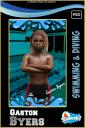
Is there anything, a technique of blending or something, I can do to make the figure appear more in the photo as opposed to just superimposed on top of it?
This is one of those expectaions vs reality issues. I have grandiose ideas on how things should look, but having the talent to get it that way is entirely different.
SwimmingTemplate.jpg
1200 x 1800 - 936K
Daz 3D is part of 
Connect
DAZ Productions, Inc.
7533 S Center View Ct #4664
West Jordan, UT 84084
Licensing Agreement | Terms of Service | Privacy Policy | EULA
© 2025 Daz Productions Inc. All Rights Reserved.
Comments
you have a blue light as a background and a white light on the figure, matching lighting would help to blend the scene. that could be done in gimp or photoshop ofc. other than that is also out of my talent range.
i also think there is a way to put pictures in the background of the figure so it gets rendered all at once but not sure how to do that.
-Compression, filtering, scaling and resizing: the background image looks like it went through some processes, changing its appearance. The super imposed image should look like it went through similar processes, or you'll get a difference in how well defined one part is compared to the other.
-Lighting: you'll really want to match both the lighting angle and colour of the super imposed image to the background image. Maybe not identical, but a bit of a green/blue hue in the highlights might help.
-Angle and scaling: This wasn't too noticable in this particular image, but the angle and scale of the original image needs to be taken into consideration when rendering the model you want to superimpose. So at least in this image, it seems like you have a pretty good feeling for getting that part right.
It is usually very noticable when a rendered figure is displayed on a photographed image, which is why I really prefer to render with rendered backgrounds, possible splitting the two up into seperate canvasses or renders, so I can still photoshop the figure and the background seperately, but generally speaking, you'll get better results combining rendered material with rendered material, and photographs with photographs.
Very good point. Thanks. I didn't even think about that.
Spot on. The background image was too small. I didn't even finish the render on top of it because I wanted to do what I call "proof in concept". So I was throwing things together to see if I could make something that half way resembles a sports card, not that I even considered what you mentioned. After all of these years, I wish I was better at this stuff, but I'm just not. it's fun. it's a hobby. I did have to rescale both images. I'll go back and re-render and specially try to get the dimensions right without having to stretch and rescale so much. Thanks.
Good point. I didn't even think of the mismatched light. I just knew it didn't look right.
I was wondering about this and almost used a real photo and render together, but in the end, I decided against it. For this project, I'd like to do as much as I can myself to learn more. I don't think I'm going to go as far as to create my own font or anything, but I want to try different things.
The idea, framing and posing seem like you are headed in the right direction. The most glaring for me is how plastic his skin looks and the lack of details to his form (his skin looks unnaturally smooth, the hair probably needs to be expanded or you should go back and touch up the black lines in his forehead, and his eyes seem dry and not varied enough to be real (most eyes tend to have varying shades- not just white and some reflection/ light in the iris)).
I think the angle of the pool and the kid standing seems a bit unnatural if it were supposedly him AT the pool when this photo was taken. It makes me think of school photos where they add backgrounds later- which I think works especially since the lighting is very different between the two. Personally I tend to think of pools and extention beaches as places with a lot of light and warm colors so I think I would reconsider all the black and replace it with blues or another lighter color. Just my $.02. As is, I wouldn't think real kid but I would think nice rendered art :)
Thank you. For the lighting, I used an iray full body predone thing. I suck at lighting in general. I so need to get better at it. I did try and do a render with the kid actually at that pool scene, but it came out really dark and I just don't know enough about lighting to get something that looks good. Rather than super impose the kid on top of the rendered pool. I'll try and see if I can figure out better lighting. It's okay, but not what I'm looking for. I'm with you. I don't think the skin looks very natural to me. Now, that I have at least a template to go by, I'll work on the details and see if I can make it look better and more natural.
Oh something you mentioned about all of the black, since I'm planning on doing multiple sports....i.e...football, baseball, soccer, etc, I was thinking of each sport having a specific color scheme. since this one is swimming, I should probably try the bluer colors instead of the black.
Okay, here is the 2nd try....well actually third, but we're not talking about the first one lol. I'll pretend that one doesn't exist. Here's what I did:
1) Skin - I switched skins. I don't think the other one was iray and I don't really know how to make it so. This one is.
2) Hair - Resized the hair just a tad and it got rid of the artifacts around the forehead.
3) Color Scheme - I change the color from black to blue. I think it goes with water better anyway.
4) Lights - I parented the lights to the figure and imported them into the pool scene. This time the character and background image were rendered at the same time. I got impatient and stopped at 50%
5) Text - I finally figured out how to outline text.
6) Eyes - I changed from whatever the default was to the new eyes. Gives it more color and hopefully more "lively".
Wow this is a huge improvement. Now comes the much harder part because you have to get really nitpicky. Some suggestions- feel free to use some or none at all. If I were doing this at this point I think I would work on the eyes- make the overall size a tad bigger to match the childlike body- and decrease the amount of space the iris is taking up. I would also consider what level of subdivision he is at and maybe a less mature skin? He works so much better with the background now but to make him stand out a little bit I would probably turn on depth of field in the camera and also the denosier at different iterations to see how that works. Not sure what your pc specs are but creating beauty canvases to separate the main character and background elements for editing in PS has helped me tremendously. Love how the blue made this look so much better!
Thank you! I really tried to take everything in consideration. I've never messed with eyes before, other than clicking on a button to change the color, so this will be interesting. I'll give it a go. I'm also not sure about the subdivision part. I'll need to learn about that. As far as mature skin, I really don't have anything else, unless I have something in the genesis 3 line or I could use a female skin right? It's funny, I had the depth of field on first, but I didn't like the look of it, unless there is a way to make it not as extreme. I'll see what my options are.
My specs for my ancient PC:
Processor Intel(R) Core(TM) i7-4790 CPU @ 3.60GHz 3.60 GHz
Installed RAM 16.0 GB
System type 64-bit operating system, x64-based processor
Nvidia GTX 970
It isn't great, but makes some things still fun. Thanks for the suggestions. I wear bifocals and I'm constantly looking up and down and I can't see very well anyway, so it helps to have another set of eyes. :)
A 970 is still quite capable of a lot so no worries. You might want to look up beauty canvases and how to use them- it will help a lot with future renders too to be able to break down parts of your render to make it easier to manipulate later in another program like Photoshop/Clip Studio Paint/Krita/ etc. If you don't have anything else- maybe try the default skins that come with Daz or using the denoiser a bit but I think if you make the eyes a little bit bigger the skin will just look like that of a kid that gets a bit scruffy :) Again it already looks great with the changes you've made!
okay here is the next iteration. This time I:
1) Skin - I ended up using a female skin, about the only other one I had.
2) Eyes - it seemed to change the eyes. I did try and make them bigger and so forth. But they look different so I'm not sure if I botched it or not. Seems to have a lot of glare.
3) DOF - I added the depth of field. Can't really say I'm a fan though, but gave it a try. It's the basic settings.
4) Denoiser - I turned on the denoiser.
I'll look into beauty canvases. The subdivision is set at 1 and the Render Sub-d is 2.
That's why I said the next part might be nit picky as you have to adjust to figure out what you like and don't. If you bump up the subdivision settings to like 3/4 some figures come preset with hd features. I think the skin looks a lot better in your last update and the depth of field blur is a bit intense. If you did two canvases- one with your character and one with your background you could take it into your image editor and set the background to different levels of blur until you were happy and then place your character on top. That way you wouldn't have to render the entirety of your image so many times. Or you could always turn off depth of field- do one render and just carefully mask out your image and blur the background in your image editor. Lots of options especially now that you have the lighting, pose, and placement all figured out :)
the only thing that really bugs me for some reason is the eyes, but I'm ready to move on. I did move the subd up to 4 and I can't tell much of a difference, but like I said I'm half blind anyway. So what I did was render the character separate (which went way faster than I thought) and then render the scene separate which takes quite a while. I can definitely see the savings if I don't render the scene every time. There are 20 peeps on the team as well as a coach, so I have quite a bit of rendering to do and experimentation and a chance to learn more. But If I render these seperate and then put them together in an editor (paint.net at the moment. I'm broke), I don't see where canvases come into play, but I don't know anything about them so I'll have to read up tomorrow. So my plan at this point is to take the 2 renders and put them into the editor and adjust the background several different ways of blurriness and see what I like or don't like. When all is said and done, I may just go with how this last render looked lol, but at least I'll know why I made the choice then.
Thanks loads! My whole purpose was to come up with some kind of sports card template to use with all of the sports so they have some kind of consistency. And of course I wanted them to "look" like a real sports card. With the suggestions, it has come a long way, way better than I thought, especially considering the first couple of renders lol.
Here is the latest. This was composited together. The blur isn't so much now and I like being able to adjust it in the editor. The eyes I kept the same. So everything looks pretty much the same except the placement of the pool and character is off just a hair from the other one, which I notice stuff like this lol. But it doesn't matter, because this one will be the new template. I'll mark where the character is standing and then bring in new ones into the scene for rendering. They are not all the same height so that will come into play also. But it'll be fun.
just jumping in I saw the improvements you made, very good, I think what strikes me most atm is the lack of expression in the face, he's mostly striong blank, so either a slicht smile or embarrasement might be good
Indeed, a huge improvement compared to the first picture! The only thing that bothers me now are the eyes; the upper eyelids to be precise. They look droopy, are not very well defined; the eyelashes are hardly recognisable. The ’drooping’ eyelids make the look a bit tired, not very childlike, and the realistic impression is a little weaker.
Yeah, I didn't put one. It just seems to me that a lot of times when I put expressions, it makes it look more fake. Or in some cases, I apply the expression, and even though it is for the correct figure, nothing changes. but I did try an expression in this latest combo. Thanks for the input!
Good eye! (No pun intended). He didn't have any lashes. I can't see worth a flip so once you pointed it out, I zoomed in close to his eye and they were missing. I added some from the character I'm using. They aren't that noticeable to me though. This gives me one more thing to look for. I guess before some characters always loaded with them so I didn't notice, or maybe it's just a genesis 8 thing. I dunno. I'm just now starting to work with genesis 8. Thanks!
Thanks. Except for gimp, I haven't heard of the others. I'll check them out. I've been using freebies, some good and some not so good. Uniforms are the hardest so far to get. I do have baskeball, soccer, wrestling (made some modifications), a cheerleader outfit. Others are harder to find especially baseball. And I want to do lacrosse, tennis, and so forth too. Basically, all of the school sports. I started with swimming because it seemed to be the easiest.
Here is the latest. I did the following:
1) Added eye lashes....oops they were missing altogether
2) Added an expression.
alright I see what you mean with the expression being troublesome.
Question: at which subdevision is the character currently? you can find that information selecting the character in the scene tab and then switching to parameters tab click on "general". below the xyz translates/ roteates and scales go to the line 7 and 8 of the grey lines "subdevision level and "Render SubD leven (minimum) put the first one to 2 and the second to 3 or 4
besides that I wouldn't dial in one expression to the fullest, that usually looks weird, and expressions basically almost need adjustment where you regulate the mouth the lips movement etc, yes this will take time ;)
btw a lot of information about these topics can be gathered in the new users challenge
the current one is about landscapes which is not really what you need right now but here is a link to the posing one from March which has some links to tutorials and other interesting topics:
https://www.daz3d.com/forums/discussion/554081/march-2022-daz-3d-new-user-challenge-posing-and-posing-ii/p1
The subdivision was at 2 and the Render SubD was at 4
I will try the partial and see how it goes.
I should try some of them at least behind close doors anyway. I've been around a long time, but not very good at stuff.
This is just my perspective, but it looks like he is in the picture more without the DOF. Blurring the entire background makes him stand out away from the background more. If the background is a photo, is there any way to apply the DOF blur as a gradient so the blurring doesn't start until above the ladder?
The background is a render also, it's not a photo.
That's cool. If you could change the camera's focal point so the DOF doesn't start until after the ladder, it might help put him in the scene better.
He has huge round hightights on his eyes, but he's not casting a shadow. The light producing the huge highlights in his eyes are not creating the expected highlight on the surface of the pool.
At the Deviantart website there are many hundreds of artists who do photo manipulation and compositing of images. There are many tricks and techniques of combining images to make them look like one photograph.
It's amazing how much of an improvement you've made from your first image.
~ and an Mild , Soft expression , perhaps could give a better look ( insteed of a blank look ) _ thanx