How can I make my rooms look good
So for a project I am making. I have to make pre-rendered rooms in daz 3D. And can't for the love of god figure out how to make them look good. Whatever I do no, matter how many lights I add to the scene, they still just end up looking like shitty genric daz render.
Here are some of the images.
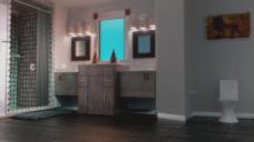

yoilet1.1.jpg
1920 x 1080 - 1M
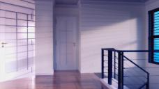

Hallway 3.jpg
1920 x 1080 - 1M
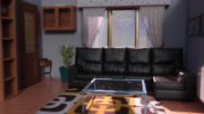

living room.jpg
1920 x 1080 - 960K
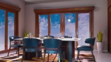

dinner room 2.jpg
1920 x 1080 - 1M
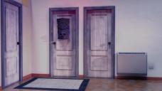

Hallway1.1.jpg
1920 x 1080 - 1M


Comments
What do you mean by look good? Which render engine are you using?
it looks like messed up settings depth of field issues etc.. it looks like some kind of soft focus effect is happening... Did you know that photographers used to smear vasoline on a lens to soften the image... that's what this looks like.
are you using a camera to render from --- there are settings that will change lots of things in the camera menu.
Or do you render out of work view.
...I thought that looked like extensive use of the denoiser?
Looks like excess Bloom on a couple of them.
1) Too much bloom, denoiser, or both (Render settings -> Filtering)
2) As mentioned above, learn how to use Depth of Field correctly
3) Texture and model quality. Dinner room2.jpg is the perfect example - horrblie textures and low-polygon objects
4) Use light fixtures like lamps, small sources of emissive lights etc that cast light on nearby objects.
5) Mess with the focal length of the camera. Try wide (18mm-35mm) shots, and more narrow shots (45-75mm) and see if you can get the atmosphere right.
6) There is very little detail in the scene. In the rooms, add clutter, some books, stuff laying on the floor, shelves, etc...
All the above should bump the image quality and realism.
Hope this helps :)
I rarely don't have DOF.
If nothing else, it tells the viewer where they should be looking, which might not be obvious without it. I would also look at the Rule of Thirds. Compose you scene according to the rule of thirds.
Now I like all the images you've done; they have a nice, appealing aesthetic to them.
There is, however, nothing happening. If they're meant to be archetectural renders then they work. But if you're telling a story, what are you saying?
Another part that looks odd to me, is doors, windows, cupboards and drawers (toilet seat) are all closed - basically anything that can move; such as the chairs NOT being perfectly arranged. For me, that doesn't give any life to the scene.
The first image, for example, it could have a wet bar of soap on the floor, maybe a discarded towel, or just some soap bubbles; make that the focus! You could even have a foot just about to disappear from the scene; I'd want some motion blur on that though.
We don't know what you're trying to do, so hard to offer anything but general advise.
Would anyone be interested in picking one of Jura's freebies, and us having a go at that. They are for Poser so there's some conversion to be done, but as we would have to re-light and re-texture anyway...
It might be fun and informative if we can work on the same one. (I've already done the 'Bathroom with the Grand Canyon view', though it might be fun to do it again)
https://www.renderosity.com/search/freestuff?keyword=jura
One question springs to mind... are these rooms from daz?
--
If they are then take one ... load in fresh into a scene and just do a default render.
If they're not ... find one at daz and load it ... render it it... add some lights if necessary etc... but use it to get a baseline.
then turn off the room file but keeping any lights and cameras
I was going to say go back and render your room as a scene subset... but you can just copy the scene file and it's ping and paste them into your content library ... Daz considers any scene file in the content library to be a subset.
click on your room in the content library and merge into scene.. then using the cameara that came with the daz room scene and any lighting.. render your scene .. this should pinpoint where the issue is.
I don't even know what focal length of the camera means
it means in camera terms a relationship between the field of view of the lens and the film size.. but basically (based on 35mm film) 60 is normal field of view ... as the numbers get lower you get wide angle lenses (but distortion as the get smaller) as the numbers get larger you get a tellescopic effect you see less of the image but what you do see is larger. Again it introduces distortion. the normal setting is 50/60 which what the eye generally sees but telescopes flatten the image as they bring distance images in closer. A picture shot down a road that has lots of road but all the trees look almost the same size is compression as seen in long focal lengths.
But a good basic book or ebook or article on cameras from the net will give you a nice basic understanding
---
the focal lenght is kind of arbitary in daz because you can change the shape of the picture to shapes a camera wouldn't support but lower the number and you''ll see more of the sides ... raise the number and the middle will get closer and closer.
I don't think they're THAT bad. They've got that oddly soft focus effect going on, which I'm not a fan of, but otherwise they look like competent enough.
One problem they DO have is that they lack any personality at all. They look like rooms in a show house, where nobody actually lives. Get up, go into your bathroom and take a picture. How many things are there in that picture that aren't in your render of a bathroom? Think about who lives in your imaginary house, and what they might have done to personalise it.
They look good, not completely realistic though. You need better materials on some of the surfaces.
Just goes to prove how subjective we are when viewing such images. To me they do not look at all realistic. As has been mentioned, a combination of focus, DOF, bloom and, perhaps, a denoiser is evident to me. Also the colour saturation is too high for my tastes. Looks like there is a spotlight (or point light) in the scene as reflected in one of the windows. You can play with the dimensions, distance and luminance of these to alter the sharpness/softness of the shadows they cast. I don't know of any way (in IRay) to avoid that reflection in the window though.